What I taught about UX in 2013 and 2014, and what still holds
With Nerd Attack closing, a look back at the teaching we did, from the MMU talk to the UX Innovate course, and the three things from those slides I still believe.
Nerd Attack is closing down this month, and one of the things I’ll miss is the teaching. I still get nervous in front of a room, students or seasoned employees, doesn’t matter… but I enjoy teaching students. We did a fair bit of it over the years, for Nokia at universities around the region, and then two of our own. In 2013 MMU asked us to talk to their final year students, and in 2014 I wrote and ran the UX Innovate course for MDeC. Before the end of the month, some notes on what I taught and what I still believe.
The MMU one was less about UX and more about starting a company. Three of us went, Enoch took the technical half, and my half was the business part… none of us had a business degree, no income for the first couple of months, runaway clients, failed projects. And one thing I told them that I’d tell any student… don’t get caught up with being a technopreneur. At the end of the day you start a business to make money and profit. Otherwise you’re just building hobby projects because you can.
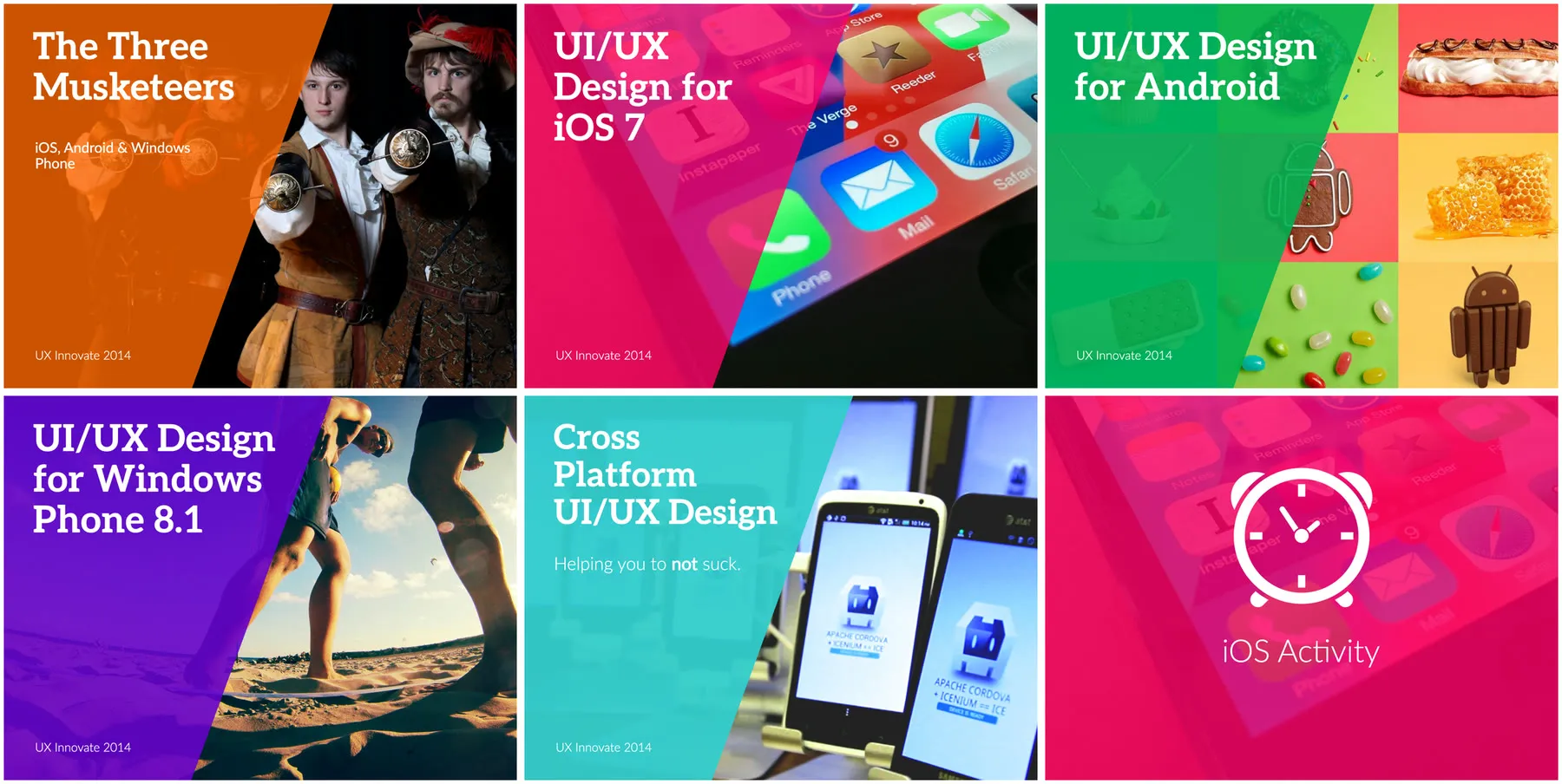
The course was seven modules, and a lot of it was platform rules… which bars go where on iOS 7, action bars on Android, pivots and panoramas on Windows Phone. That part has dated. Three lines from it haven’t, and I’d still put them on a slide today.
Start thinking in flows and not screens. Flows meaning the user journey. You need to understand the intent and the end goal first, what the user is trying to do, and only then design the experience for it. A lot of young designers go straight to the screen, which button goes where, the layout, without understanding how a user might use the app and what that user is trying to achieve.
Design for errors and not for success. Once you have the journey, the next question is which part along it could fail, and you design with that in mind. What usually gets missed… areas with bad network coverage, weak wifi, server errors. User delight comes after that.
If you don’t use it, you have no clue. In the course I said it about the platforms. When we did Street Beat for Samsung, it was an app for a camera, so to understand it we went and bought a Galaxy Camera.
What changed
One month after the course, Google announced Material Design, and the whole Android module, the Holo look and all the action bar rules, was out of date just like that.
Windows Phone is the sad one. A third of the course was Windows Phone 8.1, and Microsoft ends support for it next month. It would have been interesting and fresh, but the market didn’t appreciate it. From where we sat, clients weren’t interested… iPhones and Android were a lot more exciting to them, and it was hard to get developers to buy in. We built on it anyway, and to be fair to Microsoft, after all those years in software they know how to build a good developer experience and good tools.
The other thing that changed is what we build with. The course said every platform deserves its own design, and in the cross-platform module I called lazy shortcuts a way to hurt your app and your brand. Last year we built Hermo in React Native. I don’t think that’s a contradiction. React Native shares the code between platforms, but that’s no excuse for the UI/UX… developers still have the option to build a native experience on each one.
If I taught it again, I’d make it a lot more engaging. Take-home exercises between sessions, maybe interactive games with the participants and a leaderboard, and quick quizzes after each session. Preparing the material is the hard part la, it takes a lot of effort.