Designing the Hermo iPhone app
We designed Hermo's iPhone app with their design team, built it in React Native while their API was still being built, and went down to JB to hand over the code.
We went down to JB this week to hand over the code for Hermo’s iPhone app. We got a look at their office and the team, and a tour of the warehouse… oh, and there’s a slide in their office.
Hermo is the online beauty shop from Johor Bahru. They raised a Series A from Gobi Partners last October, and nearly half their orders already come in on the mobile site. In March they launched in Singapore too. They had the website, so apps were the next step la, and they came to us to build the iPhone one.
Hermo is about the second or third shopping platform we’ve worked on. The first was the OG, the Lelong team, when we built Superbuy, their shopping app for Nokia’s Symbian phones.
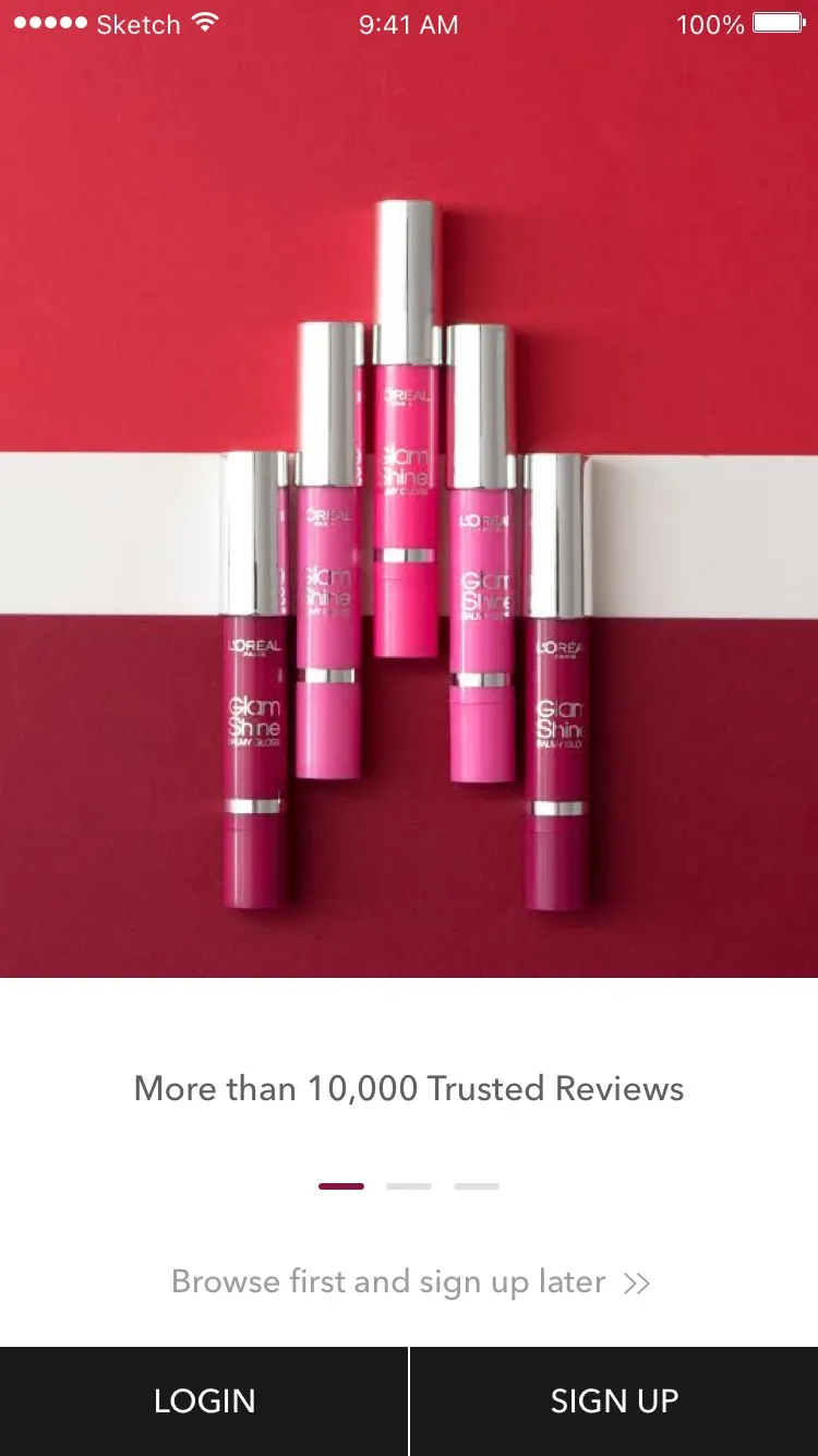
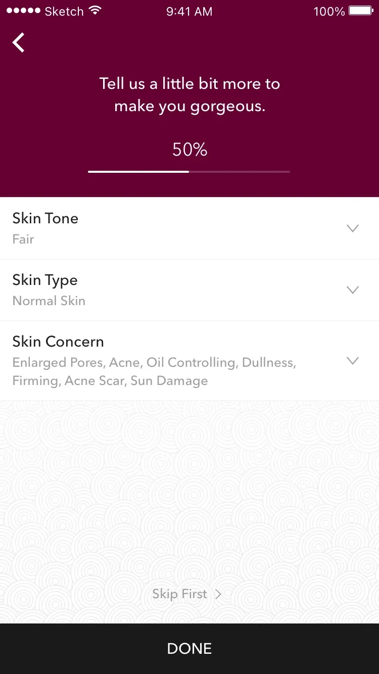
With Hermo’s design team
We did the UI/UX together with Hermo’s design team from December to June, using Hermo’s own brand. We started by going through other shopping apps screen by screen: Le Tote, The Honest Company, Lotte’s Chinese shopping app, Jumei, The Fancy, even Foursquare’s search. Then came the user flows, about 80 of them, and the first wireframes in January.
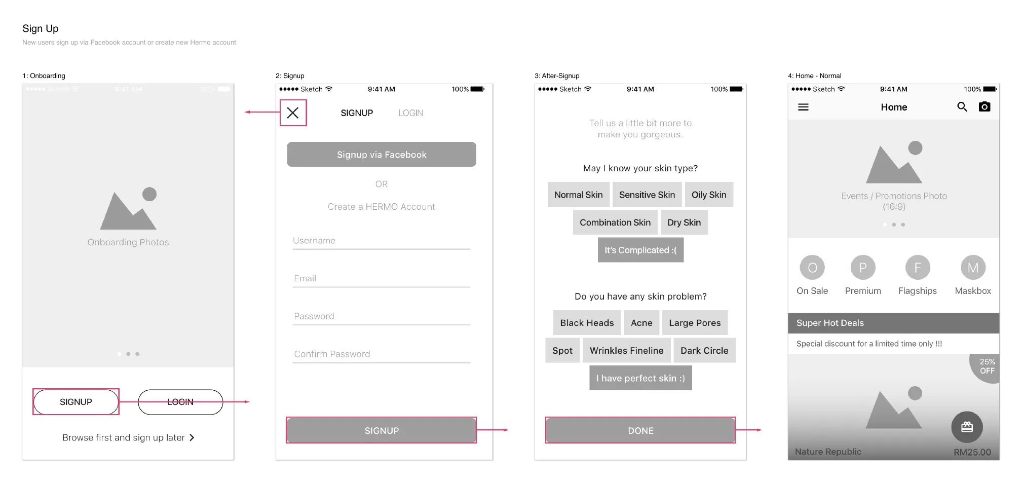
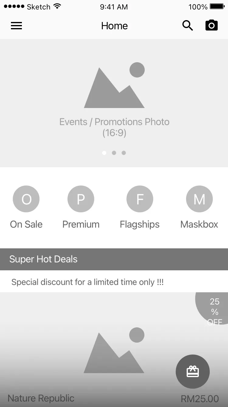
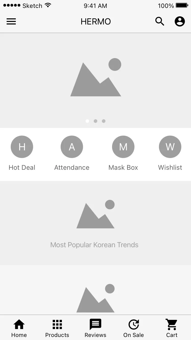
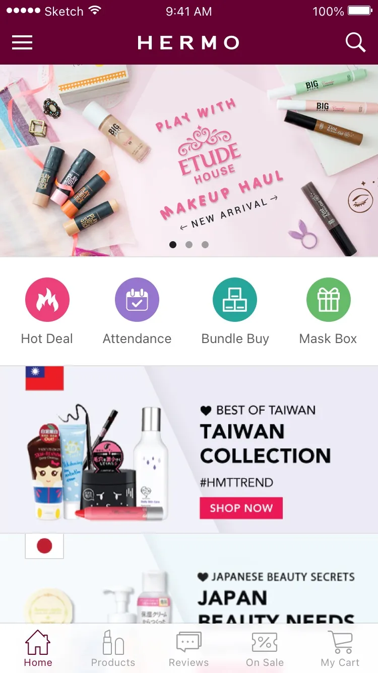
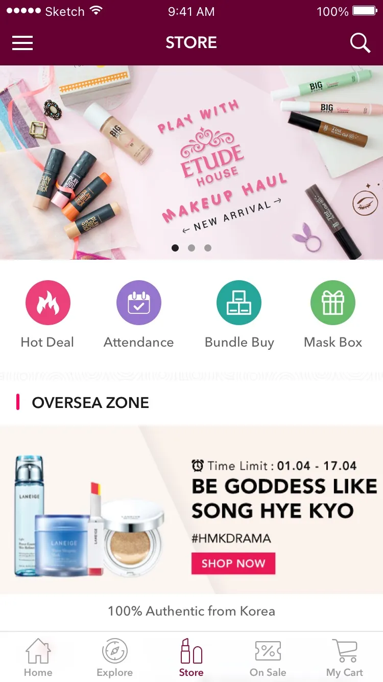
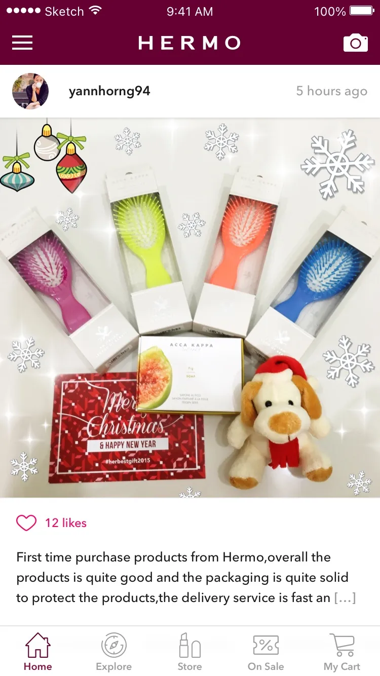
The design moved a lot along the way. We had to keep adapting, partly because Hermo’s API was being built at the same time as our app. The side drawer in the January wireframes became a tab bar in March. By June, Home had turned into a feed of reviews from Hermo’s customers, and the shopping moved to its own Store tab.
Reviews are Hermo’s big thing, about 50,000 of them on the Beauty Wall, and on the new Home you scroll through them: customers’ photos, likes and hashtags, with the products in each one. Post your own from an order you’ve received and you get 50 credits.
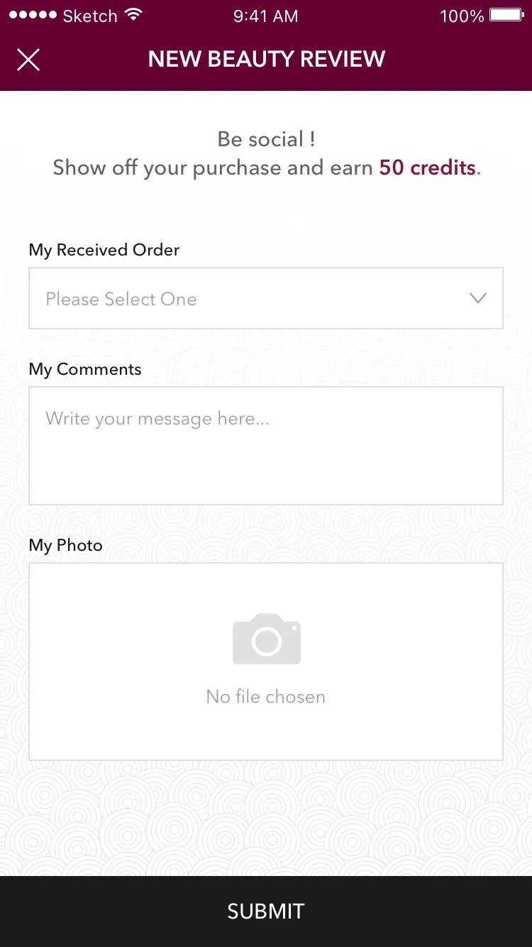
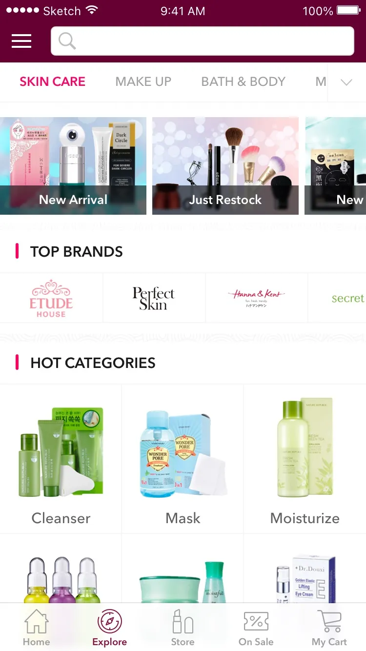
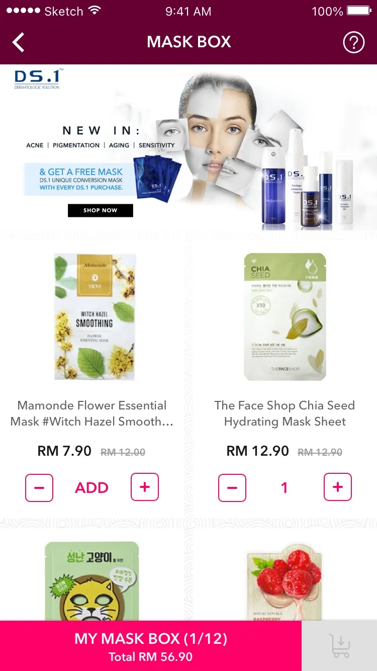
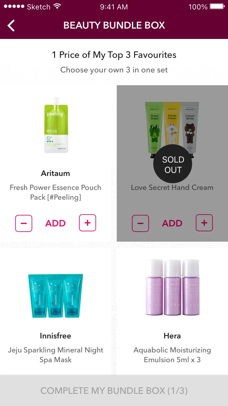
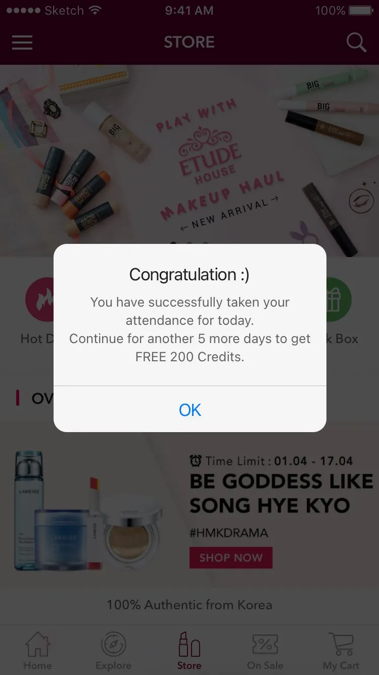
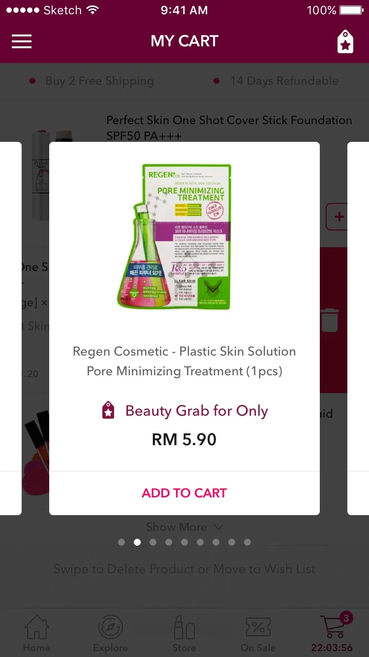
Credits run through the whole app. You earn them for reviews and for inviting friends, and Attendance, a daily check-in, gives you 200 credits if you keep it up for a few more days. Then there’s Mask Box, where you pick 12 different sheet masks and Hermo packs them into one box. Bundle Box gets you your top three favourites at one price, and Beauty Grab puts RM5.90 add-ons in the cart.
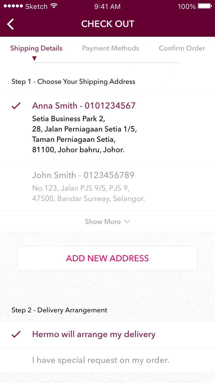
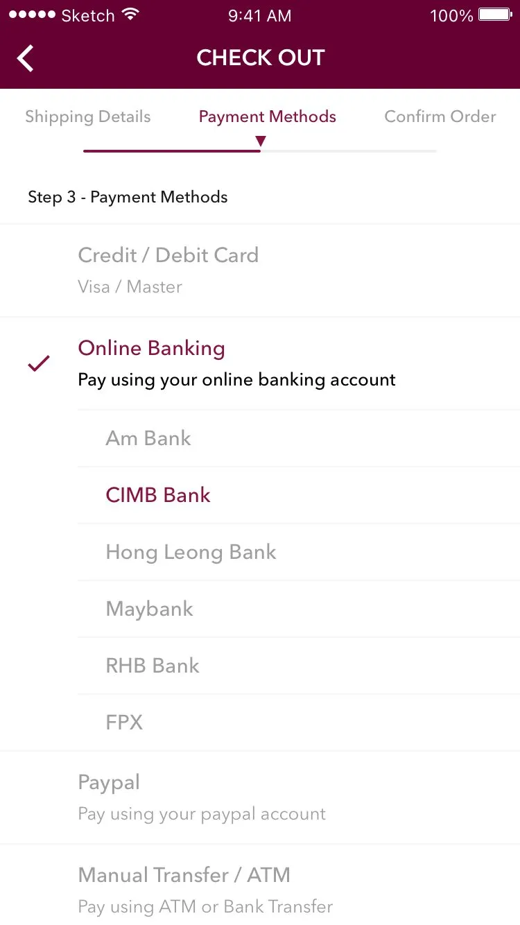
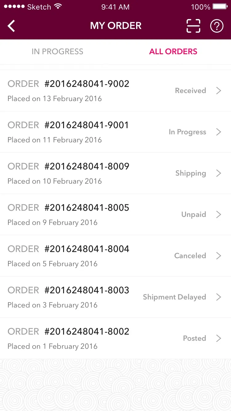
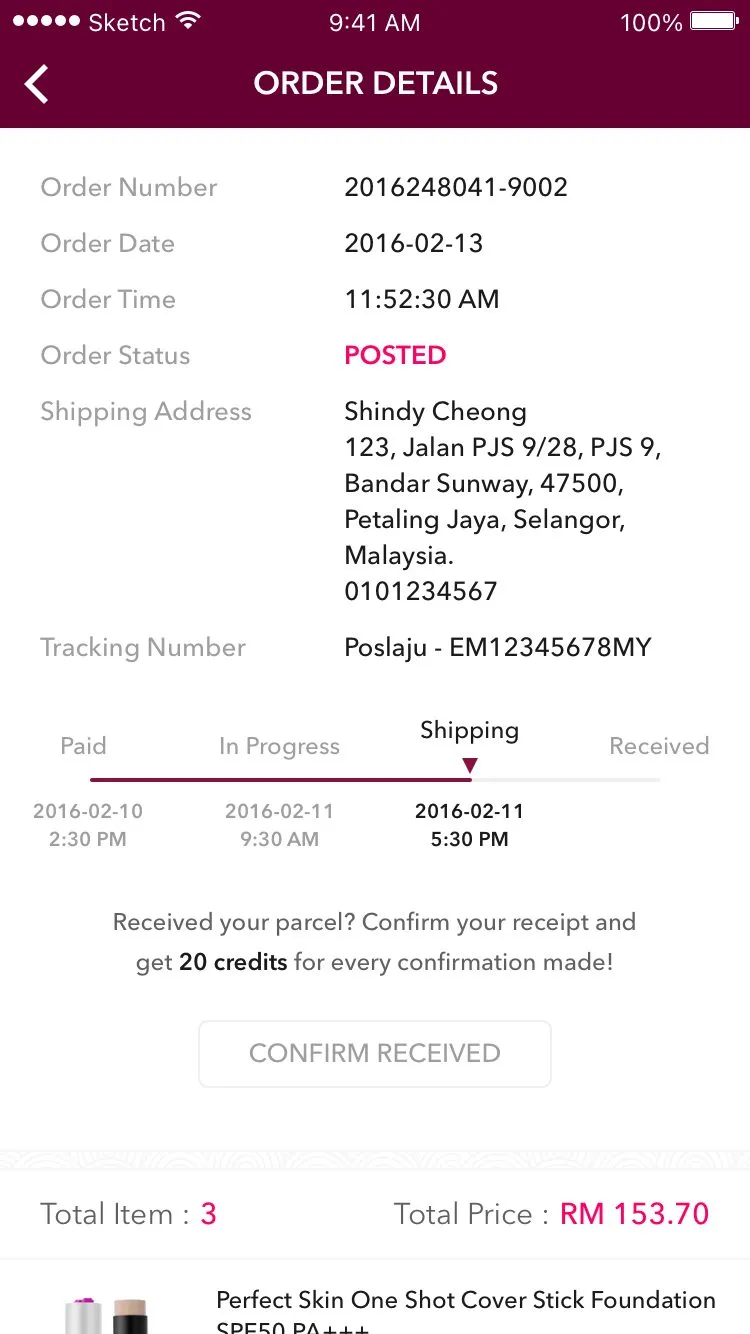
Checkout takes three steps, and you can pay by card, online banking or FPX, PayPal, or bank in at an ATM. Every order then gets a tracker with its Poslaju, Skynet or GDEX number, and confirming you got your parcel earns another 20 credits.
Building it in React Native
Going with React Native was a risk at this point. Facebook only open-sourced it last year, iOS first, and a new version comes out every two weeks. Some of the libraries we used weren’t mature yet either. But our team is comfortable with JavaScript, and React Native meant we could iterate fast without having to deal with iOS native code. Working with the simulator and React Native has been pretty good.
We started the code in March, on the first round of the design, and kept going through the second. Getting it onto the App Store is up to Hermo’s team from here.