Every Nerd Attack website
A company profile from 2009 and the Nerd Attack websites that followed. The nerd mascot changes, and Nokia drops off the list.
I went digging through the old Nerd Attack folders in Dropbox and found every logo and website we ever had. Eight years of trying to look like ourselves.
The name
People always ask where Nerd Attack came from. There’s no deeper meaning la. When I first came up with it, it just felt right and sounded right, and it rolls off your tongue, so people remember it after hearing it once. Maybe Ow and I are just nerds deep down.
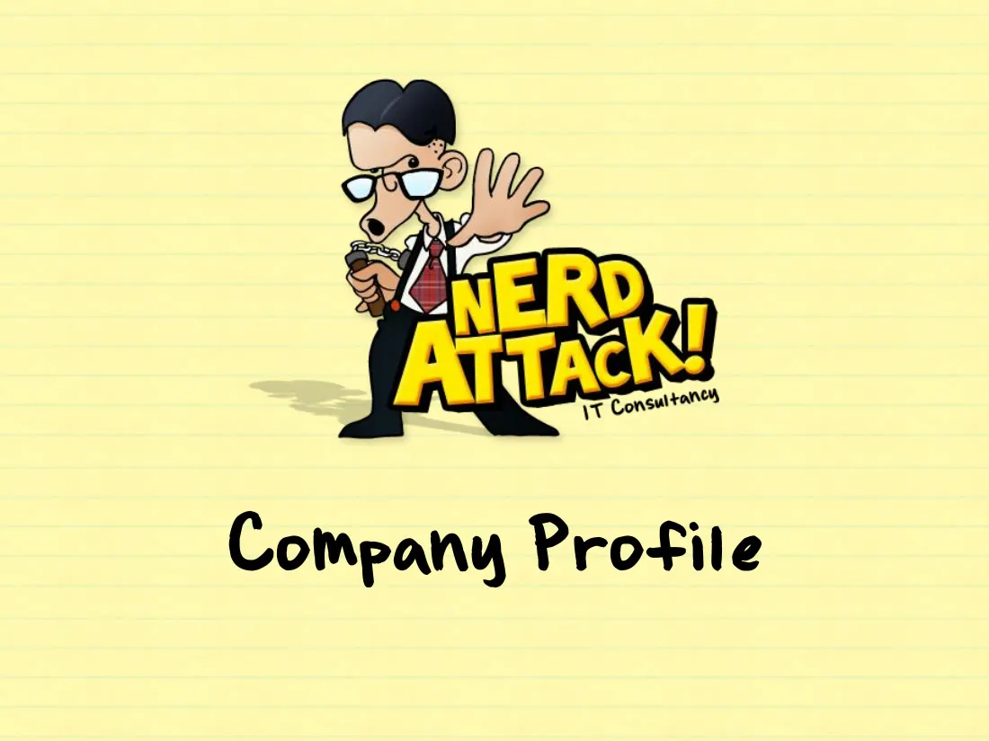
The first logo came from a favour. Alex Lim, a friend who runs his own design agency and is a pretty good illustrator, drew us a nerd for our name cards … shirt and tie, glasses, phone in one hand, the other hand up like he’s about to say something.

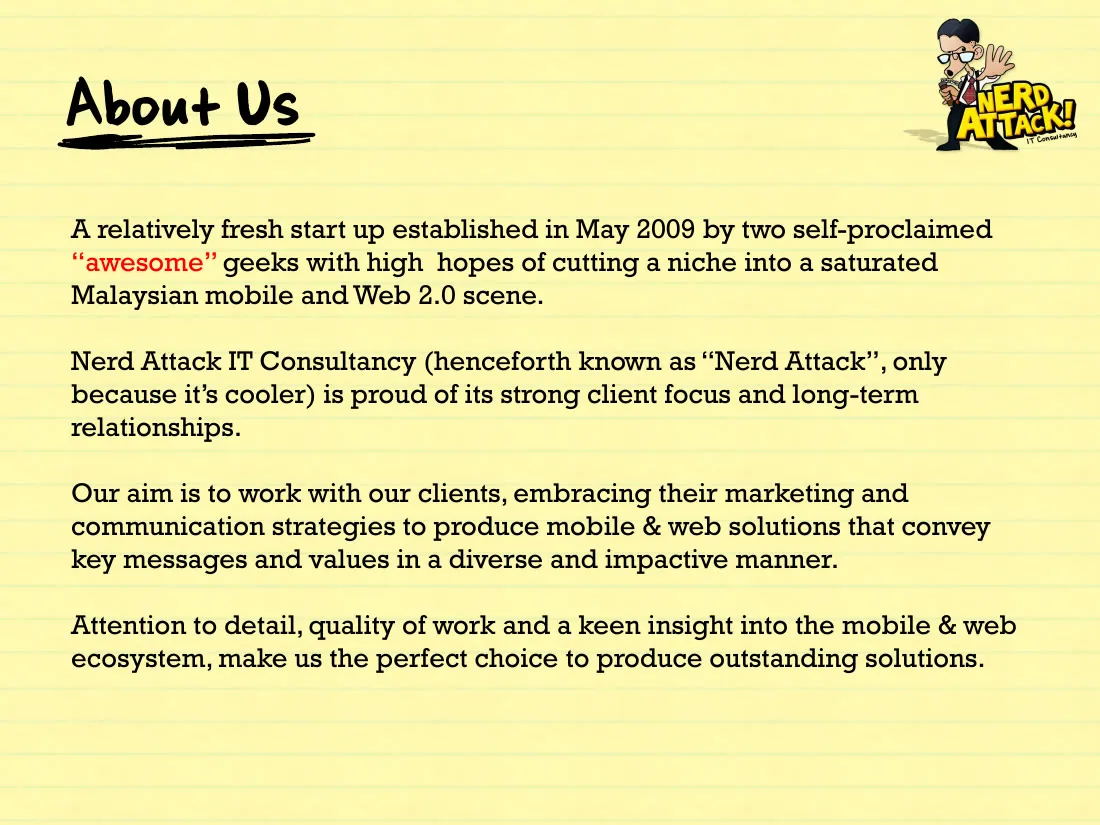
He went on the cover of our company profile too, six pages in PowerPoint. We were a partnership then, Nerd Attack IT Consultancy, before there was a Sdn Bhd, and the profile says we were “established in May 2009 by two self-proclaimed ‘awesome’ geeks”. We’d actually started in March. The capabilities page says PHP, ASP and JavaScript for the web, and Nokia WRT and Flash Lite for mobile. The last page says “Go ahead. Ask us out for coffee :)”
The first website went up later that year, on WordPress. I’ve tried, and I can’t remember a single thing about it.
A rounder nerd
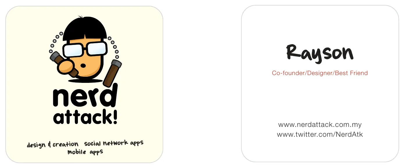
By 2010 Alex’s nerd was getting hard to use. He was a full figure, and he didn’t fit on everything we needed him on, so I redrew him … rounder, bigger glasses, something that still looks like a nerd at any size. There are Illustrator files with a few other versions before I settled on the one with the nunchucks. He went on the 2010 name cards, where my title was Co-founder, Designer, Best Friend.
The yellow one
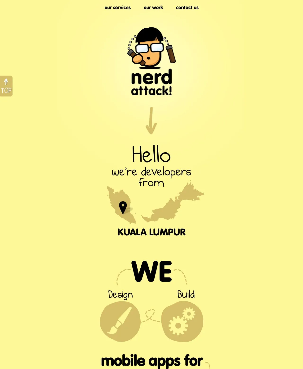
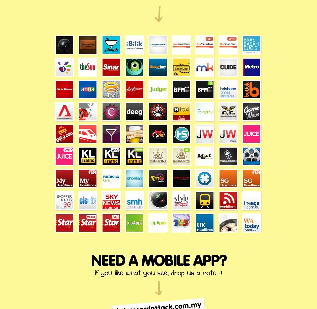
Single page sites were the hot thing back then, so the next website was one long yellow page. The nerd at the top, “Hello, we’re developers from Kuala Lumpur”, then “We design, build mobile apps for” and a heart with Nokia, Apple and Android in it. Scroll down and there’s a wall of every app we’d done, 81 of them by 2012, each with its own page. At the bottom it admits we only occasionally “try” to blog and tweet, “though you might find spider webs”, and then, “The End”.
Four colours
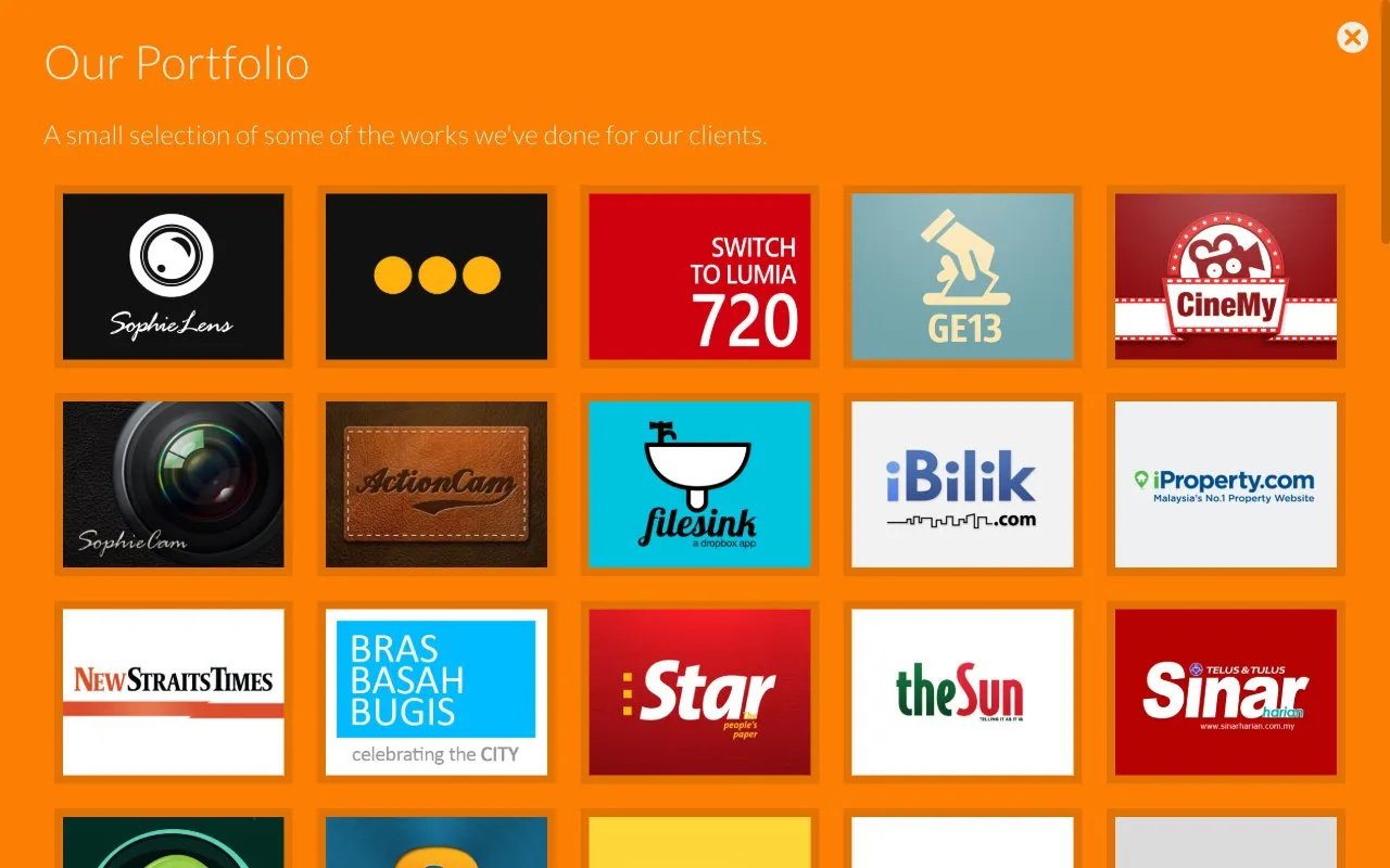
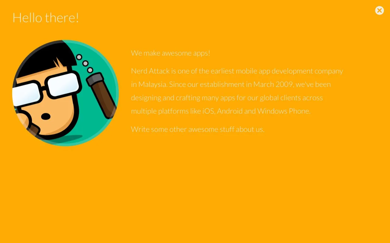
In 2013 I wanted the site to feel like a friendly company, closer to what Ow and I are actually like, so it became four big coloured tiles, About, Portfolio, Team and Contact, each opening into a full screen.
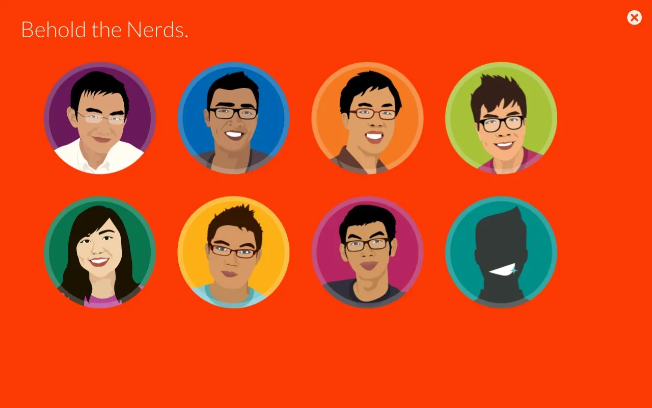
Everyone on the team got a drawn portrait and a short bio, with an empty silhouette at the end that said “This could be you”. Mine says I spent my boyhood frolicking in oil palm estates and that I’m happiest when stray pixels are kept out of sight and the mamak gets kurang manis right. Ow’s ends with “Any resemblance to the company logo is purely coincidental.”
The About panel has the nerd in a circle, the intro, and under it a line that was only ever meant to be a placeholder … “Write some other awesome stuff about us.” It went live like that.
2014
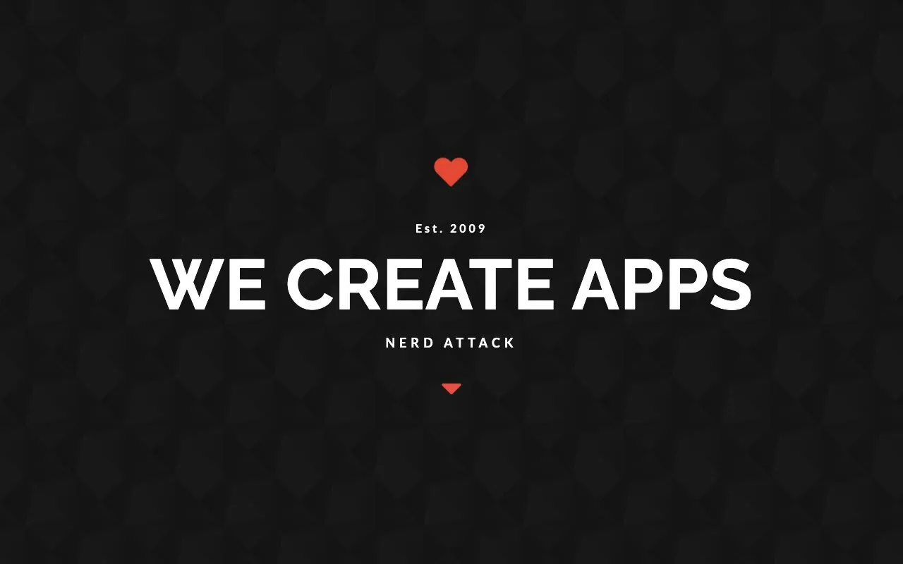
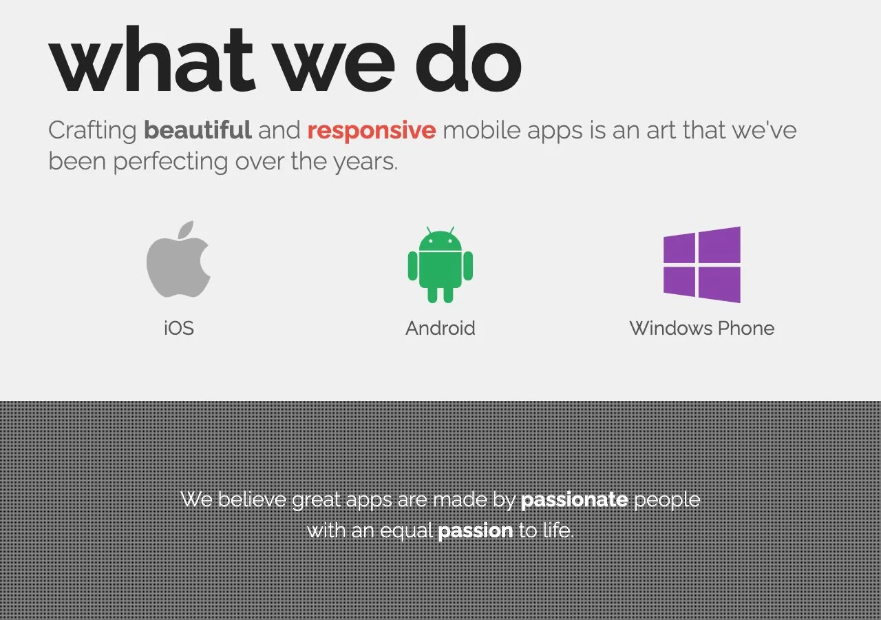
The last site was darker. It opens with “Est. 2009, We create apps”, and under what we do, the three logos are Apple, Android and Windows. By then Microsoft had bought Nokia’s phone business, and Nokia wasn’t on our website anymore. The address at the bottom is our office at Oasis Square in Petaling Jaya.
The website did bring in clients. Back then there weren’t many of us doing mobile apps in Malaysia, we were one of the earliest, and the clients who came liked that we weren’t pretentious, and they liked the work.