Teaching UX Innovate 2014
UX Innovate 2014 has kicked off with my mobile UI/UX training, and for the next few months I'm helping two MSC-status companies with their websites and apps.
UX Innovate 2014 has kicked off. It’s a programme UX Innovate runs with MDeC, and I’m one of the trainers, so it started with my training. After that, each trainer gets two MSC-status companies to help improve the UI/UX of their website or app. For the next few months I’ll check in every two weeks and meet each company’s representative as they work through their project.
The training
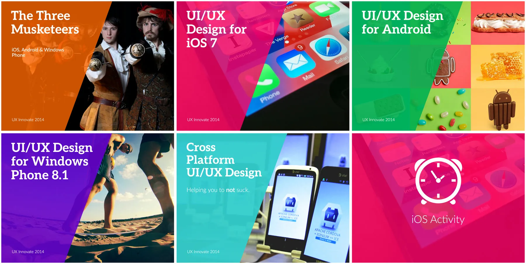
I put together seven modules. The first starts with a cake, because you’re baking it for a customer and not for yourself. “The cake isn’t for you, ok?” UX design is designing for other people. Then iOS, Android and Windows Phone as the three musketeers, one module each on designing for iOS 7, Android and Windows Phone 8.1, and the last one is cross-platform UI/UX design, “Helping you to not suck”.
One of the things that plagues apps right now is developers using the same iOS design on Android phones, and what’s worse, porting the whole design language over to Windows Phone instead of following its native design. It’s bad practice. Every platform deserves a proper redesign, and I’ve been championing that in my work, so it’s what I’m trying to say in the training. In the slides it goes, “If you think by having a similar UI across all platforms you are being consistent, you need to rethink.”
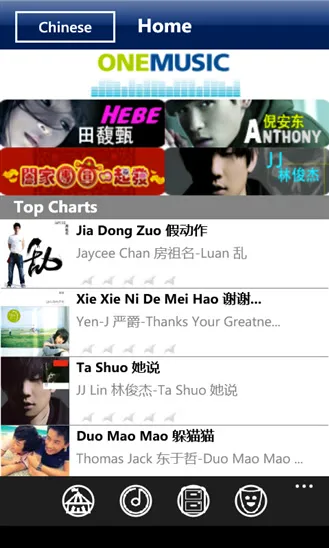
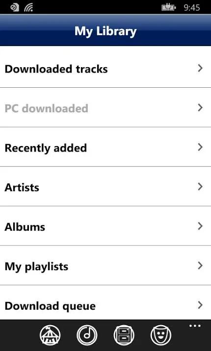
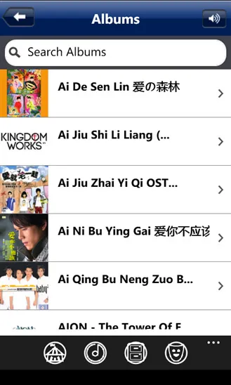
One of the case studies is Maxis ONEMusic, and I start it by asking everyone to guess the platform. It’s the Windows Phone app, with iOS navigation bars, back buttons and arrows all the way through, and the last slide of it says, “Good effort copying the iOS platform on Windows Phone platform. But, this is nothing to be proud of.”

A few other lines from the slides that I keep coming back to … “Design is not a skill set. It is a mindset.” “Start thinking in flows and not screens.” “Your users are not stupid, but they are in a hurry.”
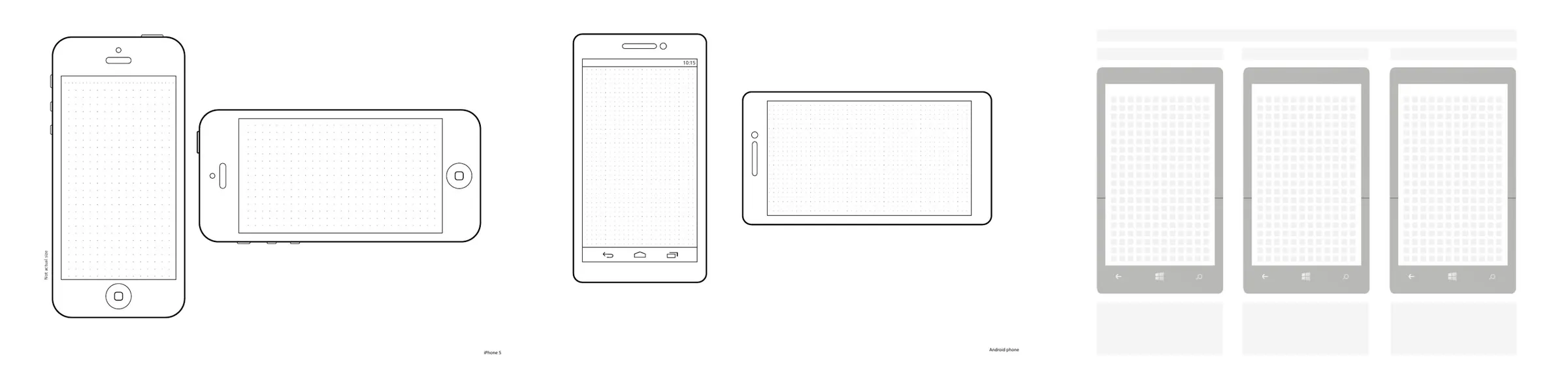
The exercises are there so they can practise it. Each platform module ends with a thirty-minute exercise told as a spy story, Agent TGV. The teams take the TGV Cinemas app and make it a better iOS app, then it gets “transplanted into an Android body” and they fix it, then it gets “a total Windows Phone makeover”. The whole session, they draw the UI by hand to practise their sketching, on sketch sheets I made for the iPhone 5, Android and Windows Phone.