Hargapedia's latest update is a whole new app
Last week's Hargapedia update looks much like the old app, but underneath it's a new one, rebuilt screen by screen in a fresh React Native project.
Hargapedia’s latest update went out last week. The release notes mention “under-the-hood updates” and “various bug fixes and improvements”, and if you’ve installed it, you probably haven’t noticed much of a difference.
That’s because, despite looking almost identical, it’s an entirely new app.
We’ve spent the past five months rebuilding Hargapedia in a fresh React Native project. Every screen had to be rebuilt, the data layer replaced, and the libraries brought up to date. We also had to make sure things like deep links, push notifications and sign-in continued working.
A lot of the work was making the new app behave exactly like the old one. The more interesting parts were the places where we couldn’t simply bring things across.
Why we started again
The old project had been around since 2018, when we built Hargapedia 2.0. It went through the 3.0 redesign and continued growing as we added new features over the years.
By the beginning of 2024, it was still running React Native 0.63, a version we’d moved to back in 2020. React Native itself had already reached 0.73.
The age of the framework wasn’t the only problem. Six years of development had left us with three generations of shared components living side by side, two versions of the navigation library running at the same time, and plenty of class components and Relay containers.
We’d even patched React Native itself in a few places to keep the app working with newer versions of iOS and Xcode.
A lot of that code was mine, written at different points over those six years.
We could have tried upgrading the existing project, but there was so much accumulated code to work through that rebuilding it in a clean project was the faster option. It also gave us a chance to sort out the architecture rather than continue working around decisions we’d made years earlier.
The trade-off was that we now had to rebuild every screen, including the ones that were already working perfectly well.
Making a new app behave like the old one
I started the new project in February using React Native 0.73’s TypeScript template.
Rather than begin with the individual screens, I built the navigation first. Every screen existed as an empty stub, with the same hargapedia:// deep link it had been given in Hargapedia 3.0.
Those addresses were already being used in banners, push notifications and links people shared. Changing them would have meant existing links no longer opened the right screens, so they needed to keep working even though the app underneath was different.
Once the navigation was in place, I rebuilt the common header, brought over the images, icons and splash screen, and started moving the shared components across. Most of those came from the newest generation in the old project, with some tidying up along the way.
Then I worked through the screens one at a time.
I built each screen against mock data, comparing it with the existing app as I went. For the product page, I worked from the top down, following the order in which everything appears on screen.
Meanwhile, the rest of the team worked on the new data layer, creating a hook for each query. As those became available, we replaced the mock data and connected the screens to the real backend.
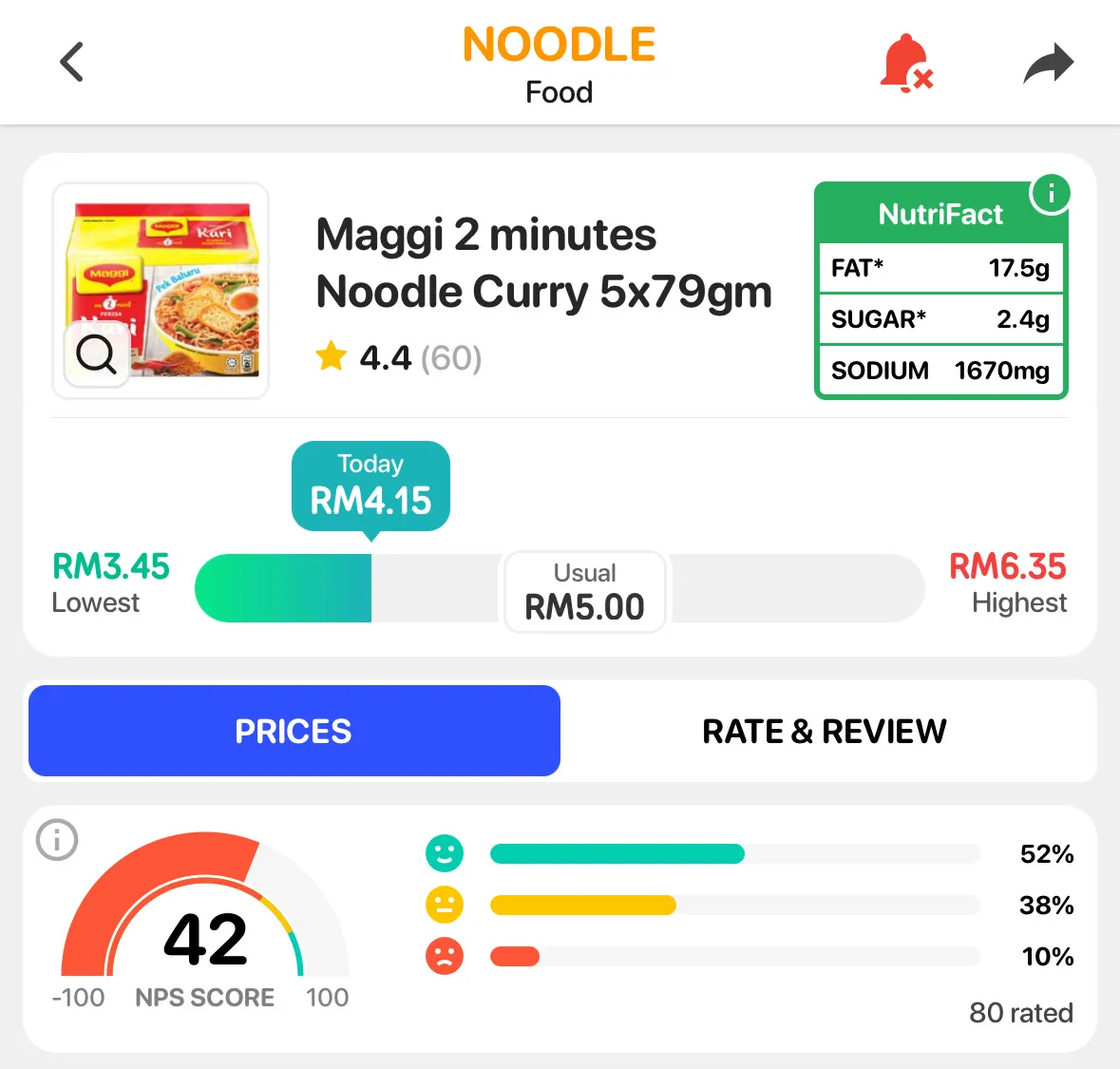
For most screens, that was the approach. Bring the interface across, clean up the implementation and make sure it still behaved the same way.
One screen needed rather more work.
Replacing the Price Tracker
The Price Tracker was originally called My List when we built it for Hargapedia 2.0. Unlike the rest of the app, it wasn’t written in React Native.
On iOS, it used a native spreadsheet view. On Android, it was a native table. Both were bridged into React Native, and they’d been there since 2018.
For the rebuild, I replaced them with a React Native table in May.
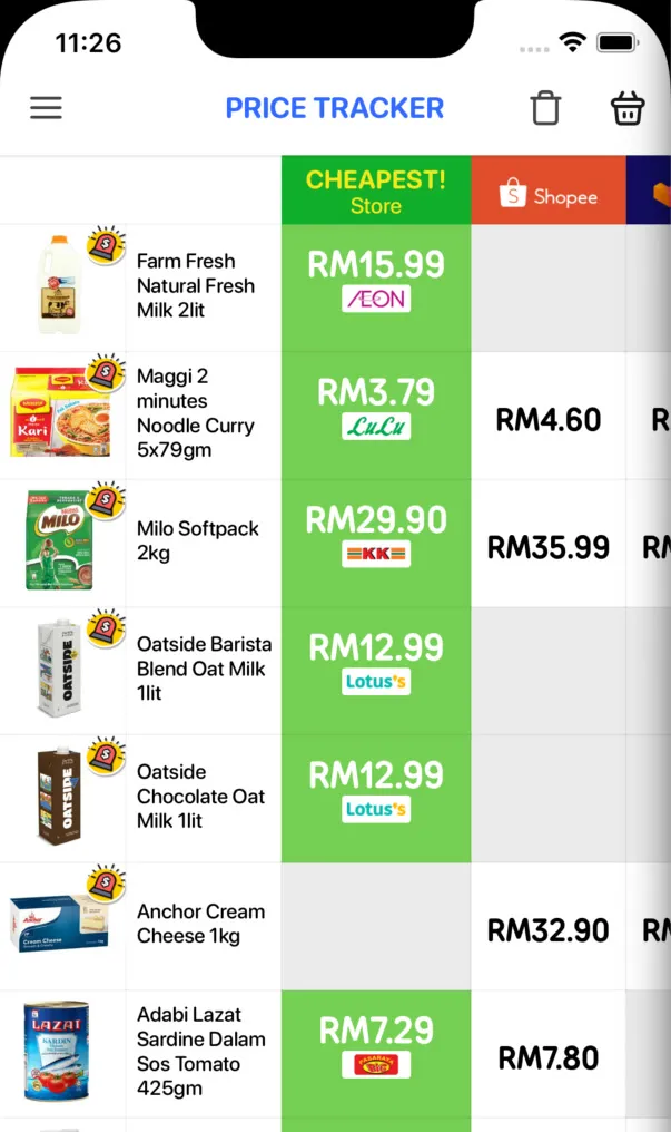
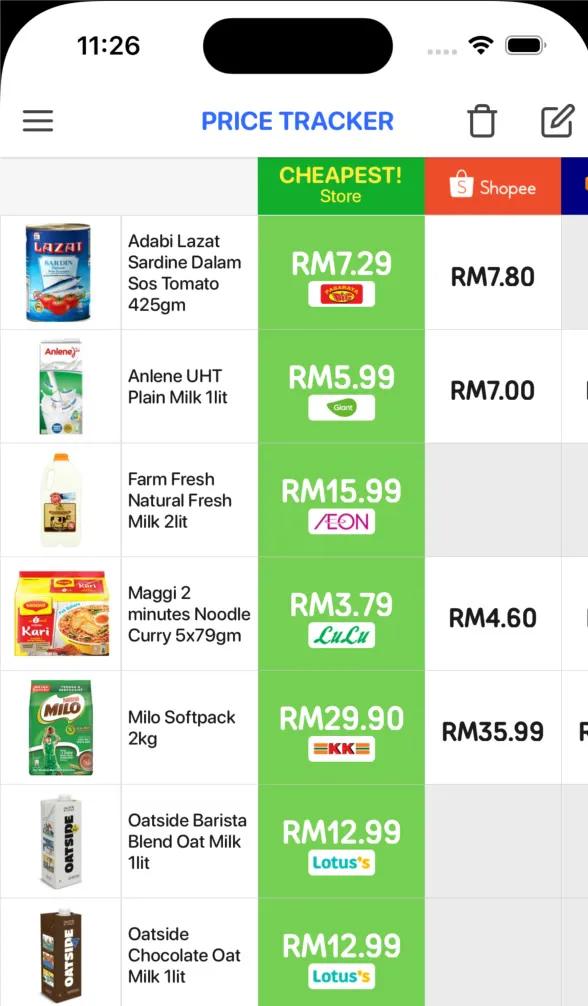
The tricky part was getting the scrolling to behave the same way.
The Price Tracker has products down the left and retailer prices across the screen. You can scroll down through the products or sideways to compare prices from different retailers, but certain parts need to stay fixed.
The product photos remain on the left when you scroll sideways, yet they still need to move vertically with their rows. The retailer logos across the top do the opposite: they move sideways with the prices but stay in place when you scroll down.
In the old app, the native table handled that behaviour. With React Native, I had to coordinate the scrolling myself.
The price table is the part you can scroll. Whenever its vertical position changes, it reports the offset and moves the separate photo column to match.
{/* Product photos, fixed on the left */}
<ScrollView ref={leftRef} scrollEnabled={false}>
  {/* ... */}
</ScrollView>

{/* Names and prices, which scroll both ways */}
<ScrollView horizontal={true}>
  <ScrollView
    ref={rightRef}
    scrollEventThrottle={16}
    onScroll={(e) => {
      const { y } = e.nativeEvent.contentOffset;
      leftRef.current?.scrollTo({ y, animated: false });
    }}>
    {/* ... */}
  </ScrollView>
</ScrollView>
The scroll event runs roughly once per frame, and the photo column follows without animation. That keeps the product photos lined up with the correct prices as you move through the table.
It was one of the few places where reproducing the old behaviour meant building something quite different underneath.
When the libraries hadn’t caught up
Rebuilding also meant moving to React Native’s New Architecture, which changes how the interface is rendered and how JavaScript communicates with native code.
We enabled it on Android in March and on iOS in April. The new app also uses Hermes on both platforms, whereas the old one only used it on Android.
Not every library we depended on was ready for that combination.
The price graph was one of the first problems. It uses a gradient under the filled area, but the gradient library we’d been using needed an alpha version to work with Fabric, the New Architecture’s renderer.
I tried that version in March, then switched the graph to a different gradient library in April.
Things got more involved when we upgraded the project to React Native 0.74 in May.
With the New Architecture enabled, 0.74 runs in bridgeless mode by default. The old bridge between JavaScript and native code is no longer there, which meant some of the libraries we’d previously relied on wouldn’t work as they were.
Push notifications and analytics needed several rounds of fixes. We wrote our own native modules for both, and the push notification libraries had to be updated before they’d work in bridgeless mode.
Even some of the small visual details needed attention.
The animations that didn’t come across
Hargapedia uses animated GIFs in a few places, including the tab bar, pop-ups and product pages.
Earlier in July, we moved the GIFs in the tab bar and pop-ups to a different image library. But there were two animations on the product page that I ended up replacing altogether.
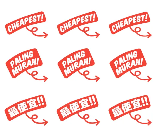
One was the red CHEAPEST! sticker, which points towards the Buy Now button for the retailer with the lowest price.

The other was the SHRINKFLATION label, which appears on products that have become smaller.
Both had been GIFs, but I couldn’t rely on them working in the new app. Rather than keep trying different ways of displaying them, I split the animations into their individual frames and had the app cycle through those instead.
The CHEAPEST! sticker uses three frames for each language, English, Malay and Chinese, switching every 150 milliseconds.
The SHRINKFLATION label has six frames, changing every half a second. I kept the same frames and dimensions as the original GIF, but added a slight pulse that makes the label grow by a tenth and shrink back again.
It’s a small change, but it meant we could keep the familiar animations without depending on the old GIF implementation.
The frame-based versions went out in the first round of App Store bug fixes this week.
What we couldn’t bring forward
For everyone installing the update, the new app uses the same App Store and Google Play listings. It replaces the old version rather than appearing as a separate app.
We also brought the sign-in and settings code across, which should allow people to continue where they left off.
There are, however, some devices that won’t be able to install the new version.
The minimum requirement is now iOS 13.4 or Android 6.0, up from iOS 11 and Android 5.0. Those are the oldest versions supported by the newer React Native release.
That means devices such as the iPhone 5s, iPhone 6 and iPhone 6 Plus, which stopped at iOS 12, will remain on the last version of the old app. The same goes for Android phones that never received an update beyond Android 5.
We’re also leaving behind the separate Huawei version of Hargapedia.
Back in 2020, we’d made a build specifically for Huawei’s AppGallery after newer Huawei phones stopped shipping with Google’s apps and services following the 2019 US trade ban.
That version needed some differences from the regular Android app. It used Huawei ID instead of Google sign-in, and OneSignal instead of Firebase for push notifications.
We haven’t carried that version over to the rebuild. There wasn’t enough support or market need to justify maintaining it.
So while the new app replaces the old one for most users, some devices and the Huawei-specific build will stay where they are.
An ordinary update
The last release from the old Hargapedia project went out in April. From here on, every update will come from the new one.
We started the rebuild in February, and five months later it reached the App Store and Google Play as an ordinary update, with mostly the same screens and familiar behaviour.
For most people, there shouldn’t be much to notice. Which, considering how much of the app we replaced, is rather the point.