Hargapedia 3.0: a design refresh
A refresh of Hargapedia's cards, new places for deals and vouchers, and the animated tab icons that made it into 3.0.
Hargapedia helps people compare prices and find deals. For 3.0, we redrew the cards on the home screen and added more places to show promotions throughout the app. It’s the first big design refresh since 2.0, two years ago, and it reached the stores at the start of November.
Most of the design work happened at my desk at home. We’ve been working from home for much of this year, going into the office only for meetings.
Before the home screen
I started in July by mapping what a new user sees between opening the app and reaching home. The flow included a startup ad, when there was one, and a poll for new users. A tooltip would appear on their first visit to the home screen.
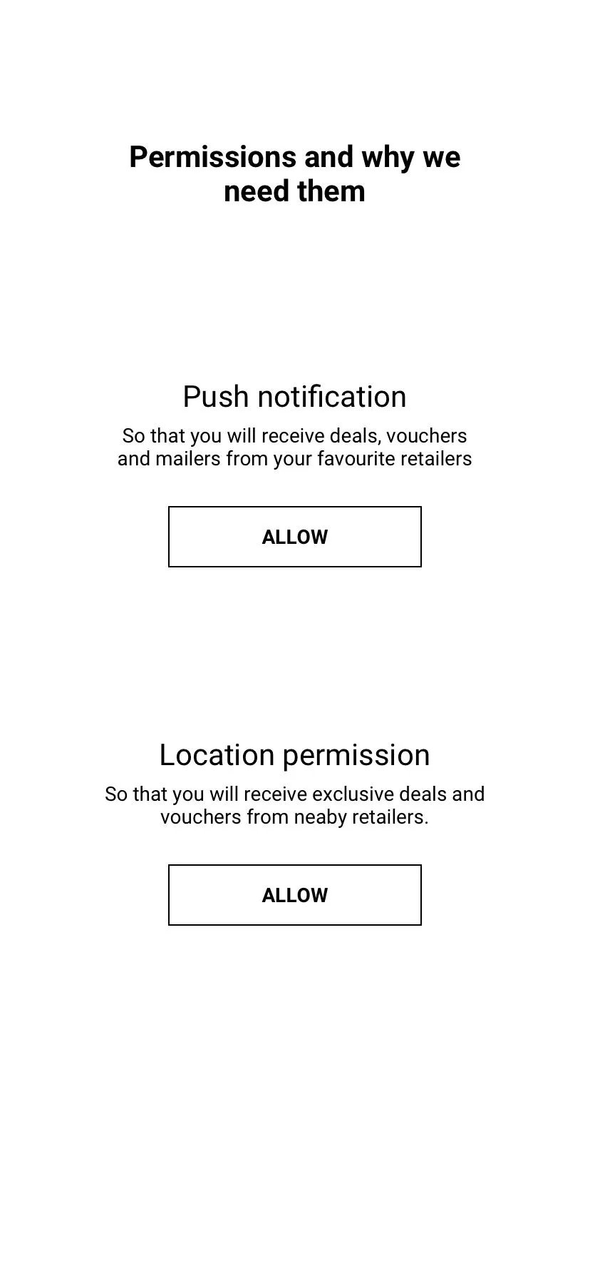
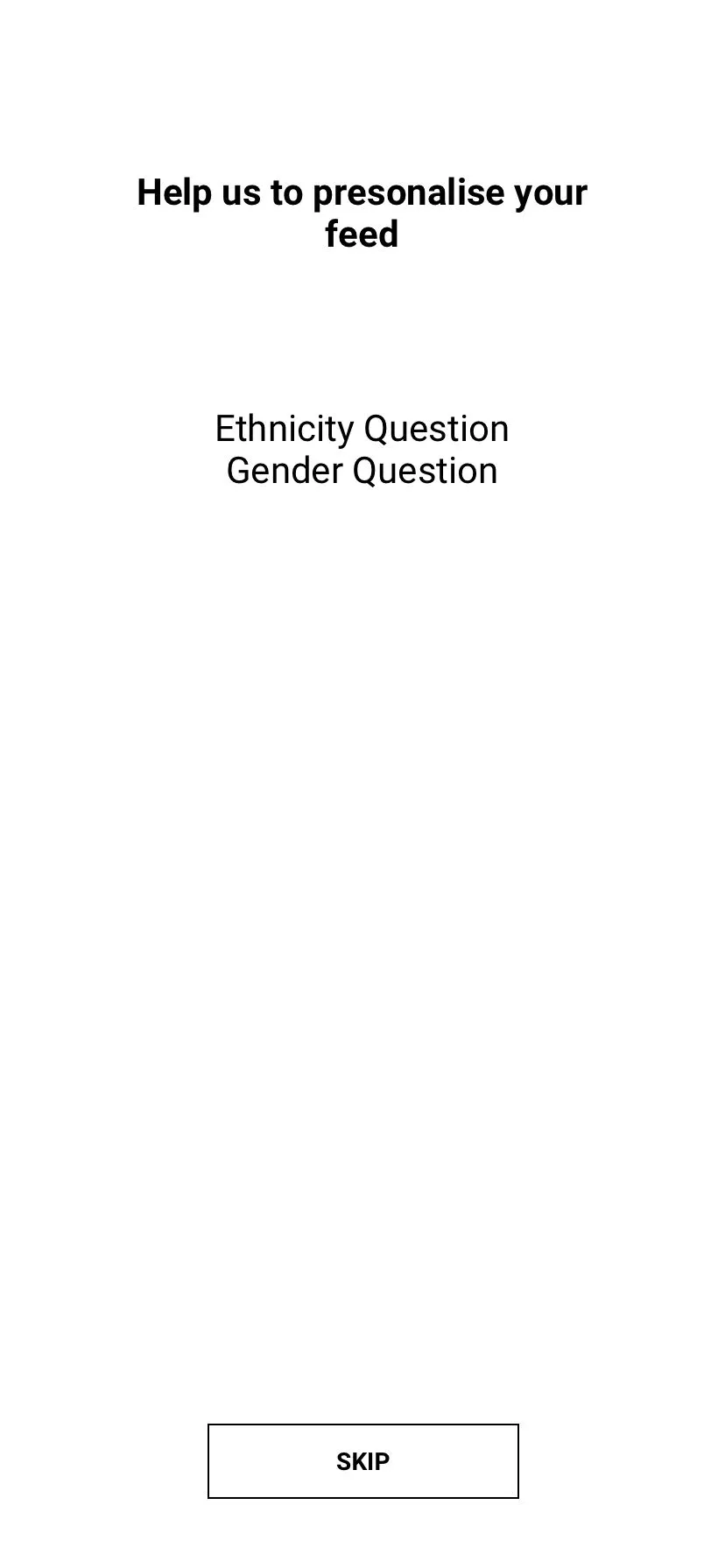
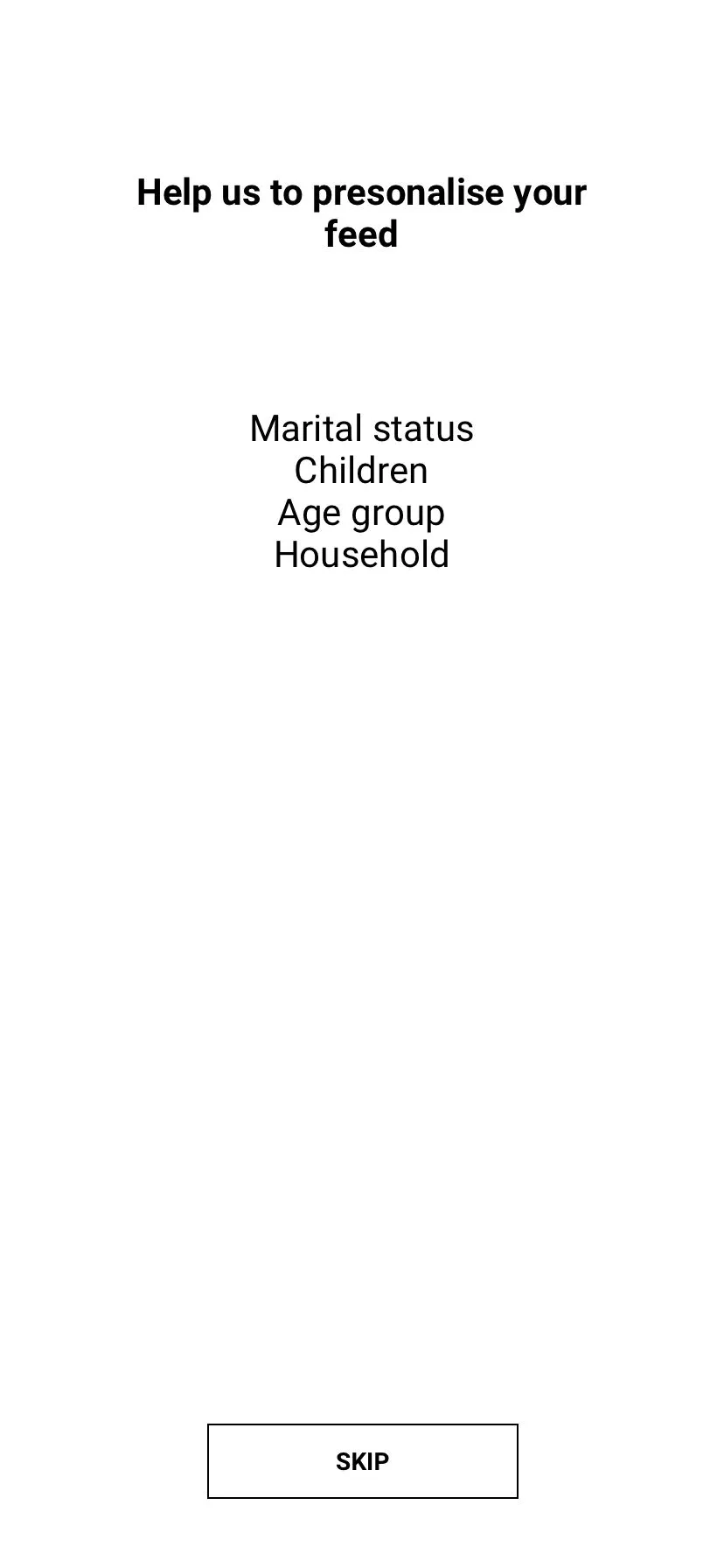
The wireflow was five plain screens, mostly words. First, pick a language. Then permissions, with a short explanation of why we were asking: push notifications for deals and vouchers, and location for retailers nearby. Two poll screens followed, to personalise the feed.
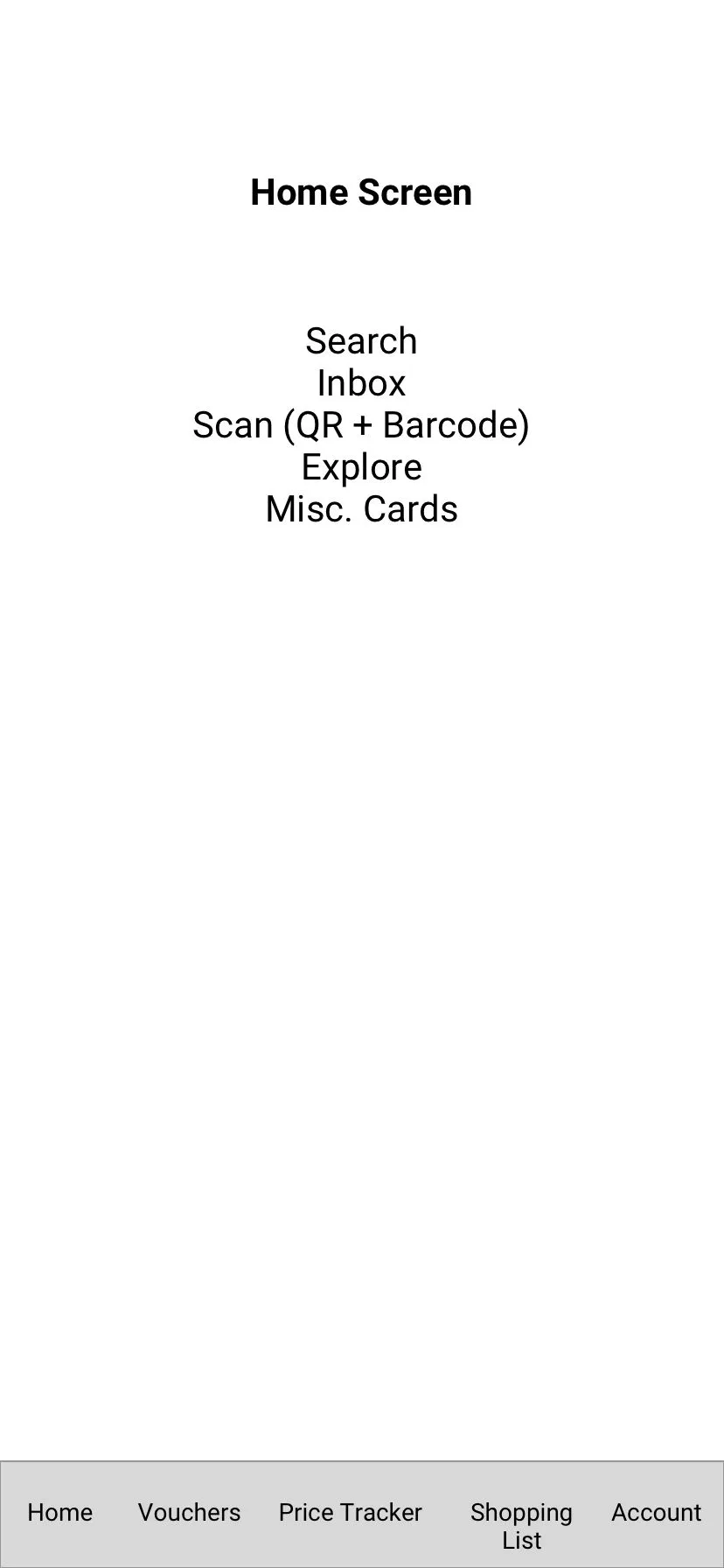
The last screen was a list of what home needed to contain: search, inbox, QR and barcode scanning, explore and the cards. The tab bar included vouchers and the price tracker, alongside the shopping list and account.

Redrawing the cards
The home screen has been a stack of cards since 2.0. We kept that approach and redrew the whole set for 3.0.
The cards had to cover quite different content. A retailer’s deals could sit in a row, while a weekend sale had a countdown. A comparison card put three stores’ prices under each product. There were also price tables, a back-to-school row and a card for tracking your coffee.
Some of these didn’t make it into the build. The sheet below shows the full set of designs.
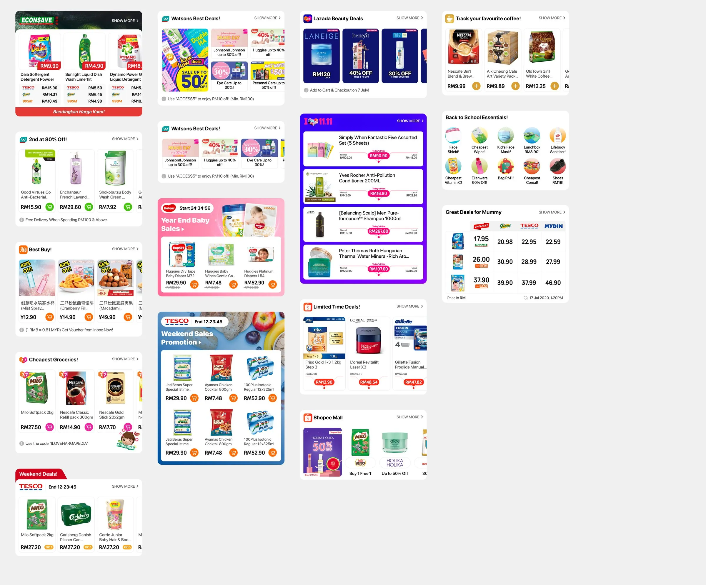
The product cards had their own variants. One showed prices from three stores; another had a cart button for an online store. There were versions with a usual price, retailer-specific cards and a tall card for a single product.
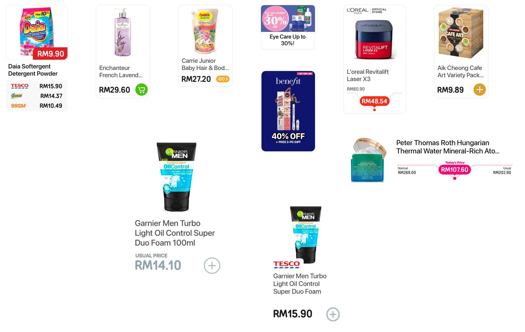
More places for deals
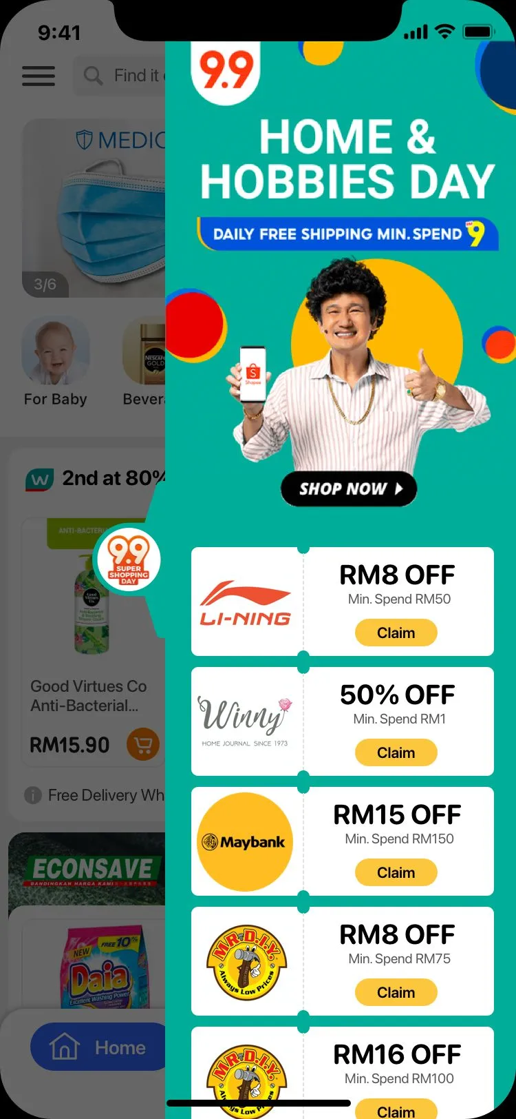
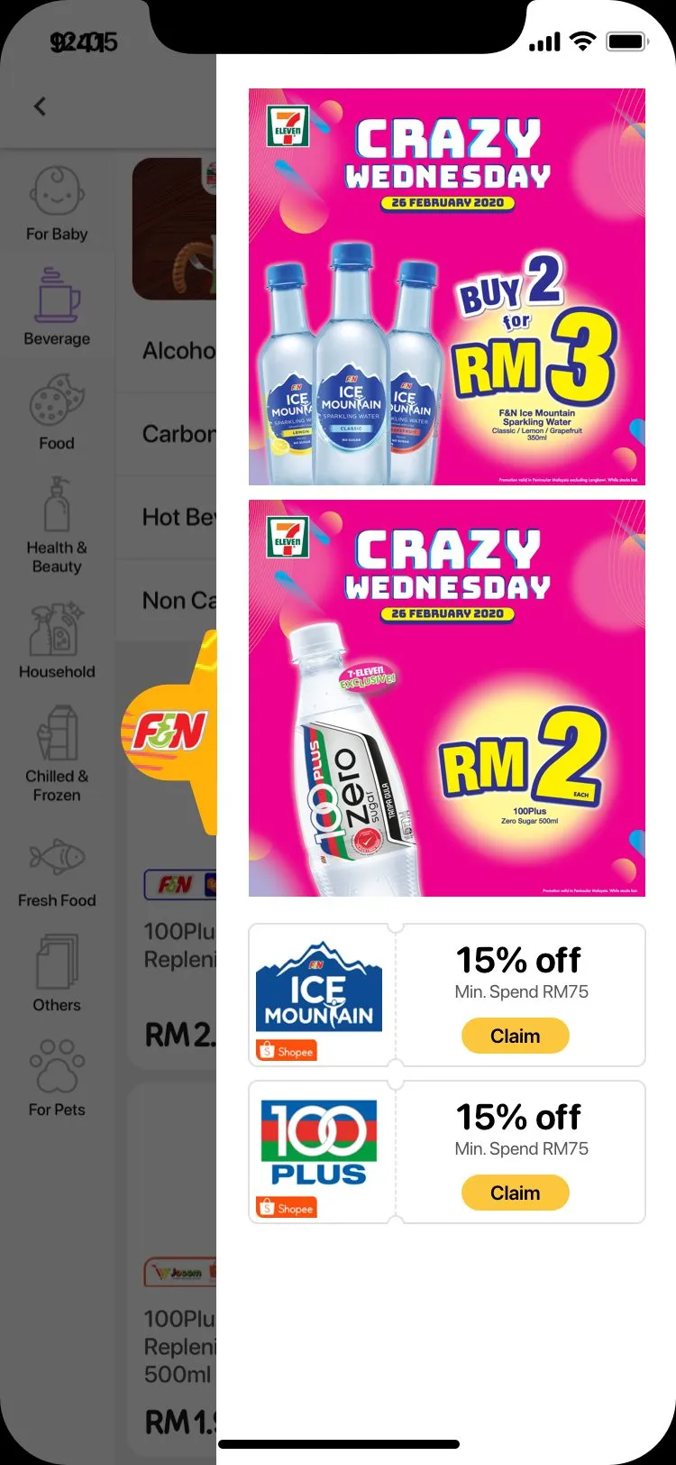
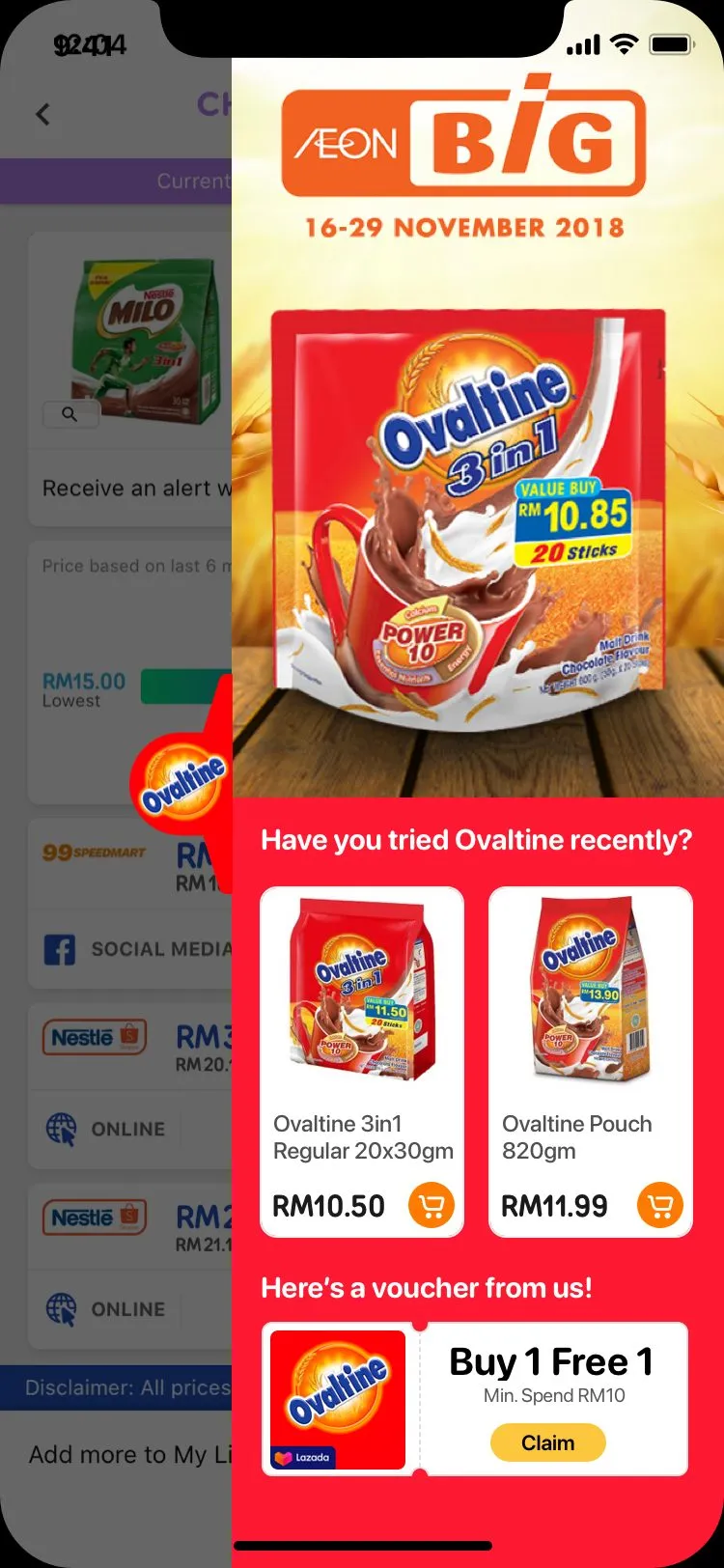
Alongside the refresh, we needed more space for deals and promotional gimmicks. The biggest addition was the pull-out: a tab on the right edge of the screen that opens a sponsor’s panel over the page.
It works on home, category, search and product screens, and each screen can have its own panel. The home mockup shows a sale with vouchers. On a product page, the panel can show vouchers for that product.
The content management system (CMS) supplies the panel as a stack of pieces: a header, text, a banner, app buttons, vouchers and products. People can claim vouchers from the panel itself, and each piece can link somewhere in the app.
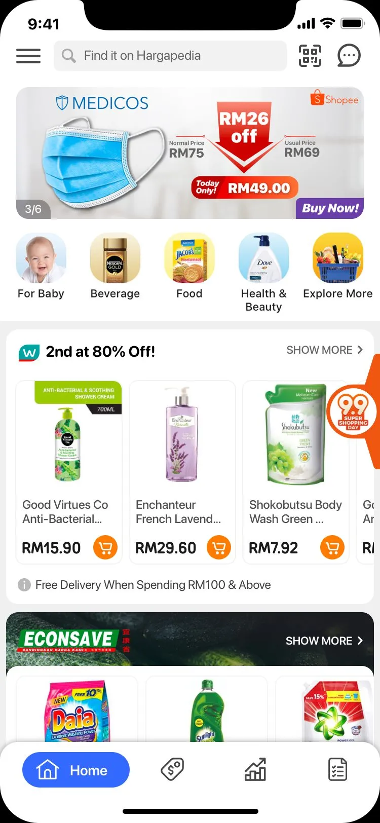
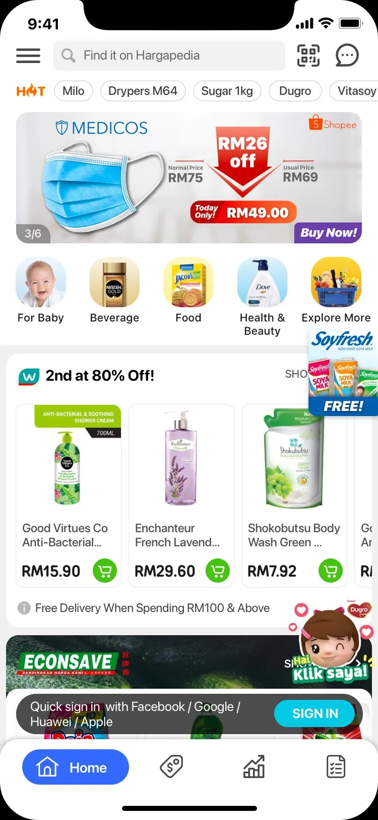
The round app buttons on the home screen are new too. The marketing team can make its own from templates, whether it’s a Shocking Sale with a product in it, a Shopee or Lazada button, or one for food. Each one points to a screen in the app.
The buttons use the deep-linking system we revamped for 3.0. Every screen now has a hargapedia:// address, whether it’s a product, a voucher, a category, the camera or the shopping list. The app uses those same addresses for its own navigation. A banner, app button or push notification can open a screen in the same way.

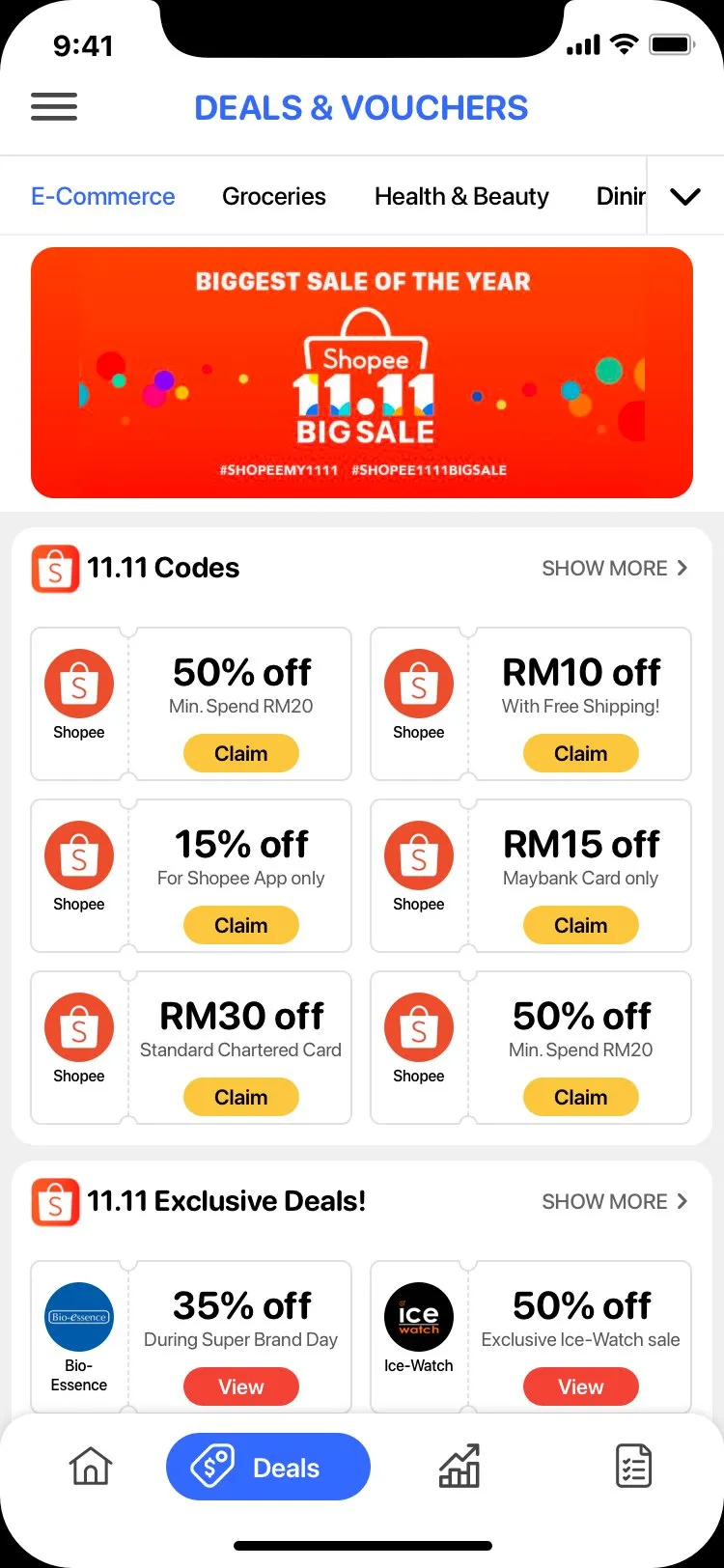
Vouchers now have a complete flow: claim one in the app, scan its barcode at the store, then mark it as used. They have a place in the Deals & Vouchers tab, alongside the deals.
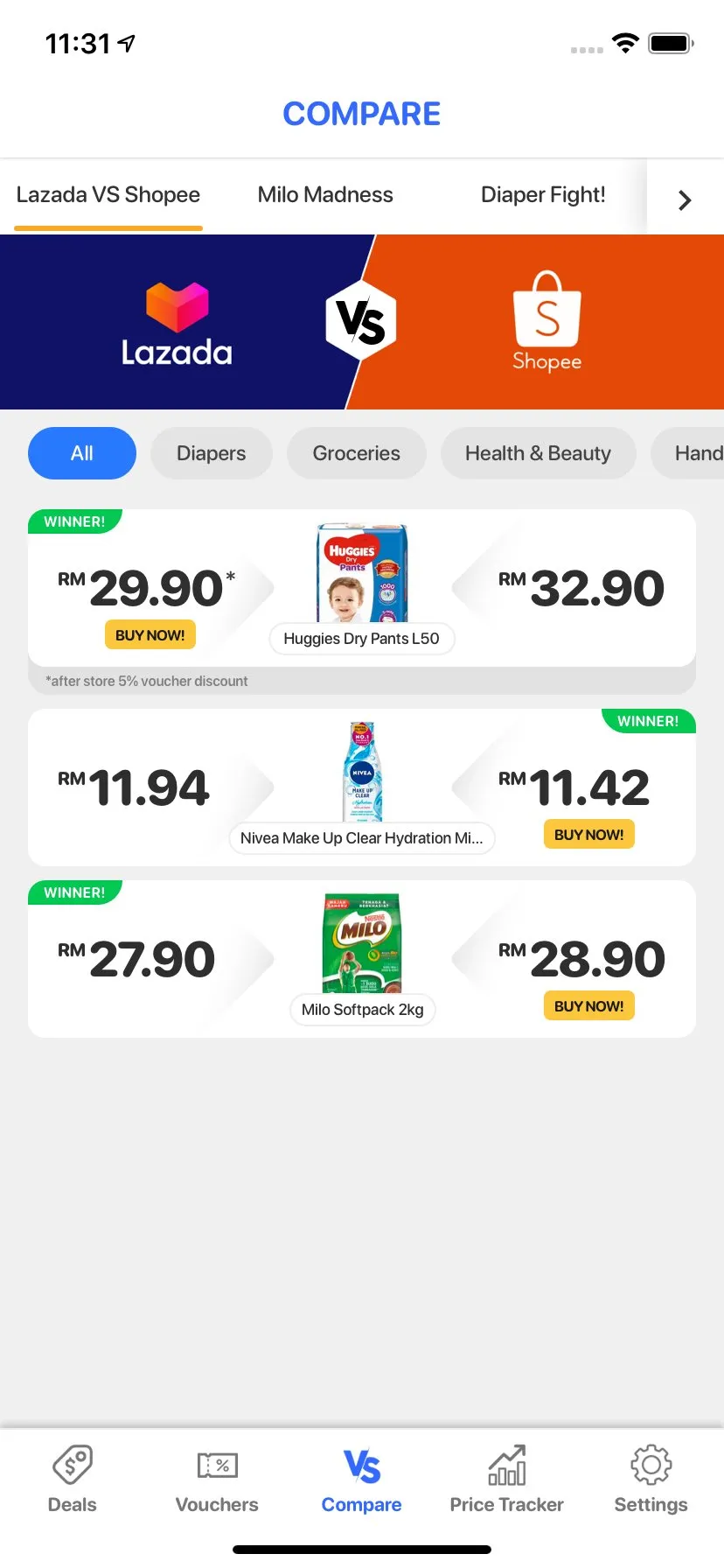
Compare puts two retailers against each other on a set of products and marks the cheaper one for each item. The mockup below compares nappy prices at Lazada and Shopee. The daily check-in card also got a redraw, with confetti when you complete a day. The first campaign on the redrawn card is with Giant.
The tab bar that shipped
In the mockups above, the selected tab expands into a pill with its label. That design didn’t make it into 3.0. We went with a traditional tab bar, which allowed us to use animated icons.
I made the animations in Hype and exported them as GIFs. The Compare icon flips from a VS mark to the two retailers being compared. The voucher icon cycles through the brands that currently have vouchers in the app, including Grab, foodpanda and Giant.
 Compare
 Vouchers
 Vouchers, with Giant
The design work carried through into React components this time: the check-in card and its day items, confetti, animated buttons and form inputs. The team handled the integration.