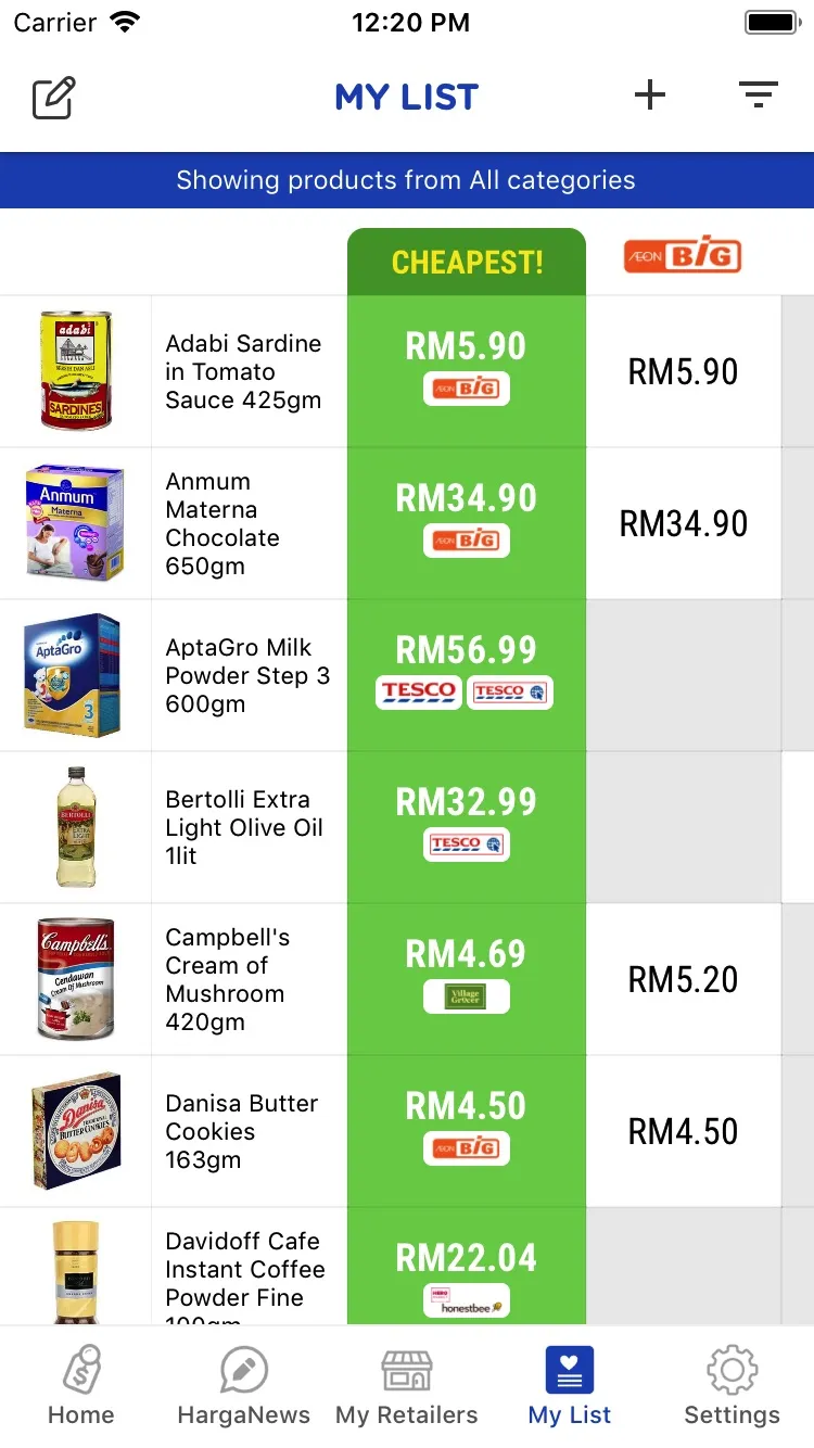
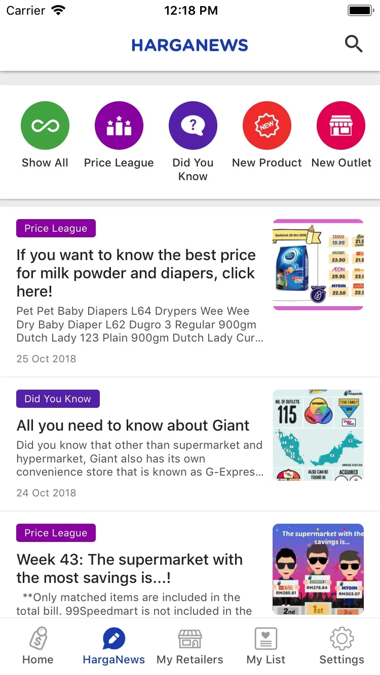
Hargapedia 2.0: a home screen made of cards
Hargapedia 2.0 is in the stores, and the home screen is now a stack of cards the team can change without an app update.
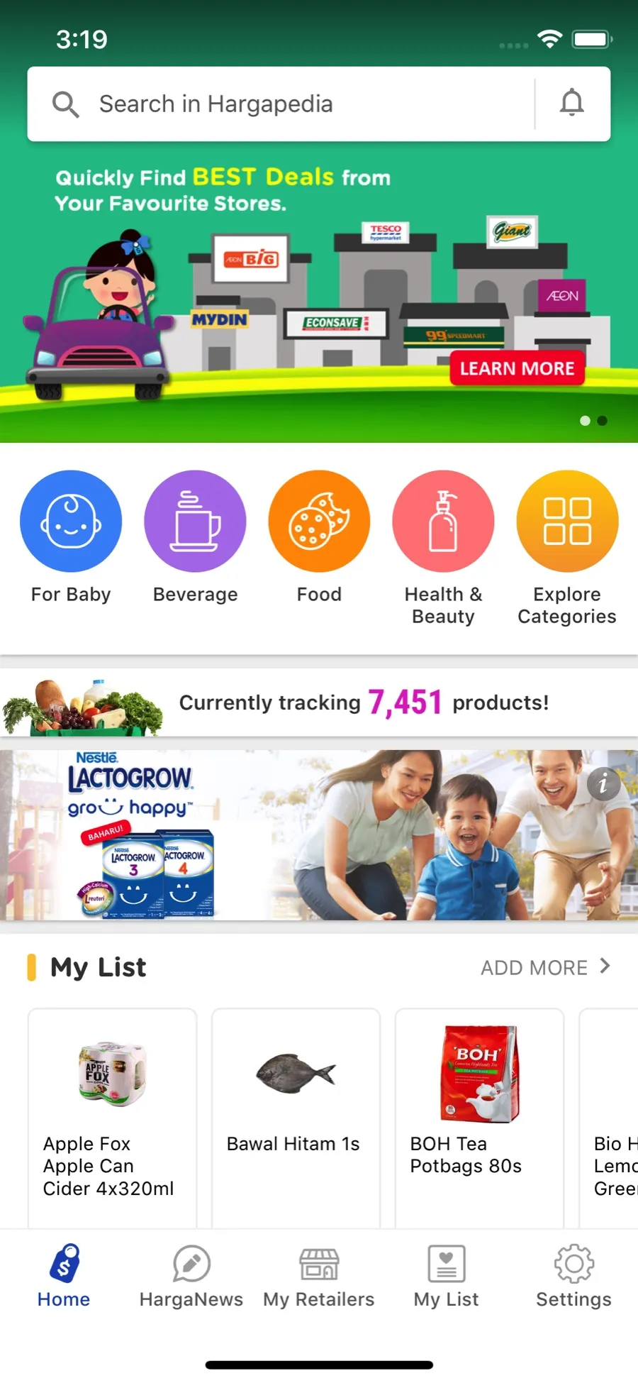
Hargapedia 2.0 went into the stores in the middle of October. Version one’s home screen was a search box and the categories, and that was it. The new one is a stack of cards, and the team can change it from the CMS without waiting for an app update… which cards go on it and in what order, down to the background colours.
I did the design and the UI/UX again. This time that meant creating the new components and working out what goes into the CMS, which parts of the app the team gets free rein over and which parts stay in the code.
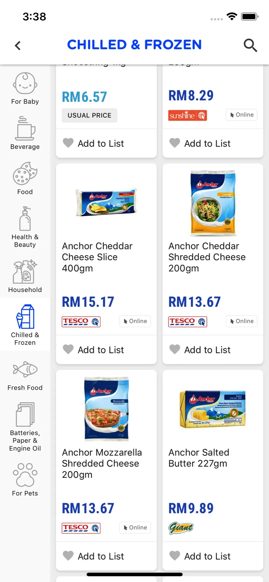
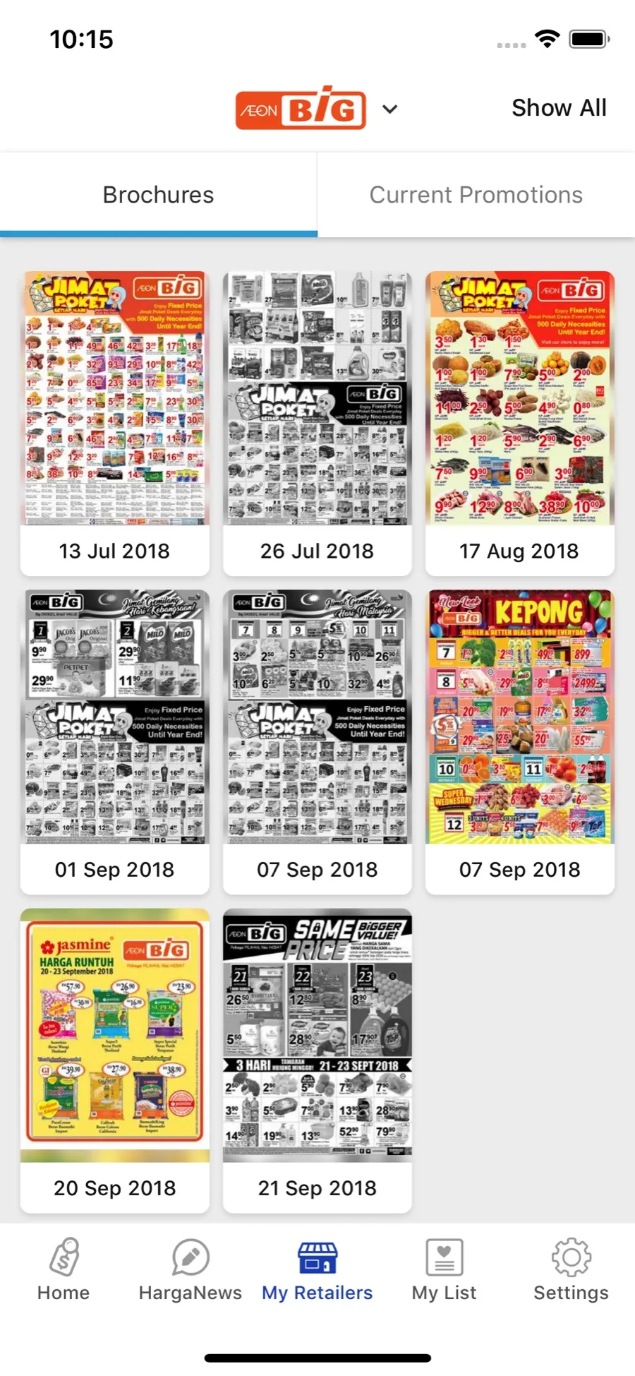
Most of the cards are for promotions. There’s a banner and a carousel, and Must Buy, where the team picks the best deals every day. An event preview puts three products side by side at three stores. Then there are the special cards, a few layouts for different kinds of promotions, and some of them have a countdown… the prices, or the whole promotion, only show when it hits zero. The rest are the category row, a line with how many products we’re tracking, a HargaNews card, and your own My List and My Retailers.
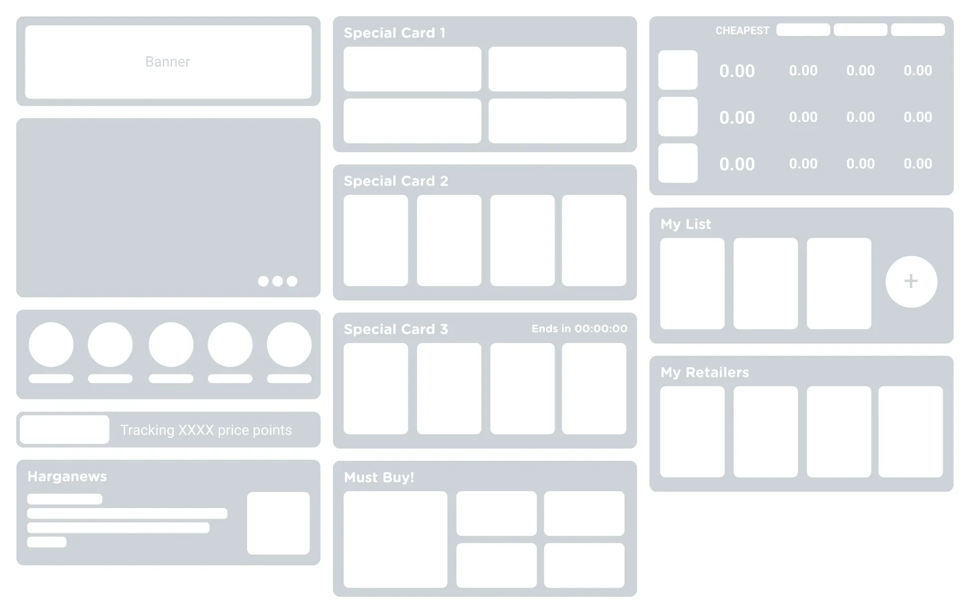
The risk with handing the home screen over is that the designs in those cards now come from the marketing team. If every promotion turns up with its own colours and its own idea of a layout, the cards clash and the whole app looks off. So we set the boundaries in code. From the CMS the team picks the cards and their order, the background and title colours, the images, one set per language, and the products and dates. The layout inside each card stays in the app, and where a card needs to look different, there are a few variants to choose from.
My List was the tricky one to code. It’s a table… your products down the side, the cheapest price for each in a green column with the store under it, then every store’s price across, and it scrolls both ways. We tried a few ways of building it, even rendering it in a WebView, but the memory it took on the phone wasn’t worth it la. In the end we built our own natively, a spreadsheet view on iOS and a table view on Android, both bridged into React Native. It’s also the only screen in the app that turns sideways, so you can see more stores at once.
HargaNews is new too, a tab where our blog posts show up in the app… price leagues, did-you-knows, new products and new outlets.