CineMy for Android, in Material Design
Last year CineMy got the iOS 7 treatment on the iPhone. Now it's Android's turn, redesigned properly in Material Design instead of ported over.
Last year I redesigned CineMy for the iPhone in the flat look of iOS 7. Now it’s Android’s turn, in Material Design, the design language Google brought out last year with Lollipop.
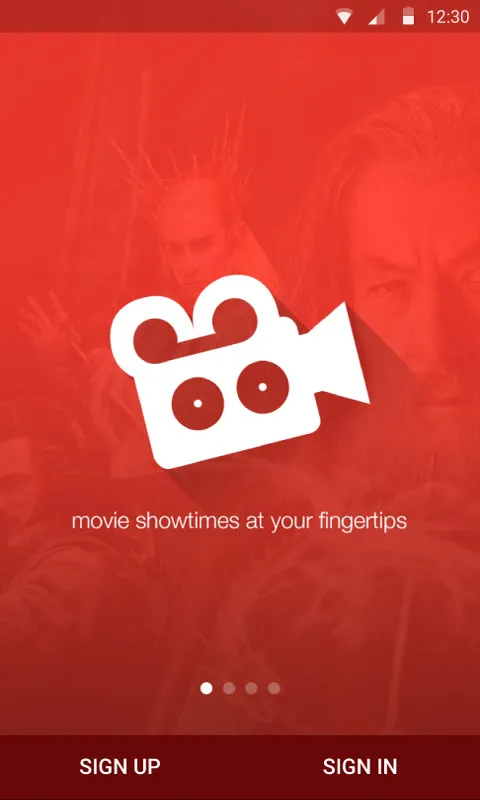
I didn’t want to port the iPhone version over. Every platform deserves its own redesign, which is what I keep telling people in my UX training, so this is me practising it. It keeps the same red and the same camera, and everything else follows Android.
Movies
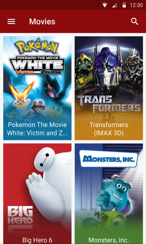
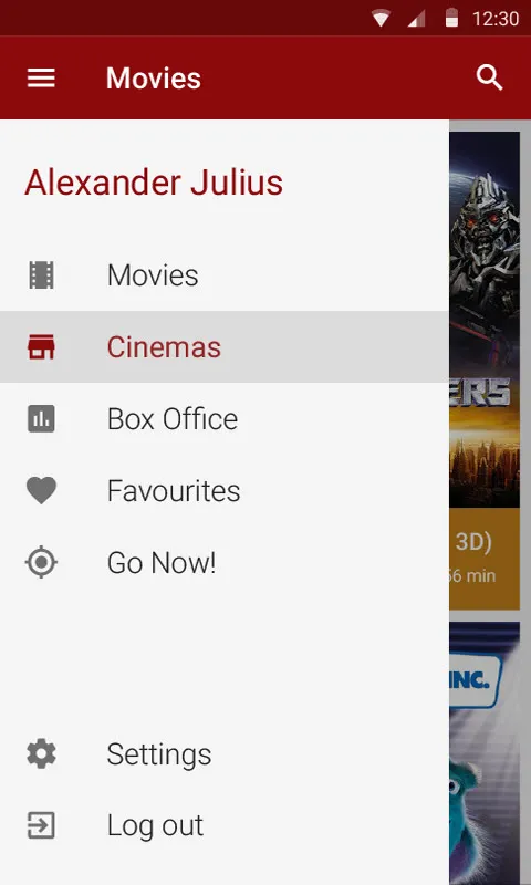
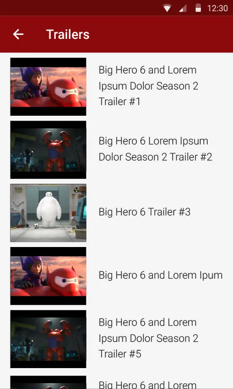
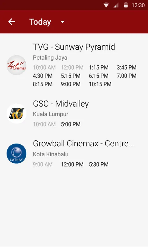
Movies are a grid of posters now, and the navigation drawer slides out from the side the way it does on Android. A movie opens with its poster up top, the Rotten Tomatoes score, and tabs for more info, trailers and showtimes. The showtimes have a dropdown for the day.


Cinemas
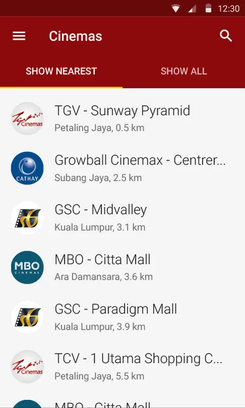
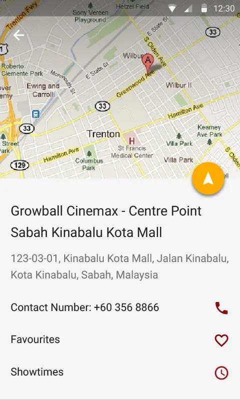
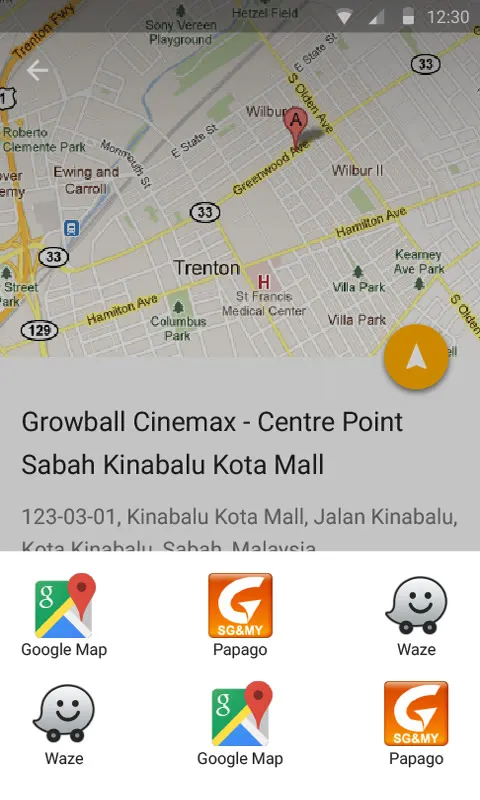
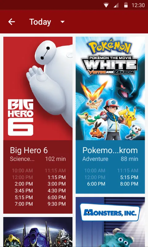
Cinemas are split into nearest and all. A cinema has a map with a round navigate button, and tapping it lets you pick Google Maps, Waze or Papago to get there. Its showtimes are the posters again, each with that day’s times underneath.
Go Now! and the rest
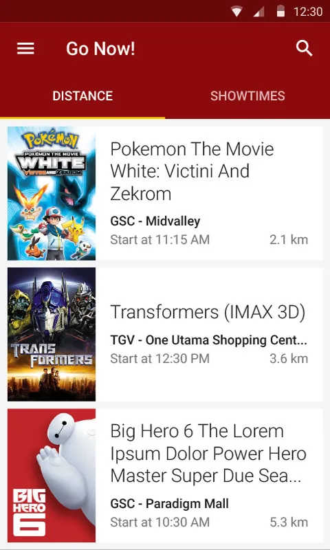
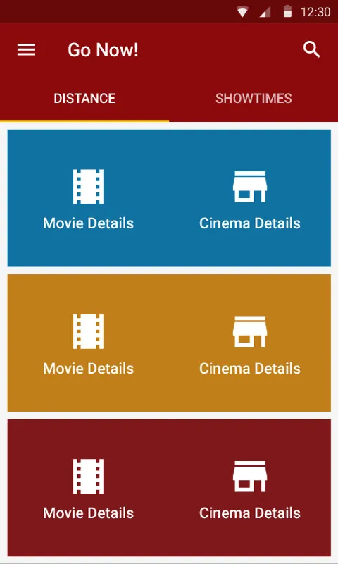
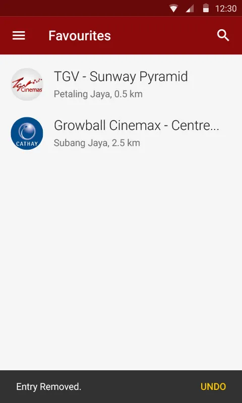
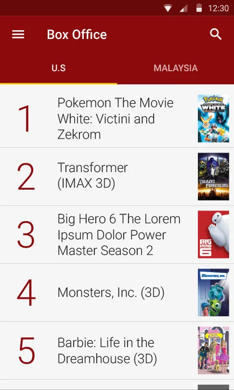
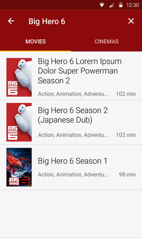
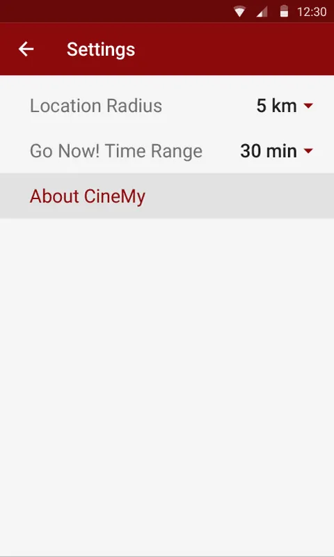
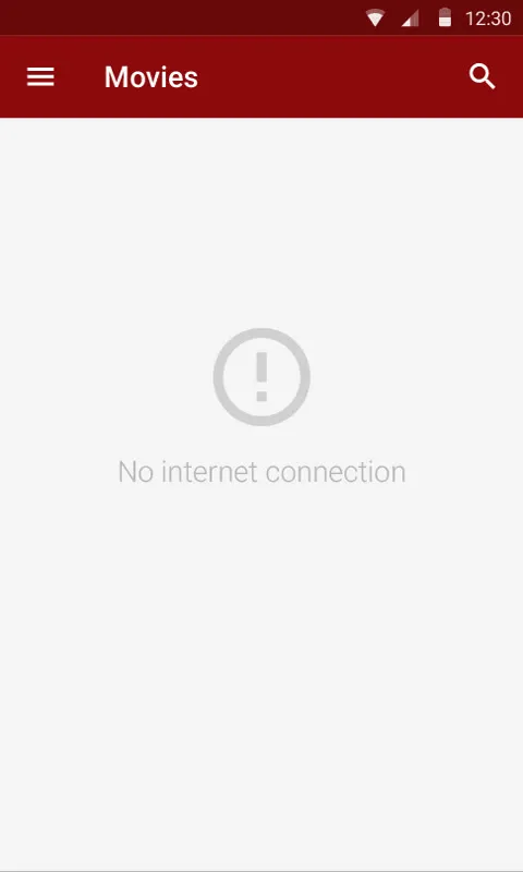
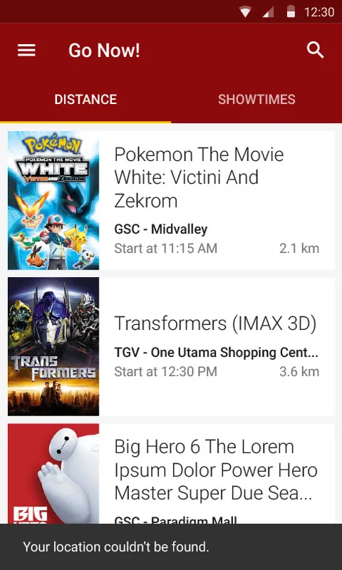
Go Now! has tabs for distance and showtimes, and tapping a movie gives you its details or the cinema’s. In settings you can set how far around you to look, and how far ahead Go Now! looks, from thirty minutes to two hours. Favourites swipe away with an undo, and there’s the box office, a search across movies and cinemas, and screens for when there’s no connection or no location.