I stopped opening Sketch and Figma
For the MoneyMama app, we set the look and feel in Claude Design and let code do the iterating after that. Every change to a screen now starts as an HTML mockup in the browser, usually with a few options to pick from.
For most of my career, designing a screen meant opening Sketch, and later Figma. When we weren’t sure which way to go, I’d draw every option we could think of, which really wastes a lot of time.
This year we built the MoneyMama app, and I haven’t opened either for it.
I’ve found that once you’ve established the look and feel of the whole app, you can use code to iterate between designs quickly. And with Claude, asking for variations and iterations is super easy.
Getting the look right first
The app needed a lot of screens at once: onboarding, the chat with Mama, the Money tab, settings, analytics, Mama’s chat cards and the tools tab. In July we designed all of them in Claude Design.
A few of the decisions were about how Mama looks outside WhatsApp. Her messages had always sat in WhatsApp’s green bubbles. In the app we dropped the green, and when Mama speaks outside the chat, it’s her face overlapping a plain white card.
We locked each set of screens once we were happy with it, though locked didn’t mean finished. Onboarding was locked in late July, then redone and extended in early August.
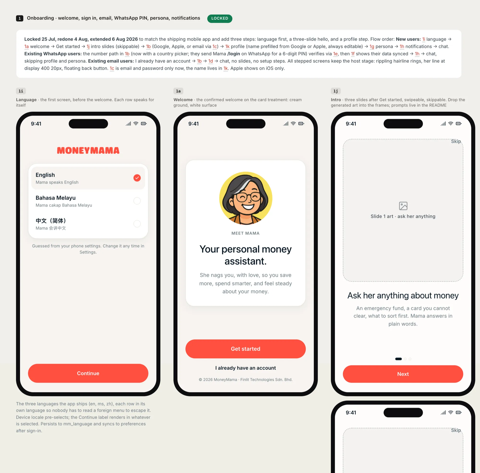
From Claude Design, everything went to Claude Code as a handoff bundle: the HTML, the colours, type, spacing and shadows as CSS tokens, and a README that walks through every screen. The README also says what happens when the bundle and the code disagree. On how something works, the code wins. On how it looks, the bundle wins.
I didn’t want to review a diff
Once the app was being built, the screens changed every day, and I was making those changes with Claude Code.
A change to a screen shows up as a code diff, and I didn’t want to judge a design by reading one. So in August I made it a rule: before Claude Code touches a screen, it shows me a mockup in HTML, the screen as it is next to the screen as it would be, built with the app’s real tokens and real copy.
The mockups live in a folder that git ignores, so none of them end up in the codebase. There were more than forty of them by the end of August.
Most of them are pages of options. I ask for variations, and Claude Code draws them side by side, lettered, each with a note on what it changes and what it gives up. Usually it marks the one it would pick. I open the page in the browser and choose.
The pill at the top of the Analytics and Money tabs took two rounds. Its icon sat inside a tinted circle, and the first round only tried different colours for the circle. The second round dropped the circle: text only, a coral dot, a filled glyph, a sticker. L, a solid coral glyph, was in the app the same day.
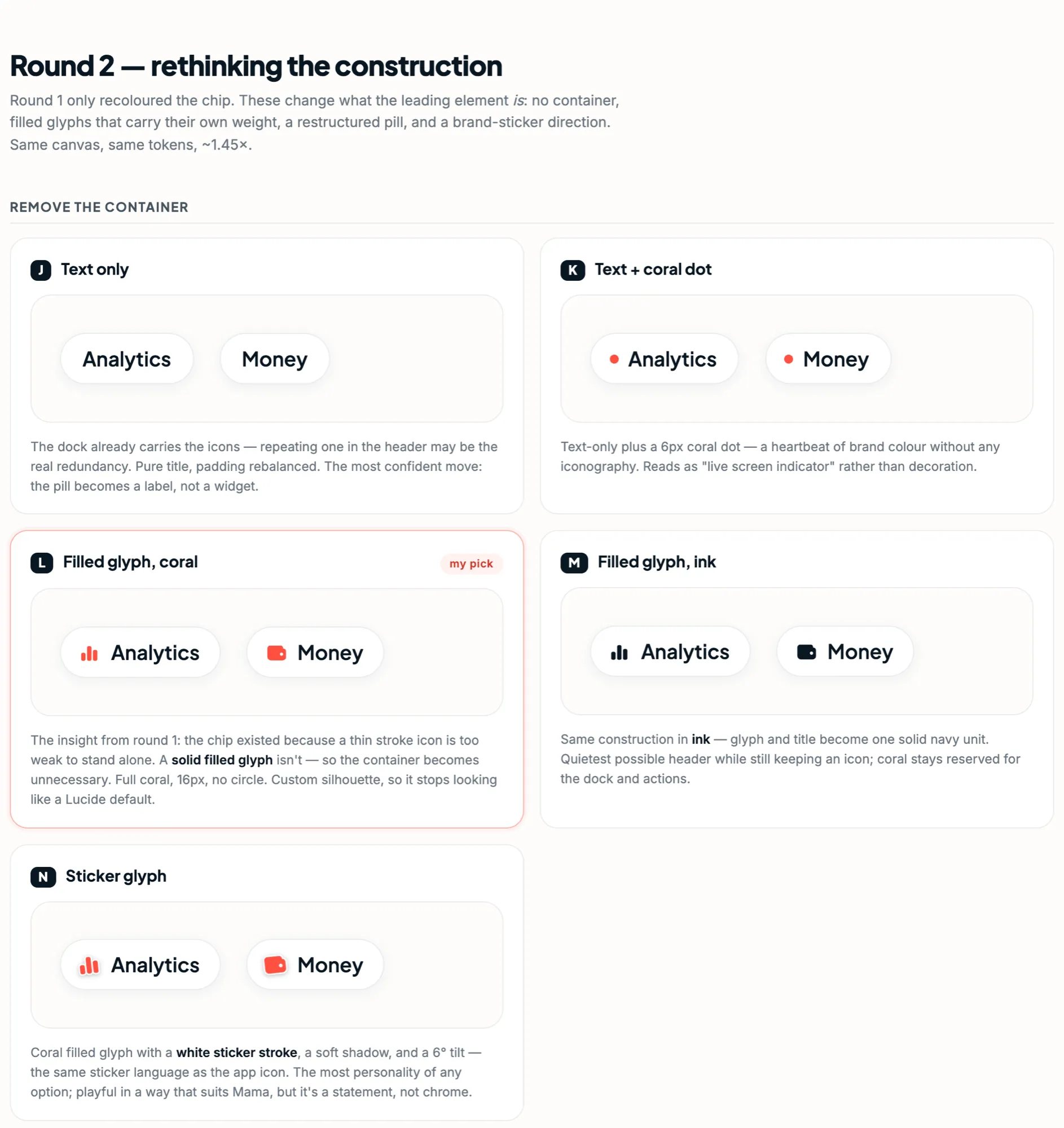
Previously, we would have had to draw both rounds in Figma, every option by hand.
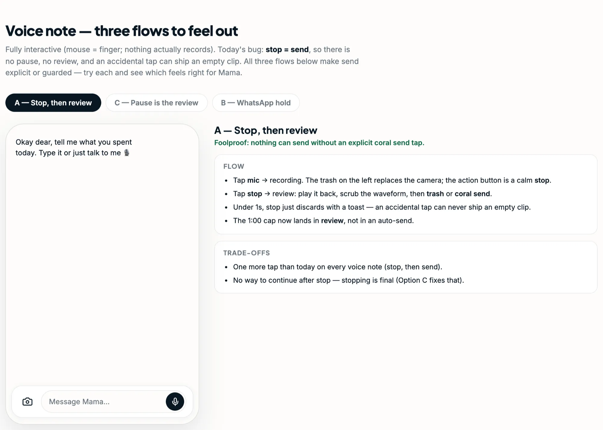
Voice notes had a bug where stopping a recording sent it straight away, so an accidental tap could send an empty clip. The mockup for the fix was one I could click through, with the mouse standing in for a finger, and it had three flows: stop and then review, treat a pause as the review, or hold to record like WhatsApp. We went with the first, so nothing sends until you tap send.
Fixing things in the mockup first
A few mockups started from something already broken in the app. Because they use the app’s real fonts, numbers and strings, we could work out why in the mockup and measure the fix before changing any code.
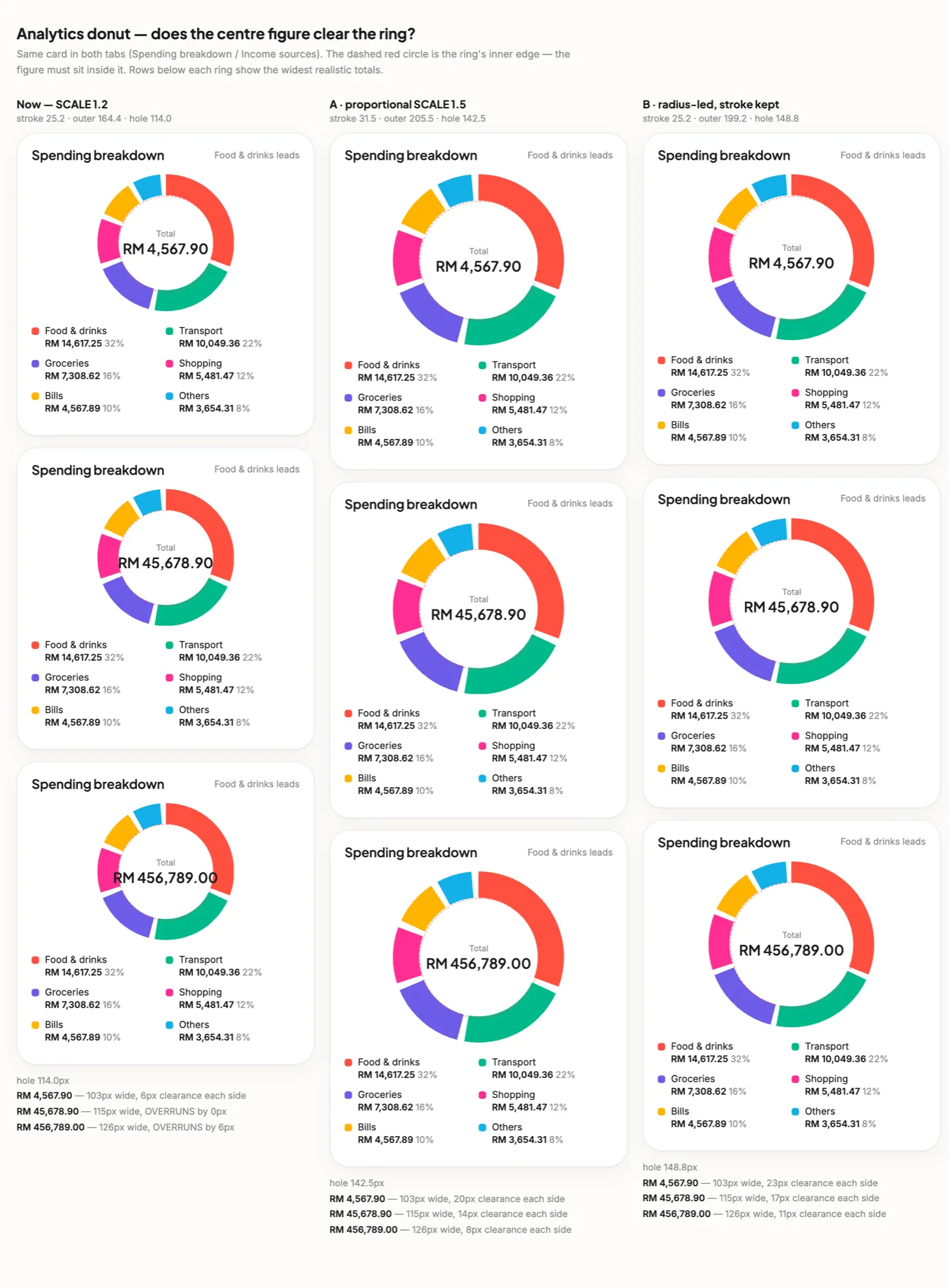
The donut on the Analytics tab shows the month’s total in the middle, and at five figures the total was sitting on the ring. The mockup put the current donut next to two bigger ones, tried three totals in each and measured the room on either side. At the current size, RM4,567.90 had 6px to spare and RM456,789.00 ran 6px over. We went with the bigger ring, scaled up in proportion, which opened the hole from 114px to 142.5px.
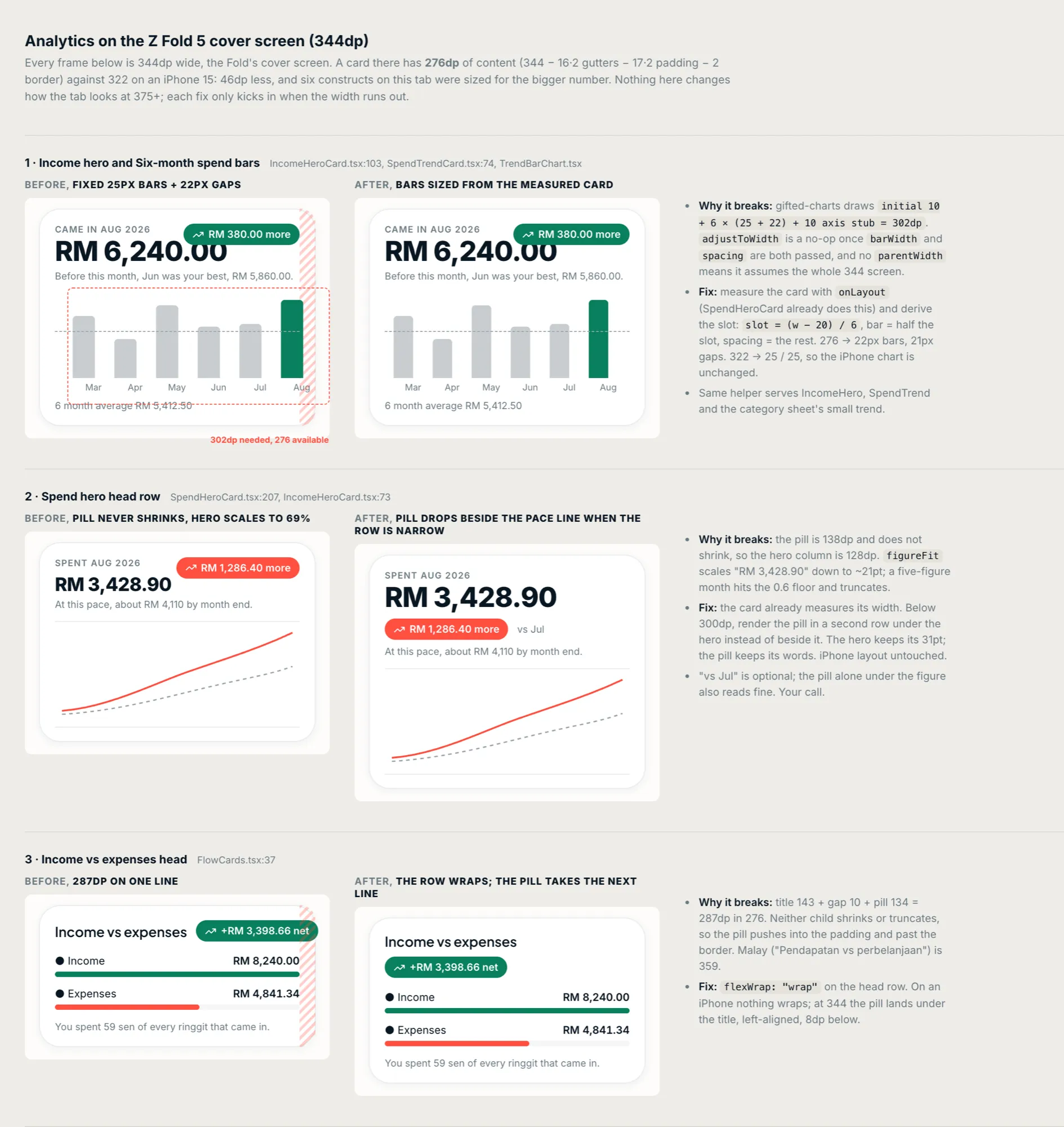
The Analytics tab was also clipping on the cover screen of a Galaxy Z Fold 5, which is 344dp wide. The mockup showed each part of the tab at that width, before and after, with a note on why it broke. A card there has 276dp for its content, 46dp less than on an iPhone 15, and six parts of the tab had been sized for the iPhone. The six-month bar chart, for one, needed 302dp and had 276. Each fix only kicks in when the space runs out, so the tab looks the same on bigger phones.
Chinese took five mockups in one afternoon. Our Chinese screens looked flat. The app never loaded a Chinese font, so every character fell back to the phone’s own face at a single weight, and bold headings, buttons and body text all came out the same.
The first mockup suggested keeping the phone’s face and asking for its weights by name, which on an iPhone means PingFang SC and adds nothing to the app’s size. The next one looked at Hargapedia, the app I worked on before this, which uses a rounded Chinese font. It set our real Chinese strings in that and three other fonts, each next to Inter, which carries our English text and our numbers. A note underneath explained why the rounded font works in Hargapedia: its English text is rounded too, and Inter isn’t.
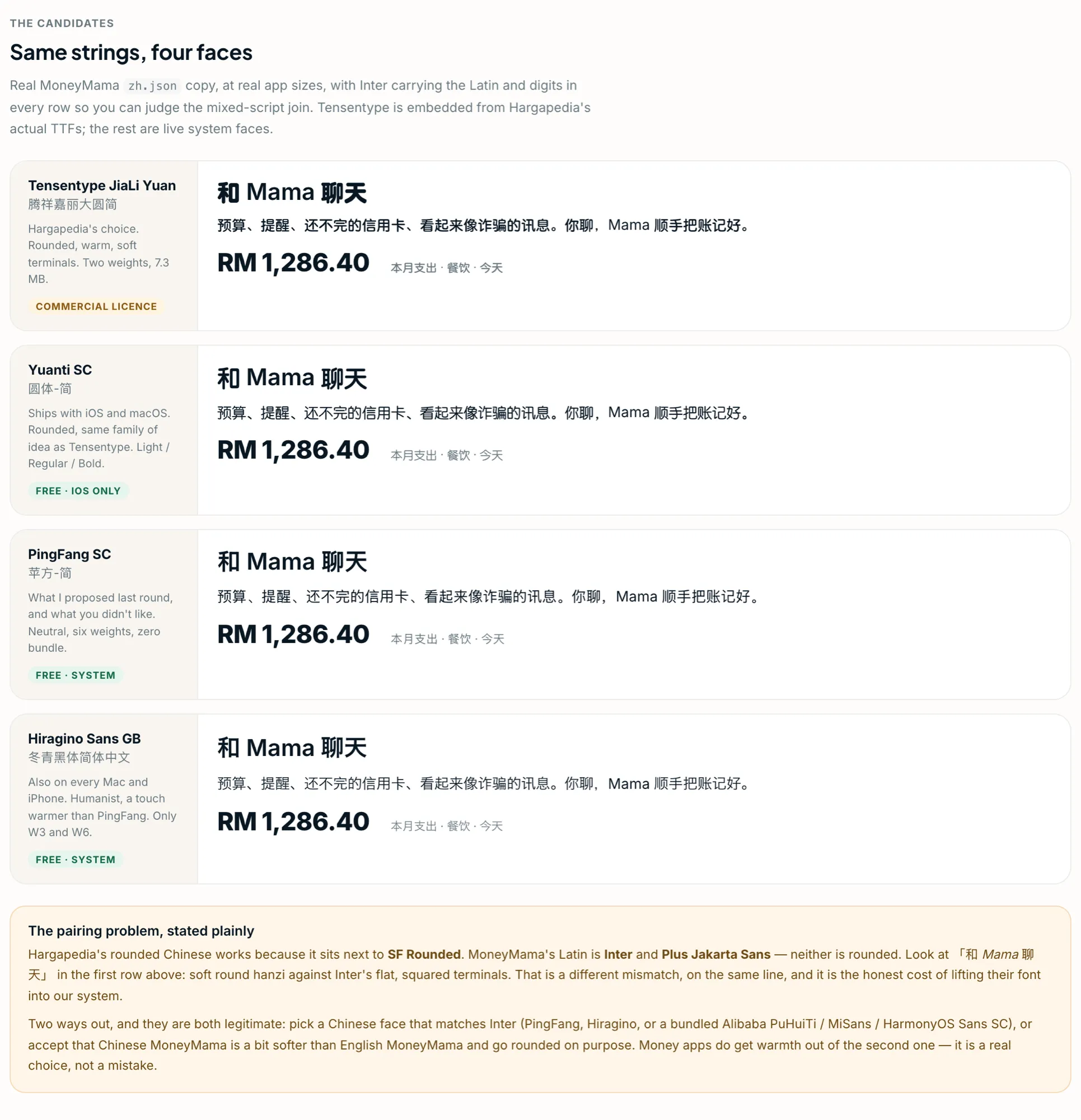
Other mockups compared the licences and file sizes of the free Chinese fonts. MiSans was out, because its licence doesn’t allow the font to be cut down to just the characters we need, so we’d have shipped about 8MB per weight. We set Chinese in HarmonyOS Sans SC, cut down to the 6,763 characters in the GB2312 standard. Three weights come to about 5MB, and the headings are bold again.
Where it’s ended up
Each of these went from mockup to app on the same day. I don’t draw the options any more. Claude Code draws them with the app’s own tokens, and I pick one.