Store listings in 2026
For Hargapedia, store screenshots meant six Sketch files. For MoneyMama, one web editor handled both stores, three languages and every size in a couple of hours.
MoneyMama is getting ready to launch on the App Store and Google Play, which means it’s time to prepare the store screenshots.
We need eight screenshots in English, Malay and Chinese, exported in the different sizes Apple and Google require. Each one also needs a headline that tells people something about the app, rather than just showing them what a screen looks like.
I’ve done this before with Hargapedia, and I remember how much work it was.
Back then, I used Sketch to prepare the store listings. Each store had its own file for each language, so I ended up with six Sketch files, all containing artboards for the different phone sizes. Preparing the screenshots and the three-language app screens behind them took around two weeks. Whenever something changed, I had to go back through the files and export everything again.
I didn’t want to repeat that process for MoneyMama.
One editor for everything
I found a Claude Code skill called app-store-screenshots, created by Parth Jadhav. It generates a small screenshot editor using Next.js, which you run in the browser.
It treats store screenshots as a series of adverts rather than a collection of app screens. Each screenshot should communicate one idea about the product.
The editor puts all the screenshots side by side on one long canvas, so you can see how the whole set looks together. You can move the phones and headlines around, even letting elements extend beyond one screenshot into the next. The text can be edited directly, and there are controls for switching between iOS, Android and the different languages.
Once everything looks right, the editor exports the required sizes into ZIP files.
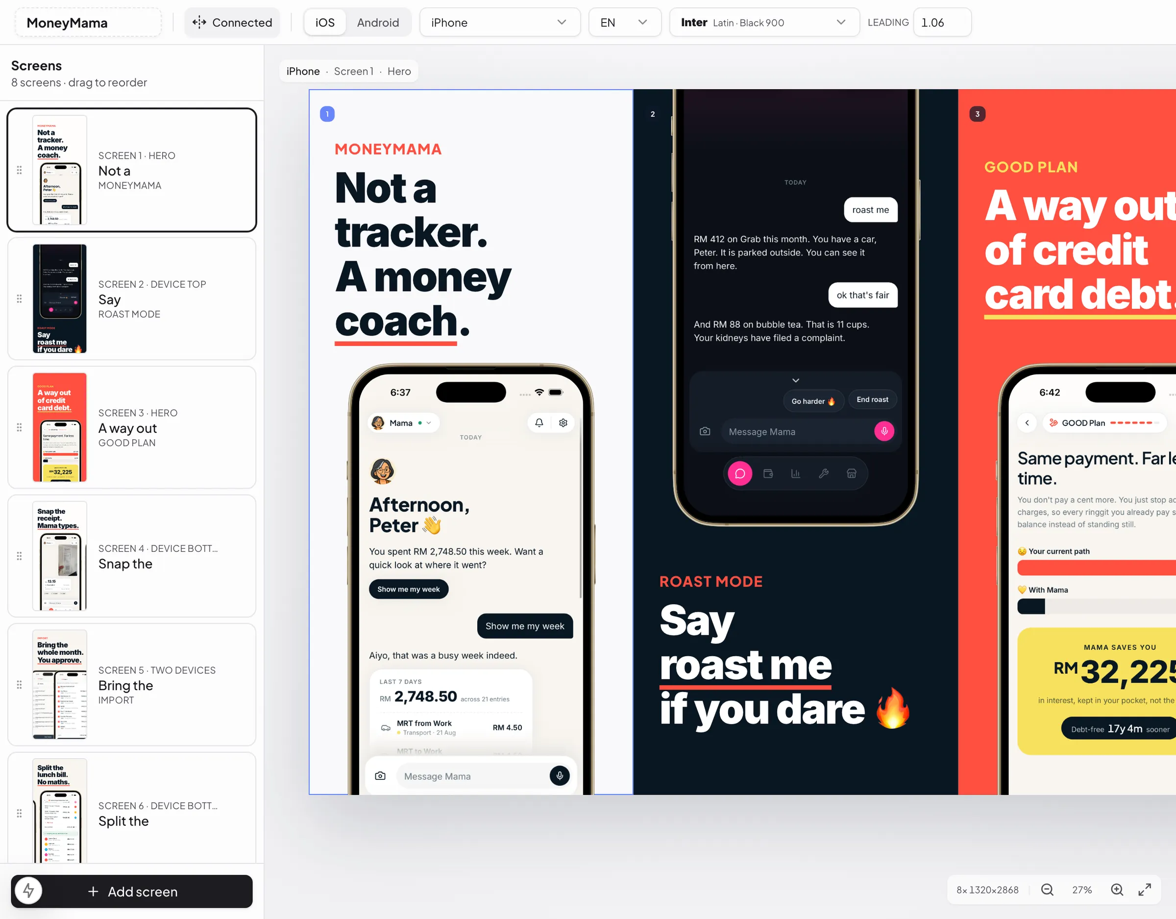
The original skill gave me a starting point. From there, I used Claude Code to adapt the editor for MoneyMama.
We brought in the colours from our website, including the warm white background, dark ink, coral highlights and the underline we use beneath important words.
For Chinese headlines, I used Alimama ShuHeiTi, an advertising font I’d come across while looking for Chinese fonts for the app. It wasn’t suitable for everyday interface text, but it worked well for large promotional headlines.
I also wanted to avoid maintaining separate layouts for each language. The editor uses the same slide design for all three, loading the appropriate app screenshot and headline when I switch languages. If I haven’t captured a screen in a particular language yet, it temporarily shows the English version.
For Android, the phone frame draws its own status bar. It adapts to the background, appearing dark on light slides and light on dark ones, so I don’t have to prepare a separate version for every colour.
That took care of the layouts. I still needed the actual app screenshots.
Making the app screens repeatable
I didn’t want to use my personal MoneyMama account for the screenshots. Apart from exposing real data, it would be difficult to reproduce the same transactions, messages and figures every time I needed another capture.
So the app has a developer menu with eight prepared scenarios, one for each screenshot we want to show.
There’s the welcome screen, Mama’s roast mode, the GOOD Plan, receipt scanning, reviewing imported transactions, splitting a bill, reminders and checking for scams.
Each scenario sets up the app with specific data, so I can open it in the simulator and get the same result every time. The names, amounts, dates and greetings are all fixed. For the chat screens, the conversations are generated in whichever language the app is currently using.
Even the receipt is a real one, with its personal details blurred out.
The scenario stays active until I clear it, which is useful when I need to navigate around, change the phone orientation or retake a screenshot. None of this is included in the release builds.
With the scenarios ready, I went through the simulator in English, Malay and Chinese, capturing the same eight screens in each language.
Those screenshots then went into the editor, ready for the headlines and layouts.
Writing the headlines in three languages
I didn’t want the Malay and Chinese headlines to sound like direct translations of the English ones.
The message should be the same, but the wording needs to feel natural in each language.
For example, our first screenshot introduces MoneyMama with:
English: Not a tracker. A money coach.
Malay: Bukan sekadar catat belanja. Mama tegur sekali.
Chinese: 不只是记账。是你的理财教练。
The Malay version has a slightly different personality. Instead of simply calling Mama a money coach, it suggests she’ll also tell you off when needed.
The roast mode screenshot follows the same idea:
English: Say roast me if you dare.
Malay: Taip roast me kalau berani.
Chinese: 输入 roast me 看你敢不敢.
All three use the same fire emoji, but the words are written for the language rather than translated word for word.
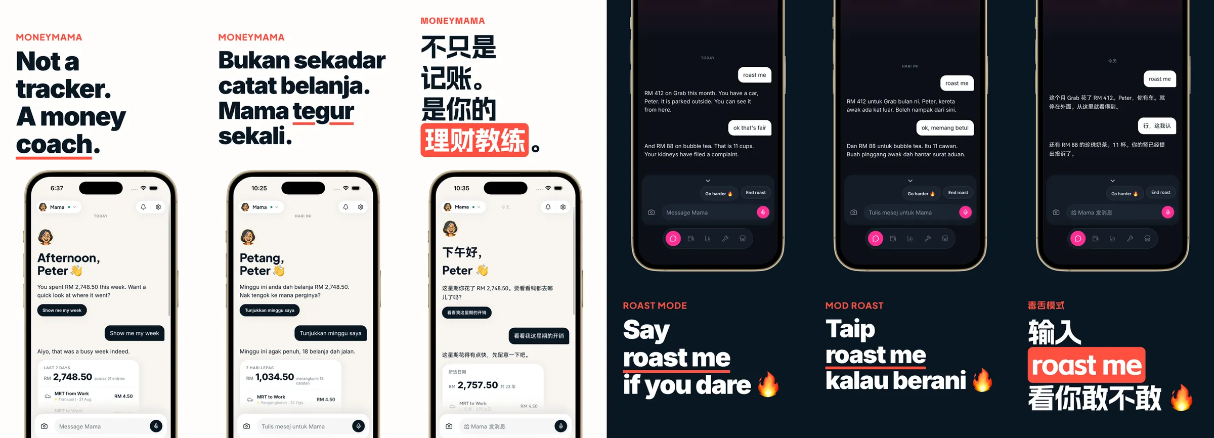
Having all three languages in the editor made this much easier to review. I didn’t have to open another Sketch file every time I wanted to compare something.
Exporting the screenshots
Once the layouts and copy were ready, I could export everything from the editor.
Eight screenshots, three languages, two iPhone sizes and the Android phone size. The editor generated the different versions and packaged them into ZIP files for the two stores.
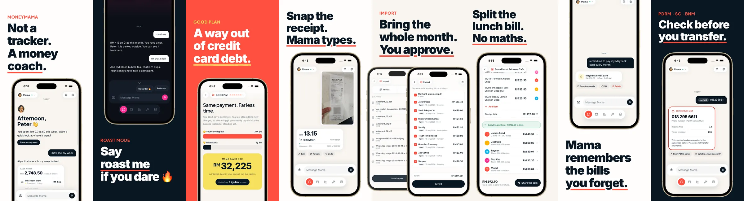
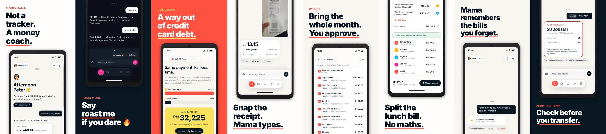
Preparing the complete set for MoneyMama took a couple of hours.
It’s not quite a like-for-like comparison with Hargapedia, since we also spent time preparing the underlying app screens back then.
I’m glad I don’t have to go through those six Sketch files any more.