Moving a data-entry team off Excel
Two months into the new job, the first thing on my plate is moving a data-entry team off Excel and onto a web app of our own, which only counts if it is faster than Excel.
Two months into the new job, and the first thing the CEO put on my plate is the data entry.
The company I’m at now has a product that has been around for about ten years, in PHP, and everything in it starts with a data-entry team typing things in, row after row… into Excel. So the ask is simple to say la. Take the team off Excel and give them an internal web app of our own.
Speed is what I keep coming back to. The team is fast in Excel, and a web form that is slower than their spreadsheet is a step backwards, whatever it looks like. So the measure is whether a person can finish a day’s entries faster than before.
We’re building it in React. I’ve been in React Native for the past year or so, and React on the web is not a big jump from that. I’m on the front end.
The other decision was not to design our own set of components. There’s no time for that. So we went with wix-style-react, the components Wix uses in their own back office, open sourced with a storybook where you can click through every one of them. It was easy. You npm install it, import a Button, and it’s there on the page. The only snag was the styles, which come as Sass with CSS modules, so we had to eject from create-react-app and add their loaders to webpack, and that took a day or two to settle. They also push new versions many times a day, which is a bit mad, and we’ve already had to work around one bug in their inputs. Still, look at what you get for free.
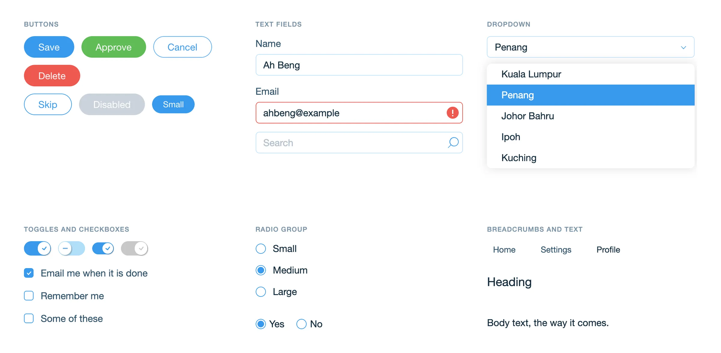
Every page gets the same buttons and text fields, and I didn’t have to draw any of them. So most of my time has gone into how the app feels to use, and into building our own components on top of theirs… a side menu that can get out of the way, tables you can sort, search and page through, modals for editing in place, a drop zone for uploading images, and our own inputs wrapped around theirs. And then getting the pages in front of the team to test.
It has been a steep learning curve. The system is complicated, and we’ve had to learn the FMCG business along with it. We got some of the requirements wrong at the start, and made some assumptions we shouldn’t have. That’s all I’ll say about that.
This is the tool that will take the company to the next level.