Three core values and a guided tour
Hargapedia's home screen now highlights three ways to save money, and new users get a short tour of them the first time they open the app.
We’ve added three messages to Hargapedia’s home screen, each one describing a different way the app can help people save money.
They’re our three core values, and they came from our CEO:
- Compare price to save with Search, Browse and Scan!
- Check daily deals to save!
- Use voucher to save!
Rather than put all three in one place, we positioned each message beside the feature it refers to. The first sits with the search and browsing controls, the second above the deals, and the third points to the Vouchers tab.
For people opening Hargapedia for the first time, we’ve also added a short guided tour that introduces those same three parts of the app.
Putting the messages on the home screen
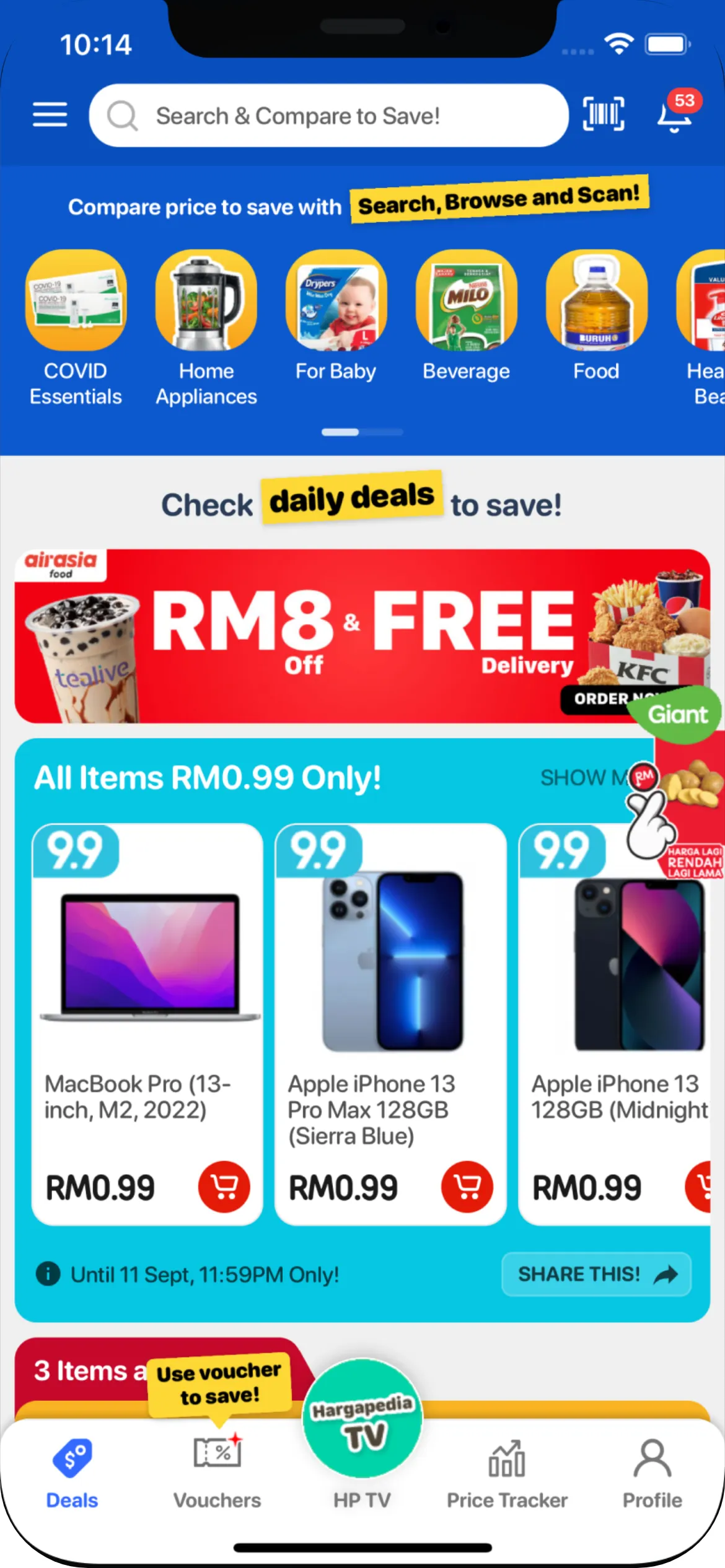
The home screen looks a little different with this update.
The header is now blue with a white search bar. We’d already changed the search placeholder to “Search & Compare to Save!” in July, so the first core value fits alongside that.
Just below the header is the row of app buttons. Above them, I added the line “Compare price to save with”, followed by “Search, Browse and Scan!” inside a yellow label.
The label is tilted by three degrees and has a slight shadow underneath. I made it a reusable component because the second message uses the same treatment.
That one sits between the app buttons and the deal cards, with “daily deals” highlighted in yellow.
The third message is a little different.
It’s a yellow speech bubble positioned above the Vouchers tab, saying “Use voucher to save!”. Every few seconds it pops into view, growing and tipping upright before shrinking away again.
All three messages are translated into Malay and Chinese, like the rest of Hargapedia.
The messages stay on the home screen, but for someone who’s never used the app before, we wanted to introduce them together.
Walking through the three features
I used rn-tourguide to build the guided tour.
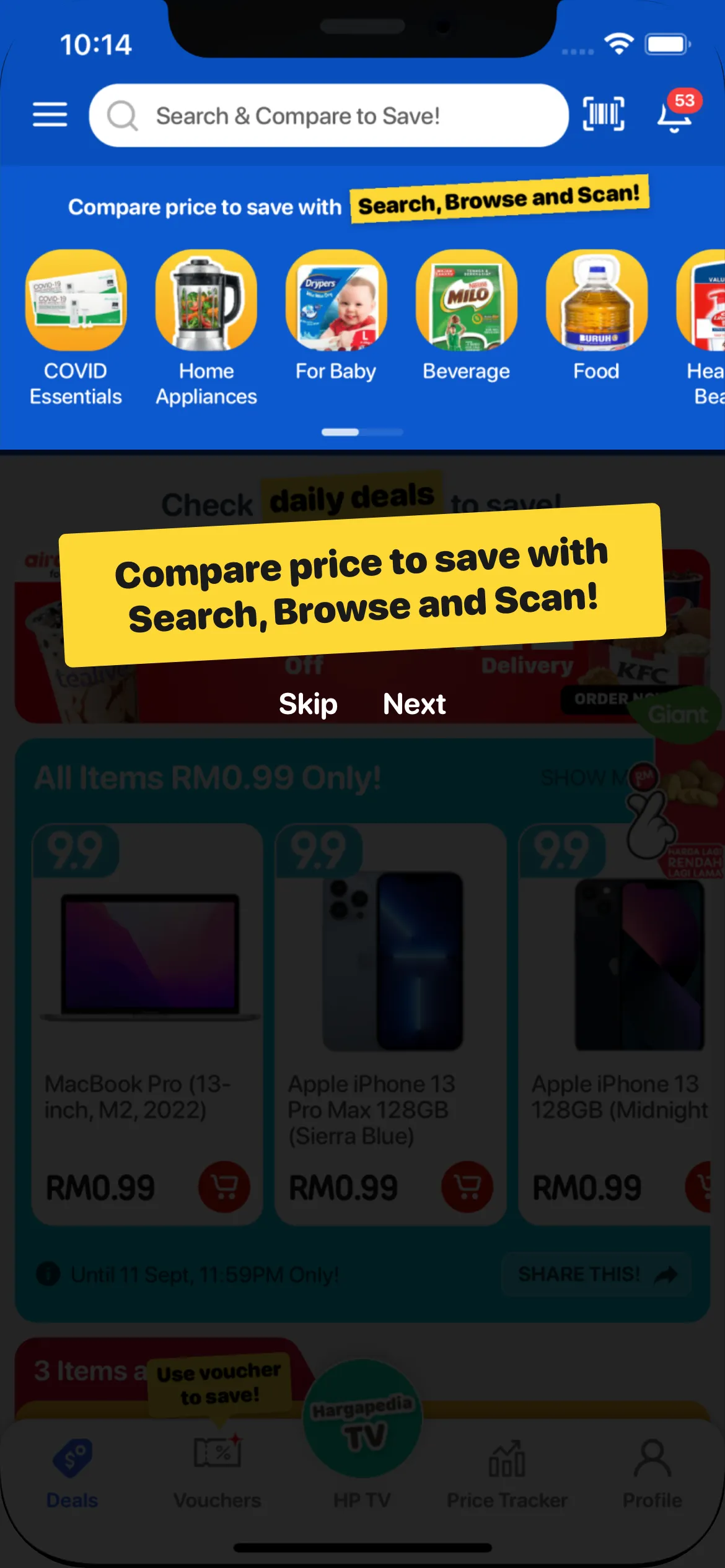
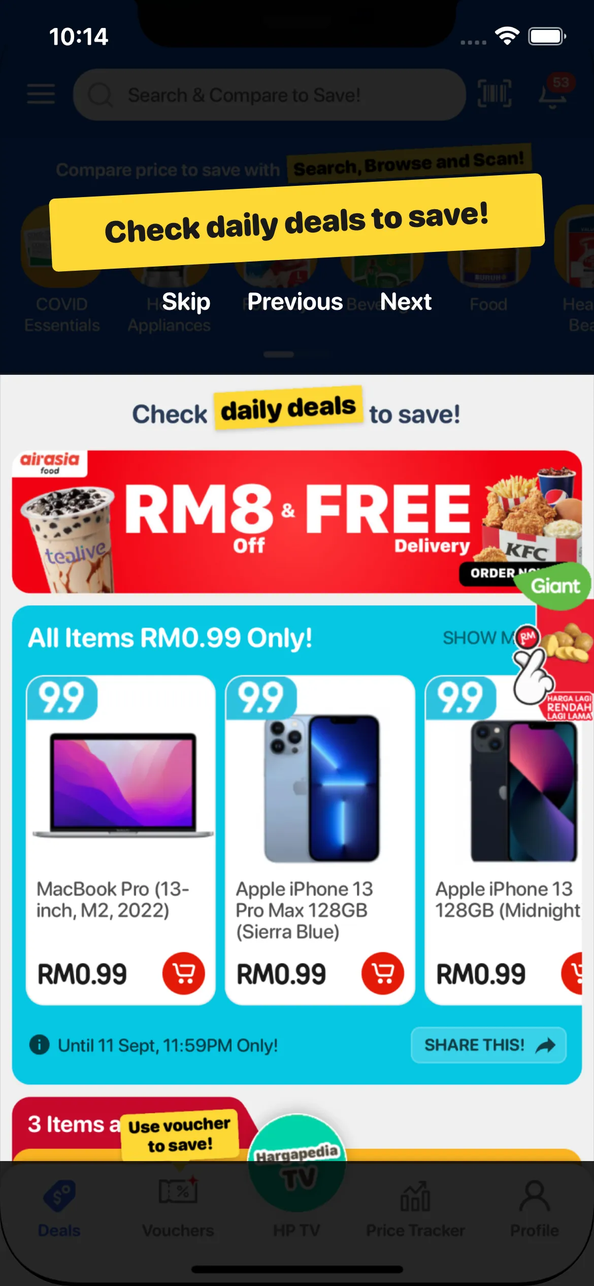
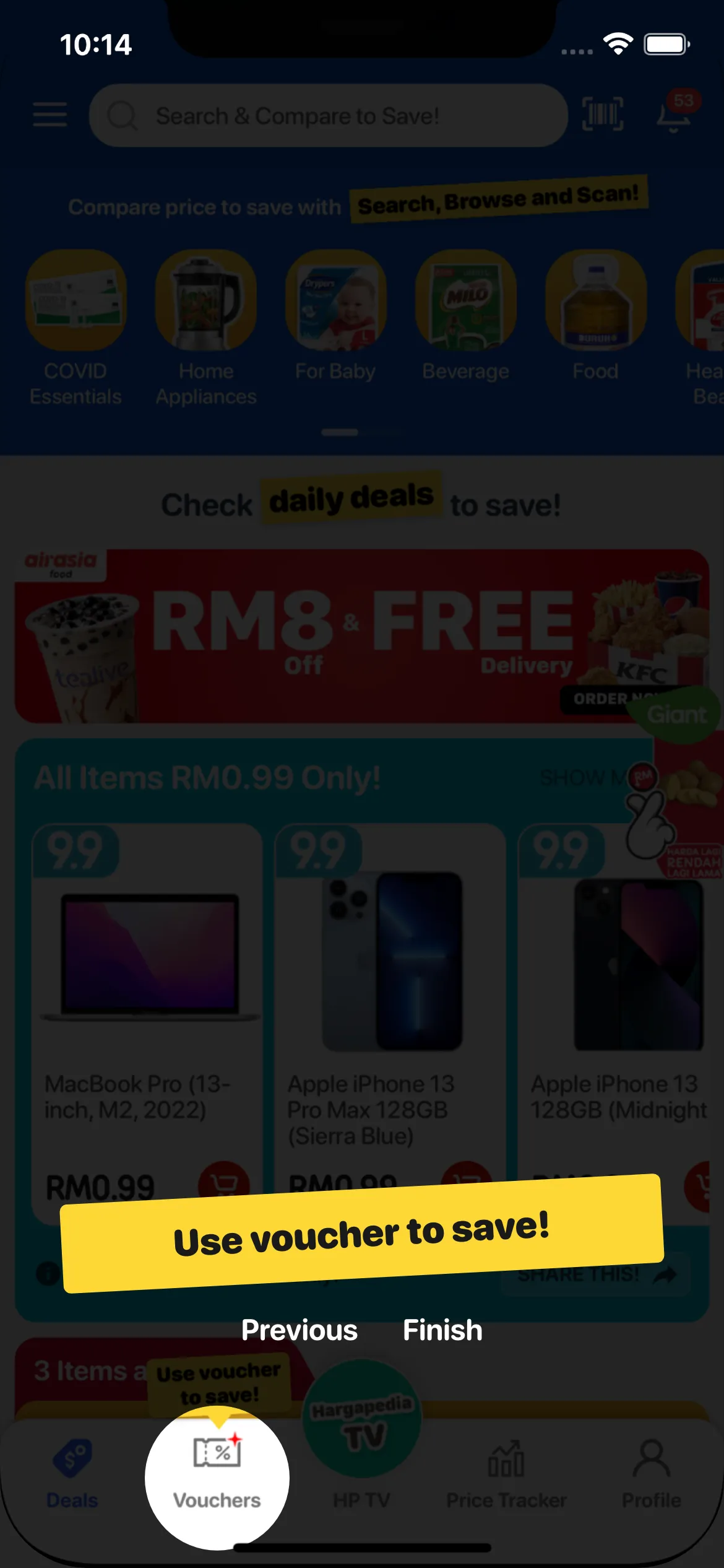
It works by darkening the rest of the screen and leaving one area highlighted, with a message explaining what you’re looking at. There are Next and Previous buttons for moving between steps, and a Skip button if you’d rather continue using the app.
Our tour has three steps, following the same order as the core values on the home screen.
The first highlights the search bar, scan button and the row of app buttons. It shows the message about comparing prices through searching, browsing and scanning.
The second highlights the deals section, with “Check daily deals to save!” above it.
The third puts a circle around the Vouchers tab and introduces the voucher feature.
The messages use the same tilted yellow labels as the home screen, with the tour controls underneath in white.
Getting the highlights to line up took a little more work than using the library normally would.
Working around the Home Screen
rn-tourguide usually works by wrapping the React Native components you want to highlight.
That isn’t quite how Hargapedia’s home screen is built.
Since Hargapedia 2.0, the home screen has been made up of cards that the team can arrange through the CMS. We don’t have one fixed arrangement of components to wrap for the tour.
So instead of attaching each highlight to a particular component, I defined the areas using their positions on the screen.
The first highlight covers the top of the home screen, from the header down to the bottom of the app buttons.
The second covers the area below those buttons, where the deals appear, ending at the tab bar.
For the Vouchers tab, I used a circular highlight. Vouchers is the second of five tabs, so its position can be calculated from the screen width.
The top section needed one more adjustment.
Because the first highlight includes the app buttons, the height of that card has to be predictable. I changed the full-width app-button card so its height is always 40% of the screen width.
The tour uses that same measurement to calculate where the first highlight should end.
Making sure it only appears once
The tour appears the first time someone reaches the home screen after installing Hargapedia.
Once they finish it or tap Skip, the app saves a flag with AsyncStorage, React Native’s key-value storage on the phone, so it doesn’t appear again. The flag is stored on the phone rather than against their account, which means signing out and back in won’t restart the tour.
There was also another part of the home screen we had to account for: the startup popup.
Hargapedia can show a full-screen promotion when someone opens the app. That would get in the way if it appeared at the same time as the guided tour.
So when the tour is due, we hold the popup back.
For someone who’s just installed Hargapedia, the startup promotion that would normally appear after the onboarding questions now waits until the next time they open the app.
That leaves the guided tour as the first thing they see when they reach the home screen.
There’s no option to replay the tour, but we added a “How to use?” link to the side menu last month. It opens our YouTube tutorial playlist, Compare Price, Check Deals, Get Vouchers in Hargapedia.