Janarayson

UGO, a student deals app, and the dashboard behind it

Projects6 min read

UGO finds students the deals around campus. We did all of it: the flows, the Android app's design, the vendor dashboard and the backend.

UGO Tech found us through our website. UGO is an app for students. You find the shops around campus on a map or a list, whether it’s food, a haircut or a movie, check in to get the student price, then rate and review the place. The shops get a dashboard to put up their offers and see who’s checking in. We did all of it: the user flows, the Android app’s design, the vendor dashboard and the backend.

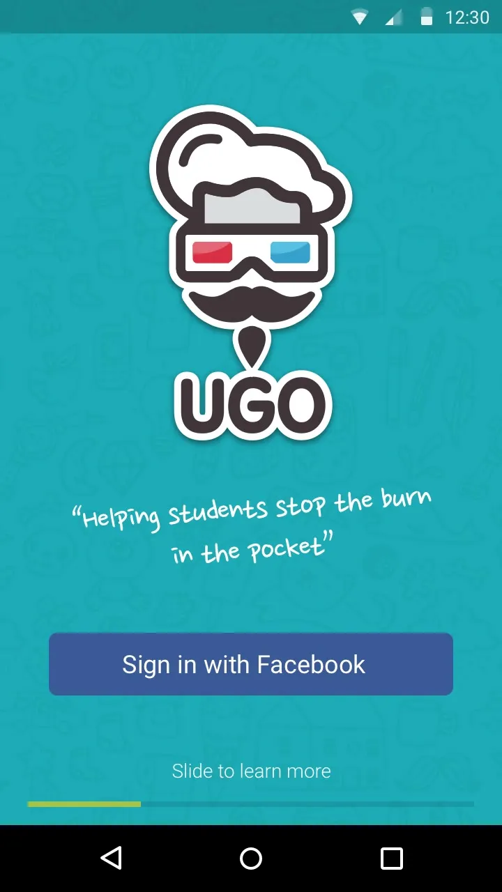
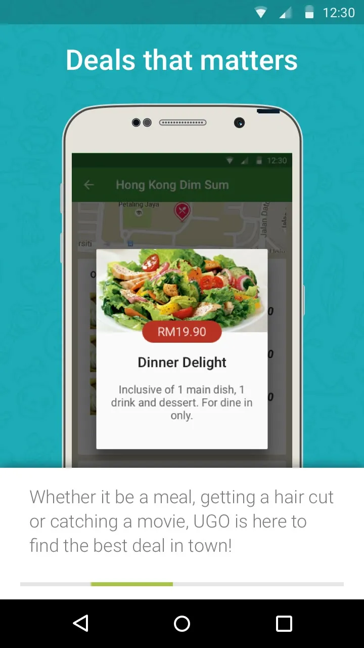
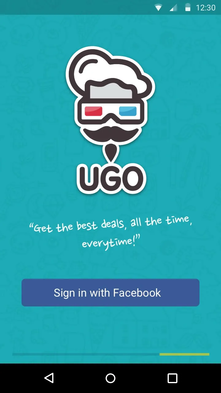
The UGO splash screen on teal: the mascot, a chef hat over red and blue 3D glasses and a big moustache, above the UGO wordmarkThe landing screen: the mascot, "Helping students stop the burn in the pocket", and Sign in with FacebookOnboarding, Deals that matters: a phone showing a Dinner Delight special, and Whether it be a meal, getting a hair cut or catching a movie, UGO is here to find the best deal in town!
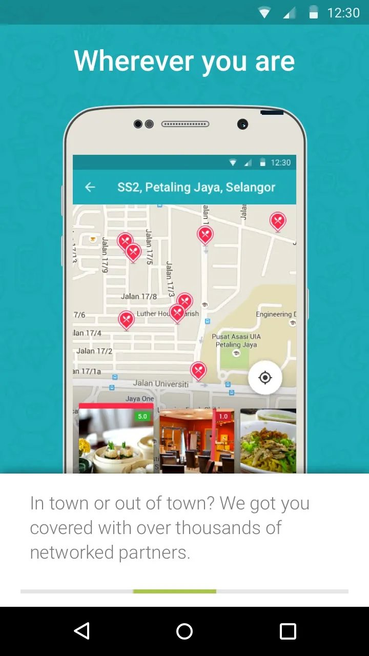
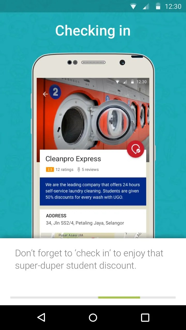
Onboarding, Wherever you are: a phone showing the map of vendors around SS2, Petaling JayaOnboarding, Checking in: a phone showing Cleanpro Express, and Don't forget to check in to enjoy that super-duper student discountThe last landing screen: the mascot, "Get the best deals, all the time, everytime!", and Sign in with Facebook
The mascot, and what the app is for.

Flows first

We started with the flows, before any screens. Every flow is a page of grey wireframes joined by arrows, with one line on what it does: signing up with Facebook, switching between the map and the list, a floating button that opens into a toolbar of categories, and the rest.
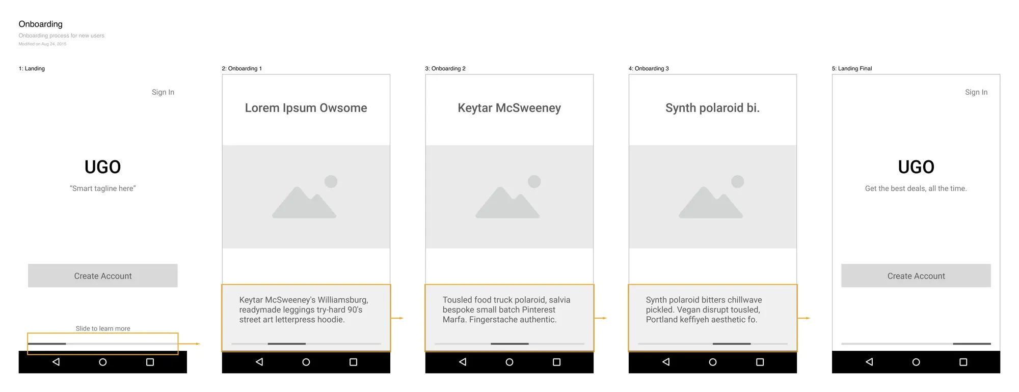
The Onboarding user flow: five grey wireframe screens, the landing, three onboarding slides and the final landing, joined by orange arrows
Onboarding, as a flow.
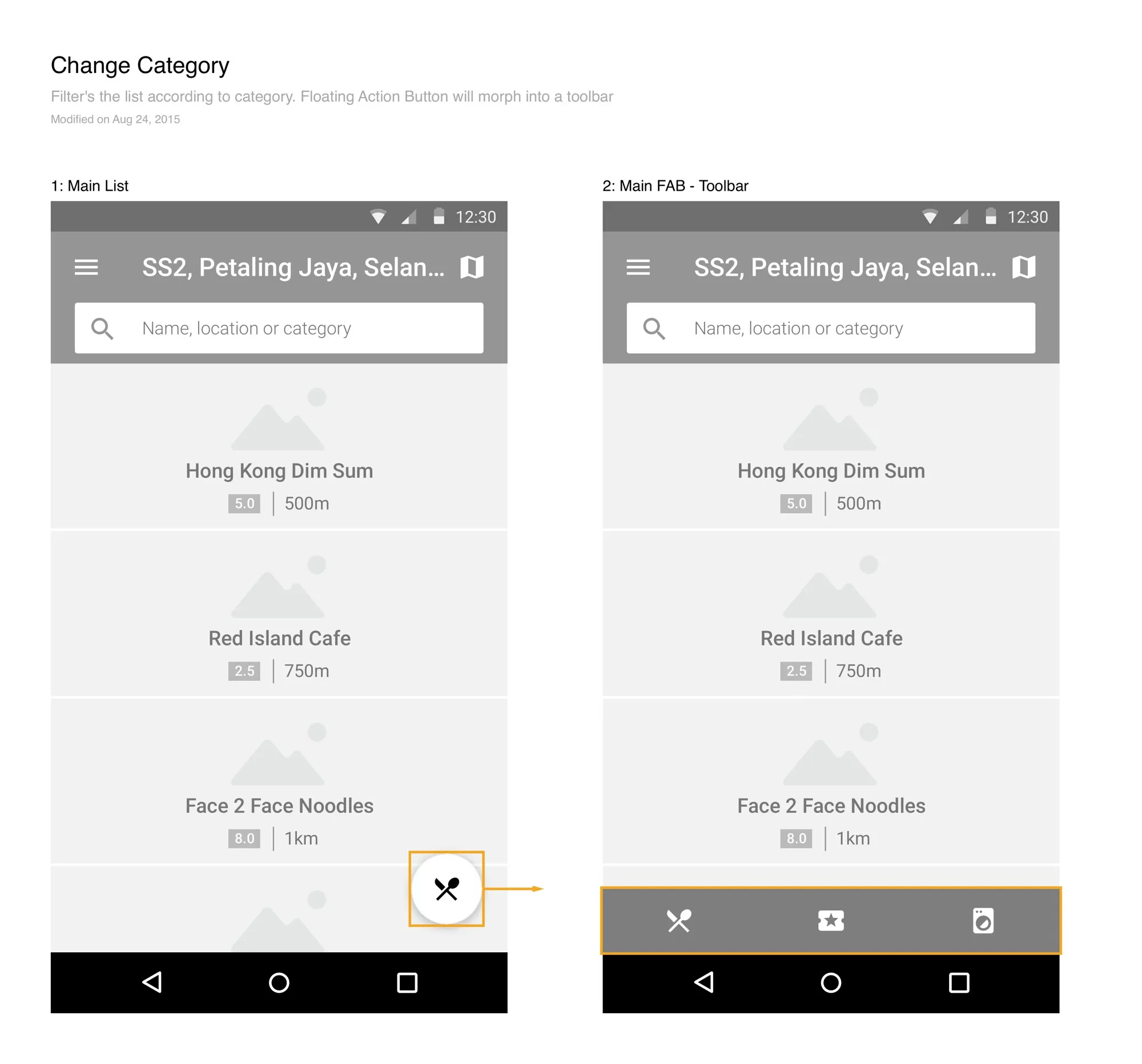
The Change Category flow: the main list with a round button marked in orange, and an arrow to the same list with the button opened into a toolbar of three category icons
The floating button that becomes a category toolbar.

The app

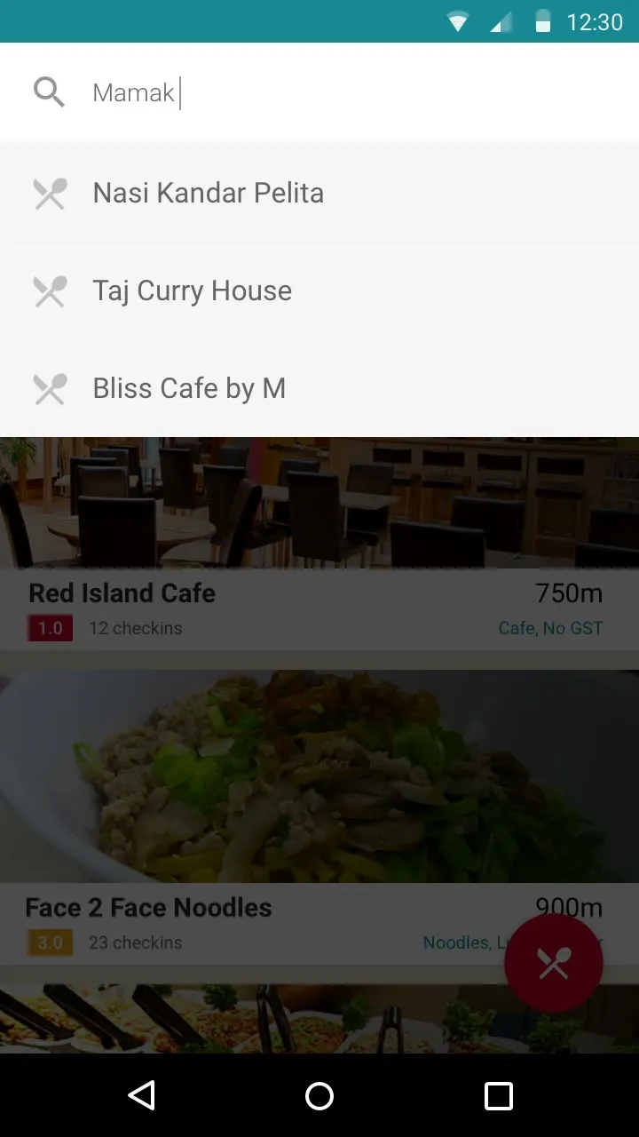
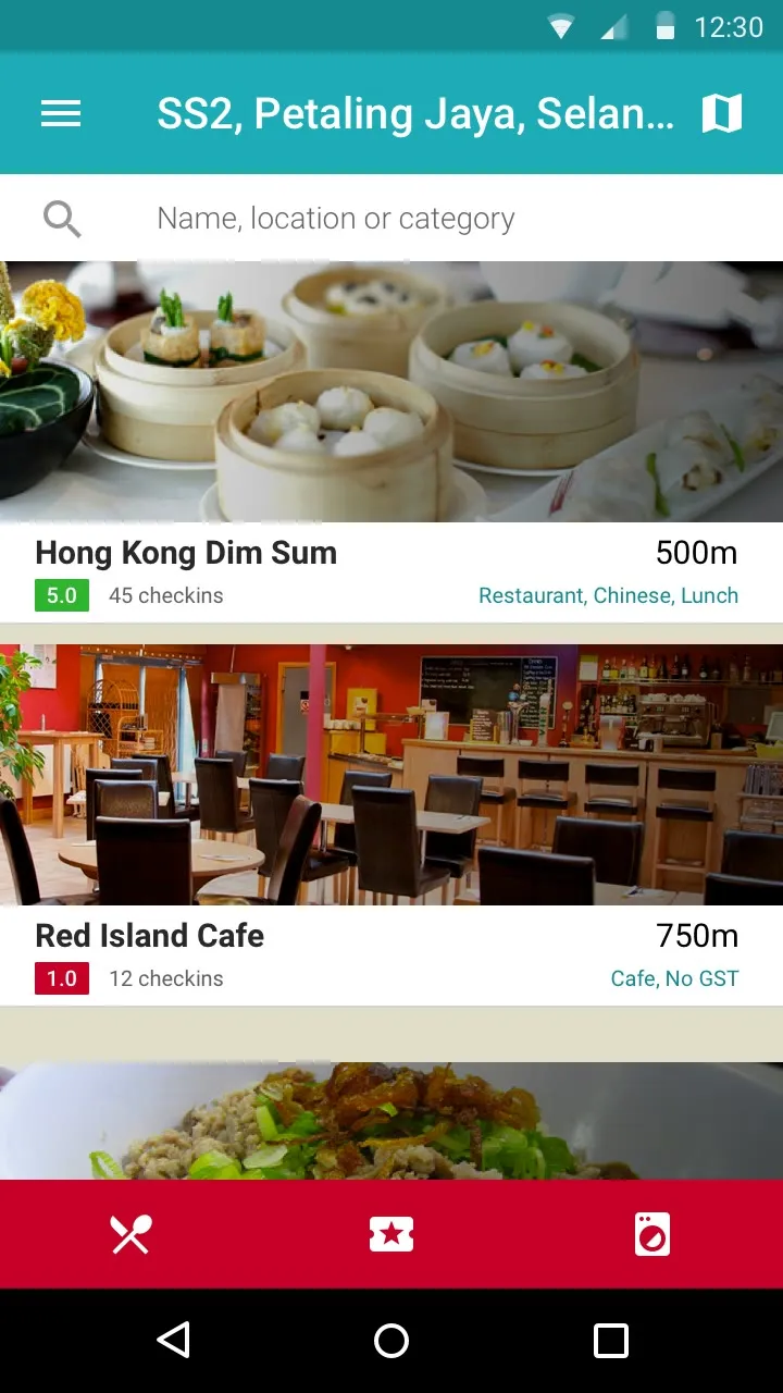
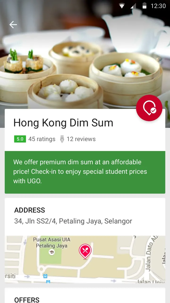
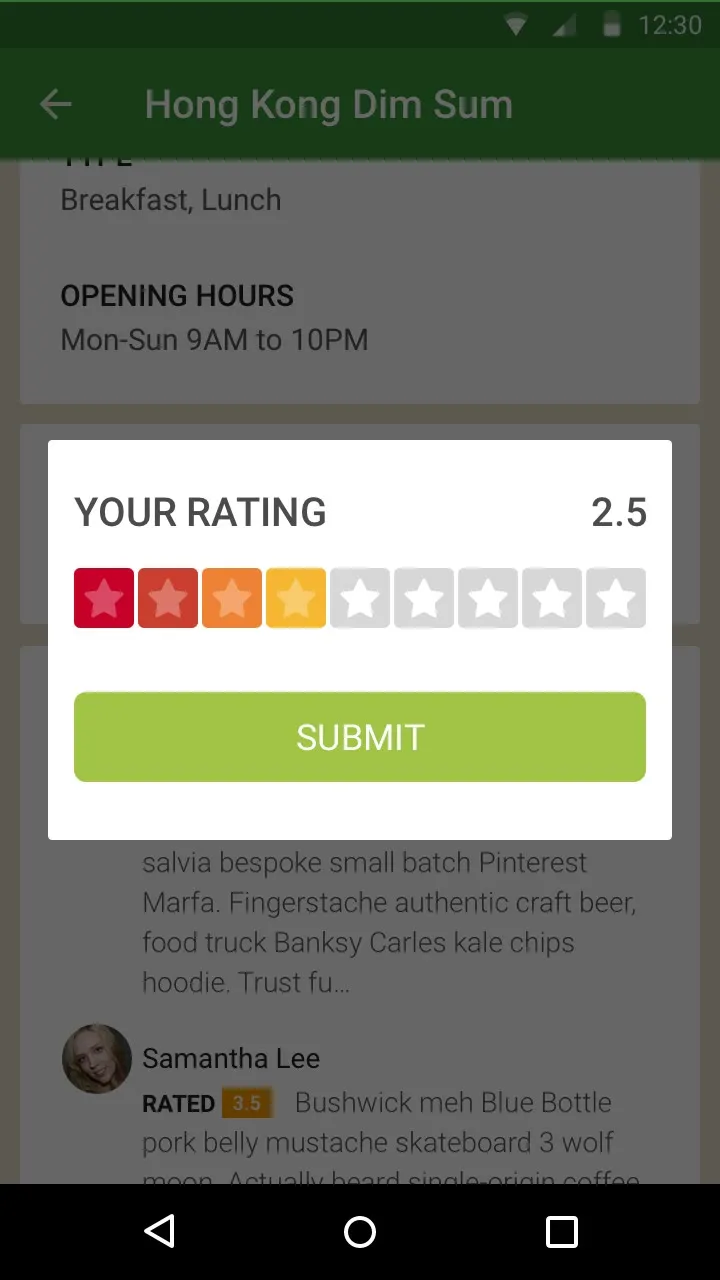
The list is sorted by how far away the shop is, with its rating, how many people have checked in, and what it starts from. The map has the same shops as photos along the bottom. Food, entertainment and services are the three categories. A shop’s page has its offers, its hours, a map to get there and a big check-in button, and you rate it out of ten stars.
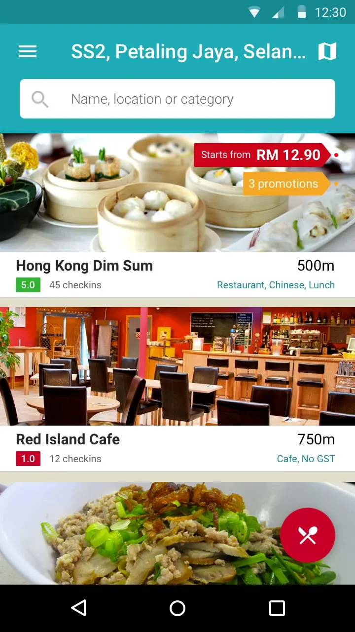
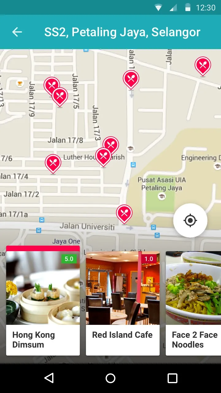
The main list around SS2, Petaling Jaya: Hong Kong Dim Sum 500m with a 5.0 rating, 45 check-ins and Starts from RM 12.90, then Red Island Cafe, and a red round buttonThe map with red pins for each shop, and a strip of shop photos along the bottomSearch for Mamak, suggesting Nasi Kandar Pelita, Taj Curry House and Bliss Cafe by MThe red button opened into a toolbar along the bottom with food, entertainment and services icons
The list, the map, search, and the categories.
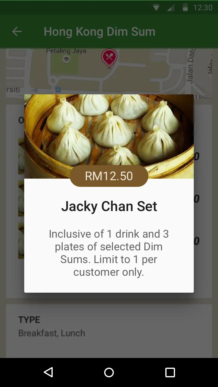
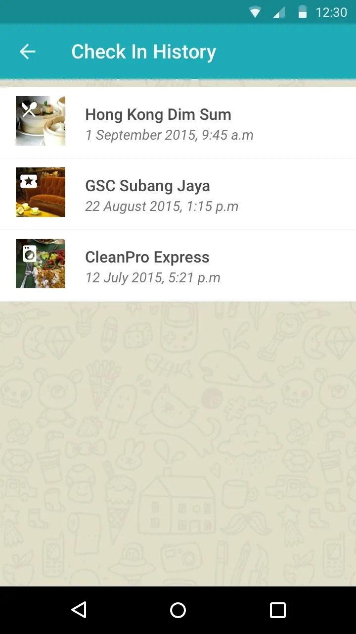
A shop page: Hong Kong Dim Sum, with a cover photo, a check-in button, the write-up, the address and a small mapA special: Jacky Chan Set, RM12.50, inclusive of 1 drink and 3 plates of selected dim sums, limit to 1 per customer onlyYour Rating: ten stars with two and a half filled, and a green Submit buttonCheck In History: Hong Kong Dim Sum, GSC Subang Jaya and CleanPro Express, each with the date and time
A shop, a special, rating it, and your check-ins.

In the design, each shop’s page takes its colour from its cover photo. The cafe comes out brown, the laundromat navy and the barber teal, using the Vibrant and Dark Vibrant colours that Android’s Palette picks out of an image.
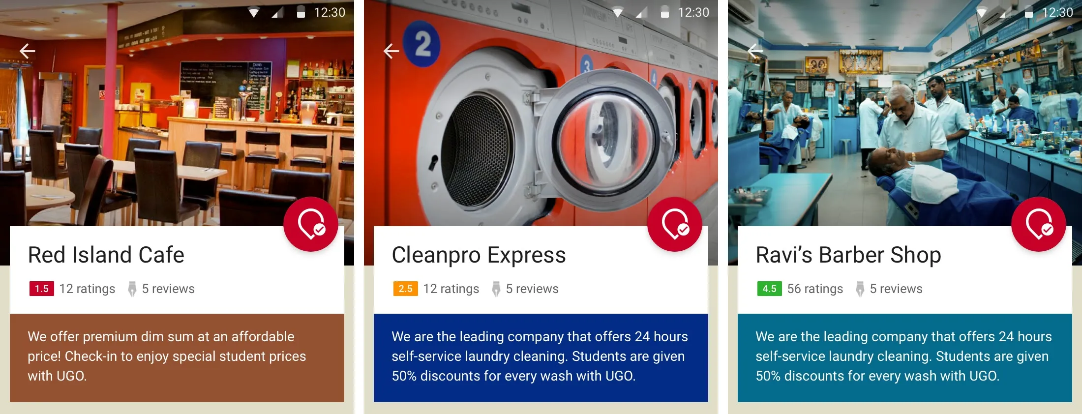
Three shop pages side by side, each with its write-up in a colour taken from the cover photo: brown for Red Island Cafe, navy for Cleanpro Express and teal for Ravi's Barber Shop
Colours from the cover photo.

For the shops

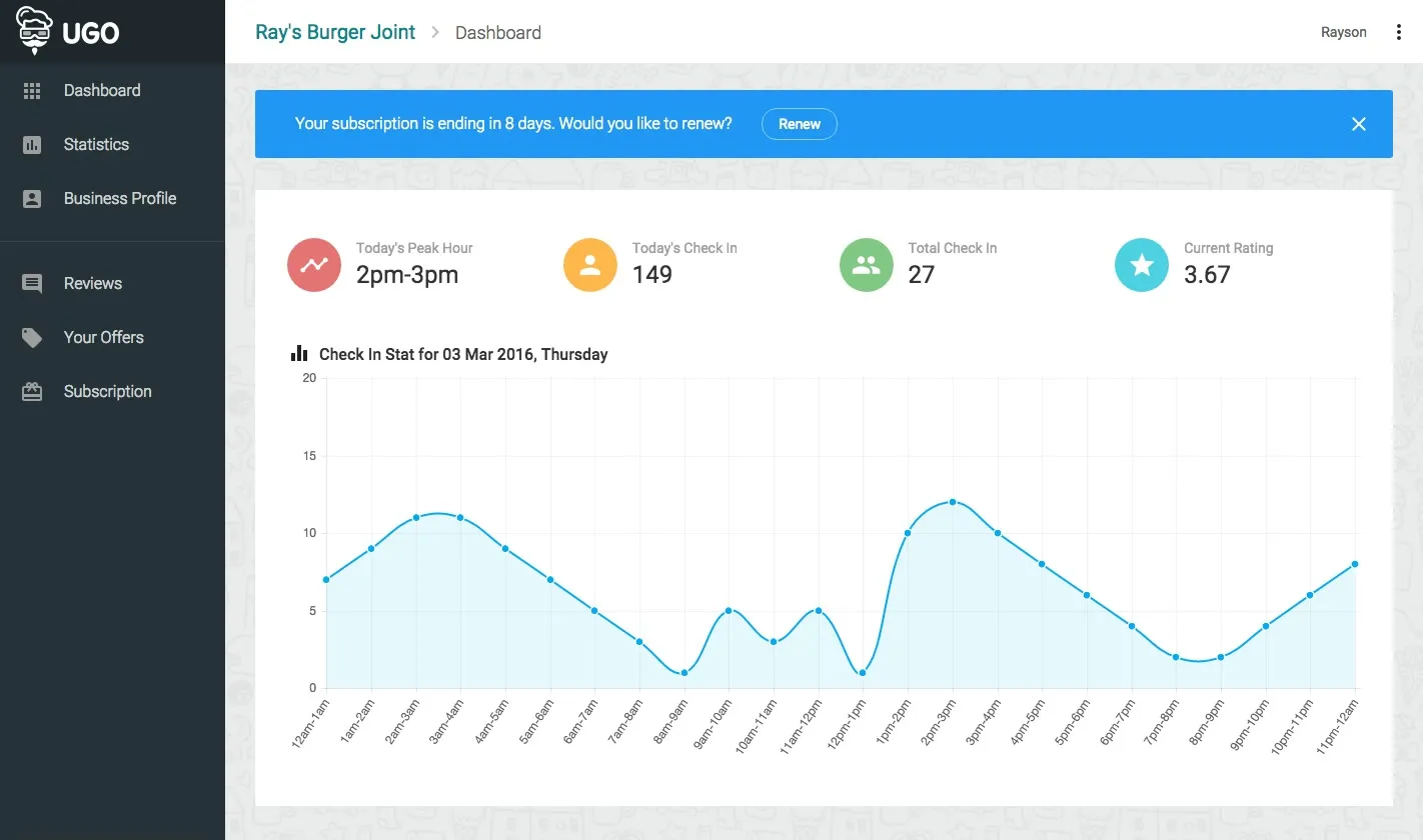
The shops get a web dashboard. It has today’s check-ins, the busiest hour, the total check-ins and the rating, with a chart of the day by the hour and their latest reviews. They can put up offers, edit their profile and photos, read and reply to reviews, and manage their subscription.
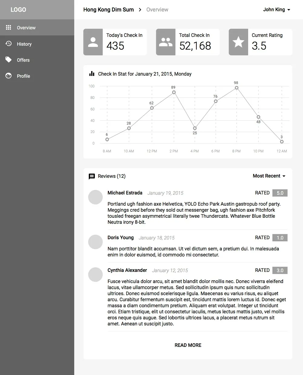
The vendor dashboard wireframe: four stat circles, a line chart of check-ins and a list of reviews
The dashboard as a wireframe.
The built vendor dashboard for a test shop, Ray's Burger Joint: Today's Peak Hour 2pm to 3pm, Today's Check In, Total Check In and Current Rating, and a chart of check-ins through the day
And built, with a test shop.

The dashboard is React with Redux and Material UI, on Parse, with Cloudinary for the photos and Braintree for payments. Check-ins are counted into the hour they happen, so the busiest hour and the chart only need to read those totals. Statistics has the same counts as a table, by the hour and by the day.
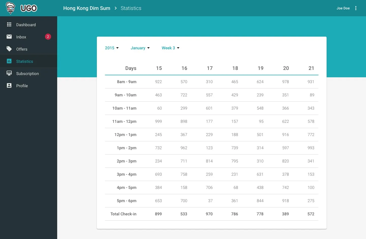
The Statistics design: a table of check-ins by the hour, 8am to 6pm, for each day of a week, with the totals at the bottom
Check-ins by the hour, for the week.

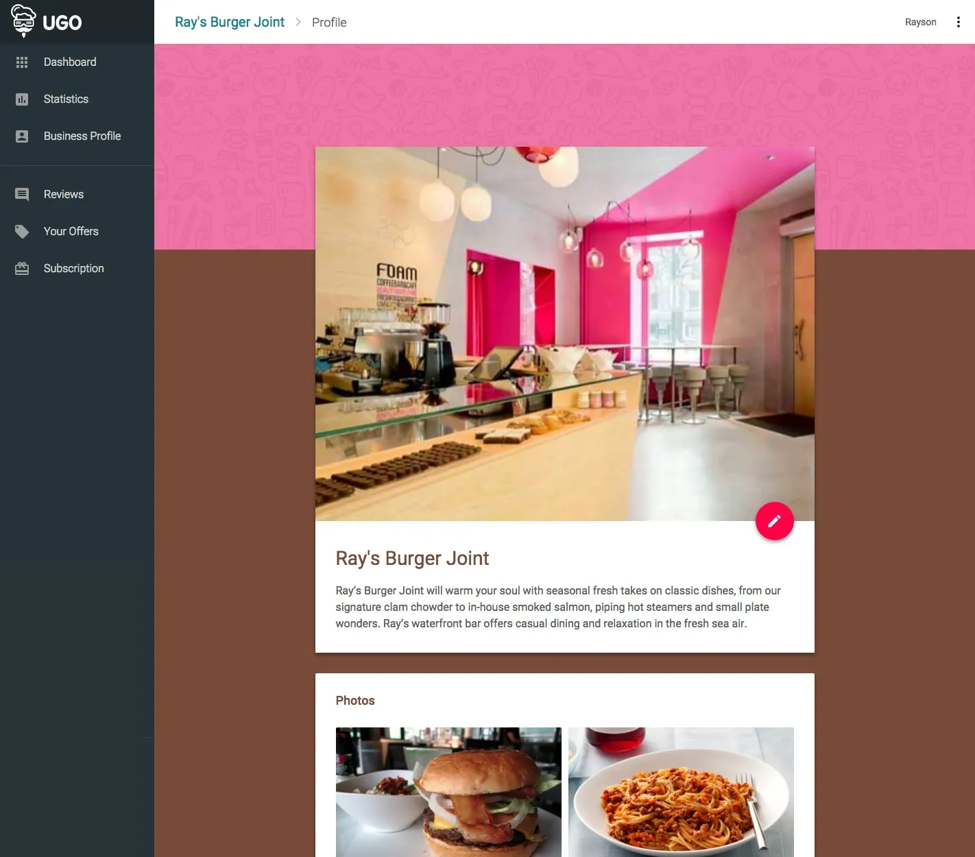
The offers and the profile do the colour trick too. The dashboard picks the colours out of each photo in the browser, so every offer card gets its own colour, and so does the profile page.
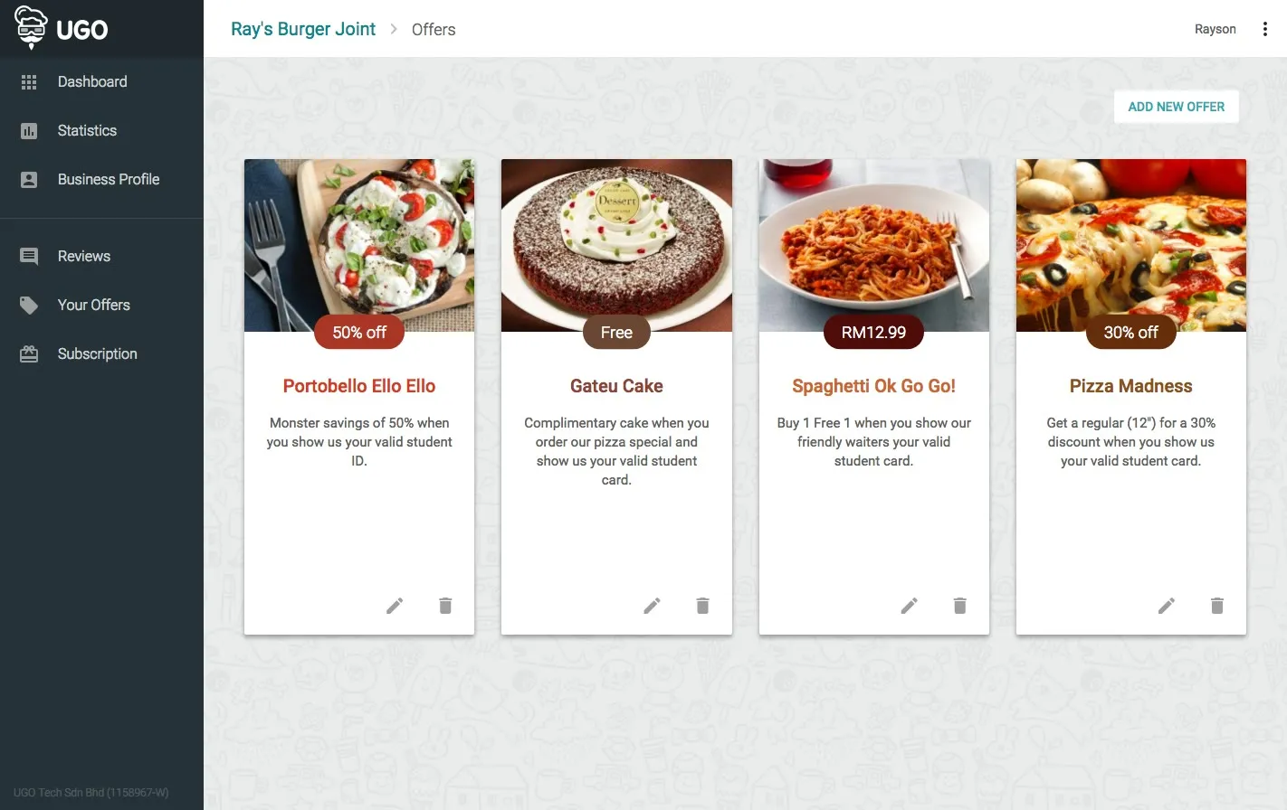
The vendor's offers: four cards with food photos, Portobello Ello Ello, Gateu Cake, Spaghetti Ok Go Go! and Pizza Madness, each title in a colour taken from its photo
Each offer in its own colour.
The vendor profile for Ray's Burger Joint, with pink and brown bands behind it taken from the cover photo of a pink cafe
The profile, coloured from its cover photo.

In January, halfway through, Facebook announced that Parse is shutting down in a year, so the backend needs a new home before then.

For now, ugo.my has the holding page, with a sign-up for the shops.
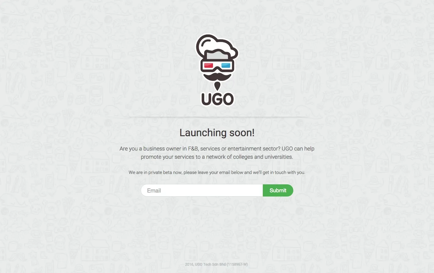
The ugo.my holding page: the mascot, Launching soon!, and Are you a business owner in F&B, services or entertainment sector? UGO can help promote your services to a network of colleges and universities
ugo.my, launching soon.