Juice is on Windows Phone
Juice went live on the Windows Phone Marketplace today. Symbian, the N9 and now WP7 ... one app, three platforms, and a few things we learnt along the way.
Hah, look who’s blogging. We said we’d write more last year … that didn’t happen, work got in the way, the usual excuse. Anyways, Juice went live on the Windows Phone Marketplace today, which means the same app is now on Symbian, on the N9 and on WP7, and it’s not even a year since we started on it. Not bad for a small company, so before we forget how any of it happened, some notes.
The app
Nokia wanted local content on their phones and Juice has the KL nightlife stuff, events, bars, clubs, reviews … so the app does what the magazine does, just on your phone. See what’s on tonight, find a place nearby, read the review, and tap to call if you want a table.
Wireframes
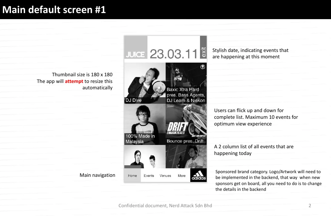
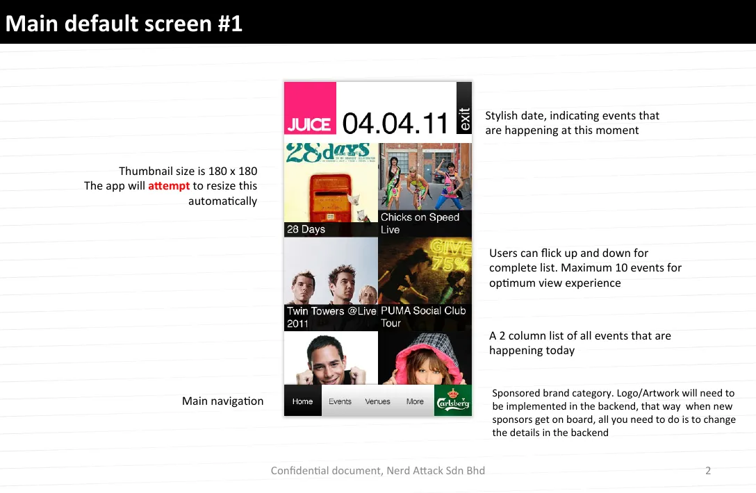
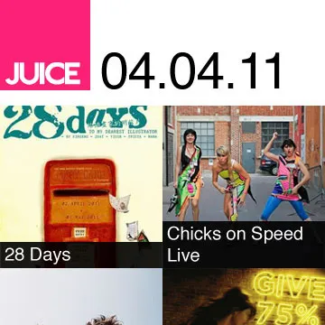
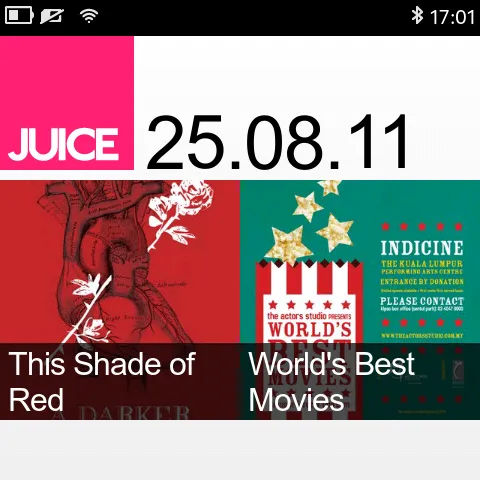
The home screen is today’s date in big type with a grid of tonight’s events under it, and you flick down for more. We capped the list at 10 events because the phone won’t enjoy loading 50 thumbnails and neither will you.
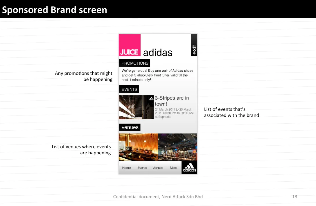
Then two things that weren’t in the scope at all, because somebody has to pay for all this la. An ad slot at the bottom of the list, and a sponsored brand … the sponsor’s logo sits inside the nav bar itself and gets its own screen for promotions, events and venues. We made the logo come from the backend, so when a new sponsor signs up, somebody changes a record and that’s it, nobody has to call us for a new build.
Symbian first
The design went out in April. Juice’s pink block, the big black date, the grid, and a black nav bar with the sponsor on the right. There’s an “exit” button at the top right corner too. Symbian didn’t give us much to go on for UI back then, so we put things where they made sense on that phone, and a way out at the top right made sense to us.
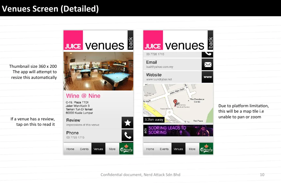
Two things the platform made us do. The map can’t pan or zoom, so the venue page gets a map tile instead, a picture of a map with a pin on it and “3.2km away” … we wrote “due to platform limitation” on the slide so nobody blames the design later. And the venue categories live in a drawer you pull up from the bottom, because the screen is only 360 wide and there was nowhere else to put them without hiding the list.
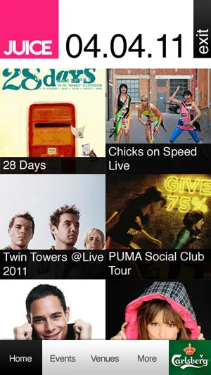
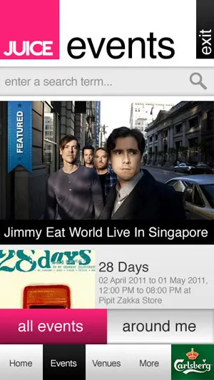
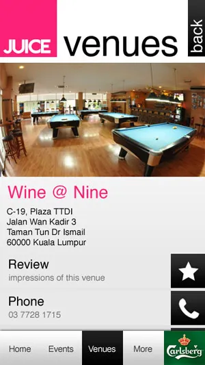
The Ovi Store listing went up in August. Ovi wants screenshots in a square, so the first thing anyone sees of a tall app is a square crop of the header and two tiles, which is not how we’d have chosen to show it, but ok.
Then the N9
We were at our booth at Nokia Connection in Singapore in June when they announced the N9, so we kind of knew what was coming … bigger screen, sharper, and a different shape altogether. The MeeGo version is the same design with every number redone on one page, thumbnails, tiles, search bar, icons, all of it. One of those days where you finish and have nothing new to show anyone, haih.
Then Windows Phone
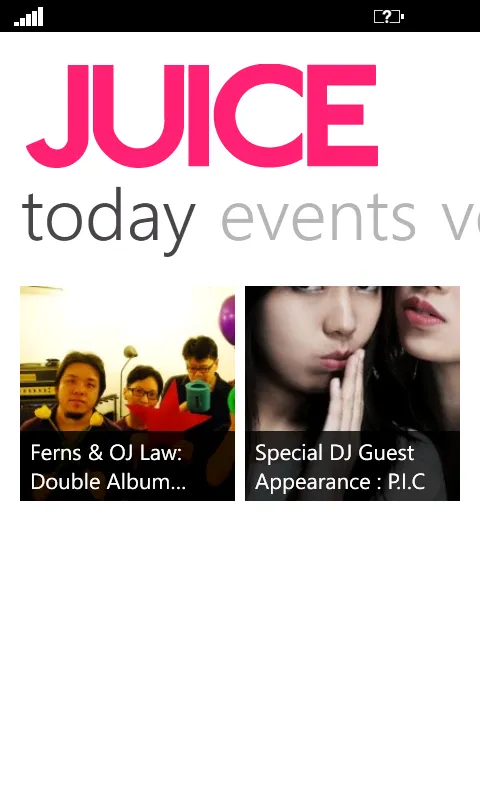
This one we enjoyed. Nokia and Microsoft made the big announcement in February and we’ve been playing with WP7 since, so when the Lumia 800 came along we were more or less ready. Nothing from the Symbian layout survived except the pink and the content, and that was the right call. Windows Phone has its own design language … the big JUICE wordmark, a panorama that reads “home events venues about” across the top with the next word peeking in from the right, square tiles, and the selected tile turns pink instead of getting a box around it. The sponsor bar at the bottom doesn’t fit any of that, so it went. Even the units changed, the Symbian spec was in pixels and this one is in points.
If we had forced the Symbian screens onto WP7 it would have looked like a port, because that’s what it would be.
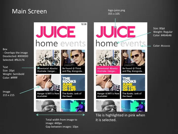
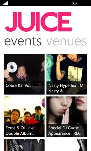
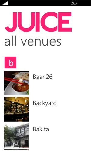
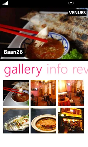
Three stores, three ideas of a screenshot
Ovi wants squares. The N9 store wants squares too, just bigger ones. The Marketplace wants the whole phone, which is the one that makes sense, and of course it’s the one we got to last.
Things we learnt
Mockups are only mockups. Everything looked settled on the slides in April, then real development started and the platform had its own ideas … the map that can’t zoom, the square screenshots, the sponsor bar that doesn’t belong on Windows Phone, none of that was on a mockup. The further the platform is from what you know, the less a mockup promises, so leave room for it. We’ll remember that the next time Nokia changes direction, which, going by this year, won’t be long.
Anyways, that’s that. Three platforms and we’re still standing. Ok, back to work.