Making Hargapedia's intro video in Keynote
I made a 22-second video in Keynote to introduce Hargapedia's new A, B and C price grades, with versions in English, Malay and Chinese.
January’s Hargapedia update introduced A, B and C grades to help people see whether a product is worth buying at its current price. I’ve written separately about the grades and the Price Meter that displays them on the product page.
But before someone gets to the product page, there’s a short video introducing the new system during the app’s initial setup. It runs for 22 seconds, starting with the thousands of promotions Hargapedia processes every week and ending with the three grades on the Price Meter.
I made the animation in Keynote and exported it as a video for the app. Keynote is primarily a presentation tool, but its transitions, object animations and motion paths were enough for what I needed. I also made three versions, one for each language Hargapedia supports.
From promotions to A, B and C
The video begins with a simple message: since 2018, Hargapedia has been processing more than 10,000 promotions every week. The number appears first, followed by the rest of the text, before introducing the idea of classifying those promotions into A, B and C grades.
The next scene shows promotion icons dropping into a funnel. As they go in, the outline of the HARGAPEDIA PRICE METER badge is drawn, and the three grades fall out of the bottom of the funnel into it, one after another.
From there, the animation moves to the Price Meter itself.
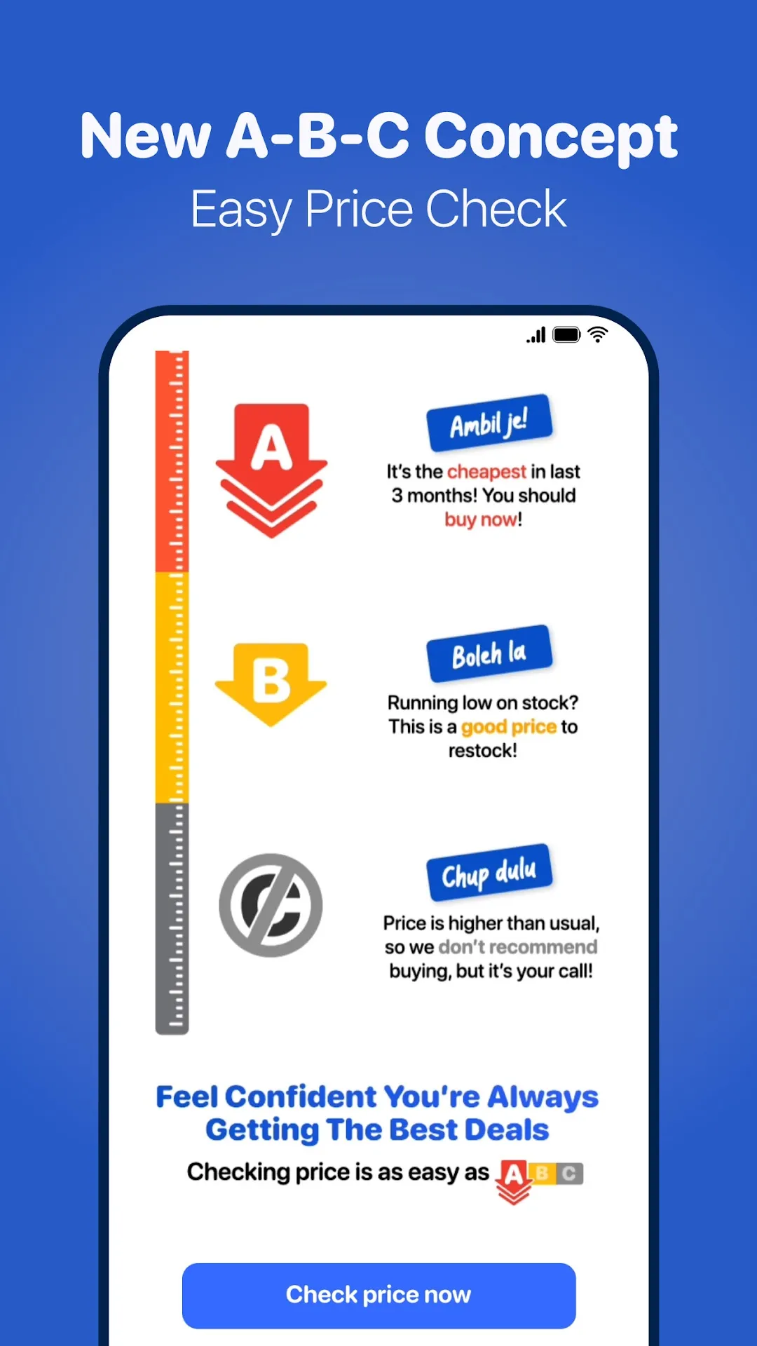
The ruler starts filling from the top, with the red section and a large A appearing alongside Ambil je! and its explanation. The A then shrinks and moves into the first row, making room for B, Boleh la, to appear in yellow and move into position below it.
By the end, the meter is shown with the three grades and the line “Checking price is as easy as ABC”.
The idea was to take people from the promotions Hargapedia already tracks to the new way of judging those prices, all before they start using the app.
Putting it together in Keynote
The animation uses four portrait slides, set to a 9:16 aspect ratio to match a phone screen.
Most of the graphics, including the funnel, grade badges and Price Meter, are vector PDFs pasted into Keynote. That keeps them sharp when they’re scaled during the animation. I used SF Pro Rounded for the text, matching the font we use in the app.
Keynote has two main ways of animating things. Transitions move from one slide to another, while builds animate individual objects within a slide. Builds can make objects appear or disappear, and actions can move, rotate or scale them.
Most of the video is made with builds rather than slide transitions.
There are Push transitions between the first three scenes. The funnel comes up from below and pushes the title card off the top of the screen. Later, another Push sends the funnel back down, leaving an empty slide for the meter to appear.
For the meter, I combined Scale and Motion Path actions. The large A doesn’t simply disappear and reappear in a smaller size. It shrinks and moves into its position on the ruler, with both actions running together. B follows the same sequence.
The other scenes use simpler builds. On the title card, the number pops in and the lines of text arrive one at a time. In the funnel scene, the promotion icons drop in, the badge outline appears using Keynote’s Line Draw effect, and the letters A, B and C fall into place.
It’s all done with Keynote’s built-in animation controls. The individual movements are fairly simple, but there’s quite a bit of timing involved in making them run together as one continuous sequence.
Making the same animation in three languages
Once the animation was done, I needed versions in English, Bahasa Melayu and Chinese.
Each language has its own Keynote deck, but all three use the same four slides, builds and timing. The exported videos are exactly the same length, with every scene arriving at the same moment.
Only the text changes, although a few things stay the same across all three languages. The grade names, Ambil je!, Boleh la and Chup dulu, remain in Malay, and the HARGAPEDIA PRICE METER badge stays in English. The explanations are translated.
Chinese needed different typography. SF Pro Rounded doesn’t include Chinese characters, so I used two rounded typefaces from Tensentype, one medium and one bold. They’re the same fonts we use for Chinese text in the app. Numbers such as the 10,000 on the opening slide still use SF Pro Rounded.
Malay was more of a spacing problem.
The English title card says “And now we classify them into”, which becomes “Kini, kami klasifikasikannya ke dalam penilaian” in Malay. That line stretches almost the full width of the screen.
The explanation under Chup dulu also takes four lines in Malay, compared with three in English. I kept the font size the same and fitted the longer text into the existing layout.
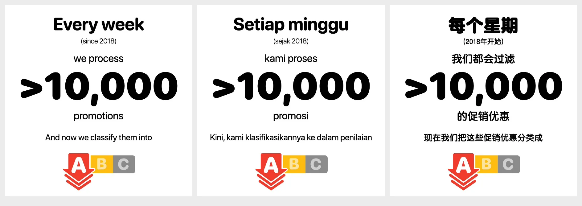
Having the same timing across all three versions meant I didn’t have to maintain three different animation sequences. But it also meant the text had to fit within the time and space already given to each scene.
Playing it inside the app
Keynote exports the decks as H.264 videos at 608 × 1080 resolution and 30 frames per second. All three files come to about 14 MB combined, and they’re bundled with the app rather than downloaded separately.
The first screen in Hargapedia’s setup asks people to choose English, Bahasa Melayu or 中文. After a screen about notifications, they reach the introduction.
The app reads the language they’ve selected and loads the matching video using react-native-video. Chinese loads the Chinese version, Bahasa Melayu loads the Malay version, and anything else defaults to English.
One thing I had to account for was how our navigation works.
When the app starts, it opens the intro screen first and places the language selection screen on top of it. That means the intro is already mounted underneath while someone is choosing their language.
Without handling that, the video could start playing before anyone actually sees it.
I made playback depend on whether the intro screen is in focus. While another screen is on top, the video stays paused. Once the user reaches the introduction, it plays from there.
The video only plays once. When it finishes, the screen stays on its last frame, showing the Price Meter with “Checking price is as easy as ABC” above the button.
There’s no separate skip button. Instead, the blue Check price now button is visible from the first frame, so people can continue without watching the whole 22 seconds. Tapping it takes them through the remaining setup, including a few questions, their postcode and the shops they usually visit.
For a video that’s only 22 seconds long, quite a bit went into making the animation, keeping the three languages in sync and getting it to play at the right point in the app.
It’s a small part of the onboarding experience, but it gives people an introduction to the grades before they encounter them on the product page.