UI/UX for an insurer's app with no name
AIA came back to us after Newsboard, this time for the UI/UX of an app for their customers: the research, the IA and user journeys, the wireframes and the look.
In September AIA came back to us. We’d done Newsboard for them, the news section in iMO, the iPad app their Life Planners use. This time it was an app for their customers, and our part was the UI/UX, which ran until early December. They never told us what the app would be called, so in all our files it’s just “AIA Consumer App”.
Starting with research
AIA wanted us to start with research. They already knew where their customers get stuck, and the findings mostly came from them. Most customers don’t really know what their policy covers. Maybe their parents bought it, or they signed up to help a friend who’s an agent, or they bought it so long ago they’ve forgotten. The first time they need a clinic, they ask HR which ones are on the panel. When they have to be admitted to hospital, they call their agent, because they don’t know their room-and-board limit or whether the hospital is on the panel. And people don’t want yet another card in their wallet.
We also looked at how other insurers’ apps handle the same things, like nib, Cigna, Allianz and Medibank, and came up with a list of features: a medical card on your phone, your policy and what it covers, a clinic finder, renewing your policy in the app, rewards for staying healthy, a wallet for your policy documents, and a medication reminder. The app had two kinds of users. Some had their own AIA policy, and some were covered by their company’s plan or by AIA Vitality, which AIA launched here in June.
The IA, journeys and wireframes
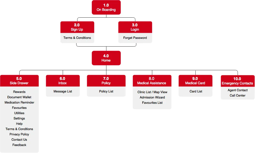
The first round had everything in it. We did the IA, with ten sections from onboarding to emergency contacts.
Then 30 user journeys. Each one starts with something the customer wants to do, like “I need to see a doctor” or “I don’t want to wait at the clinic, how do I make a reservation?”, and walks through the screens to get it done.
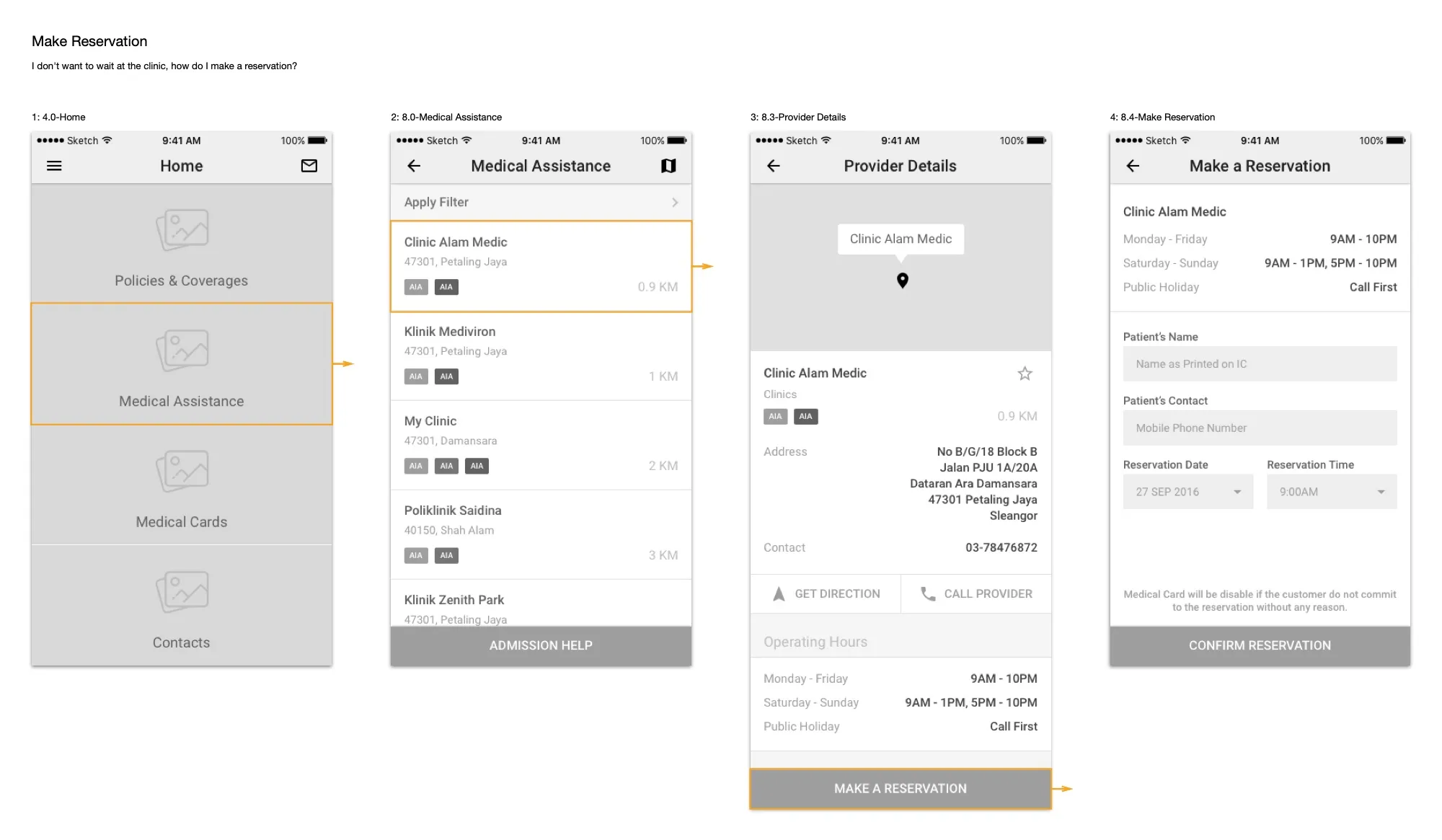
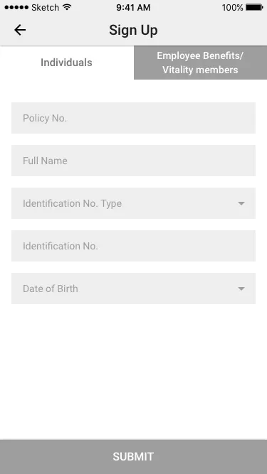
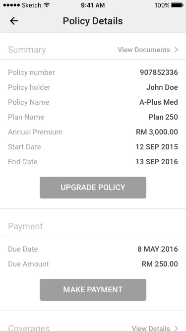
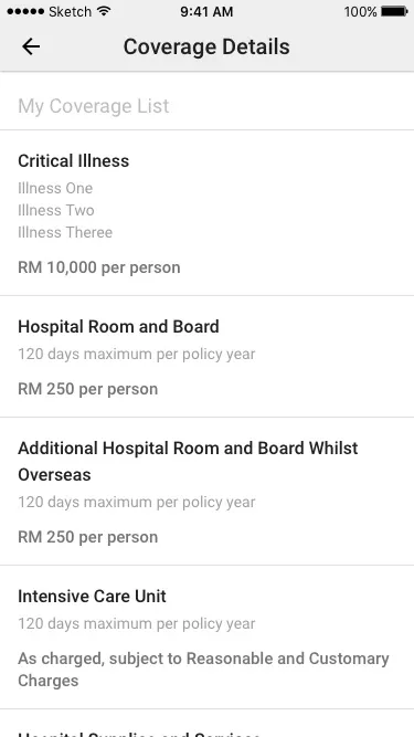
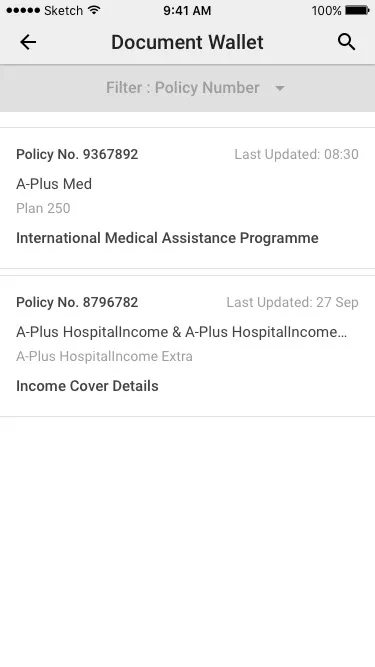
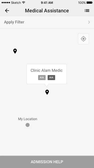
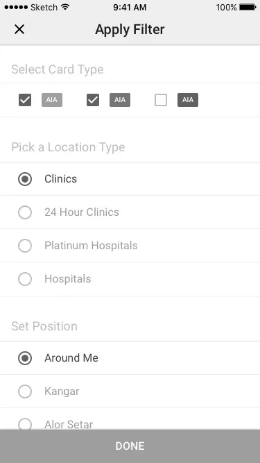
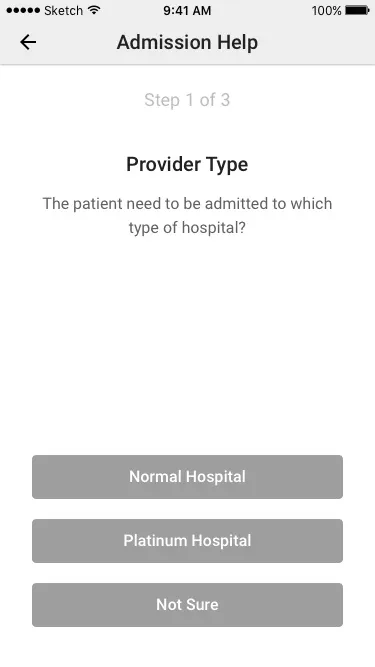
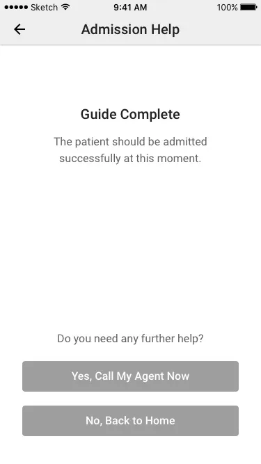
We drew 54 grey wireframes and linked them up in Prott, and all of it went to AIA at the start of October. Home was four big tiles: Policies & Coverages, Medical Assistance, Medical Cards and Contacts. Signing up had a tab for each kind of user. You could see your policy and its coverage with the room-and-board limits, pay your renewal, and keep your policy documents in a wallet. For medical help there was a map of panel clinics with filters for your card type, and a three-step helper for hospital admission that ended with calling your agent.
Two revisions
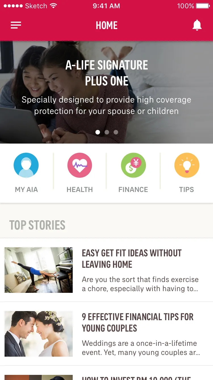
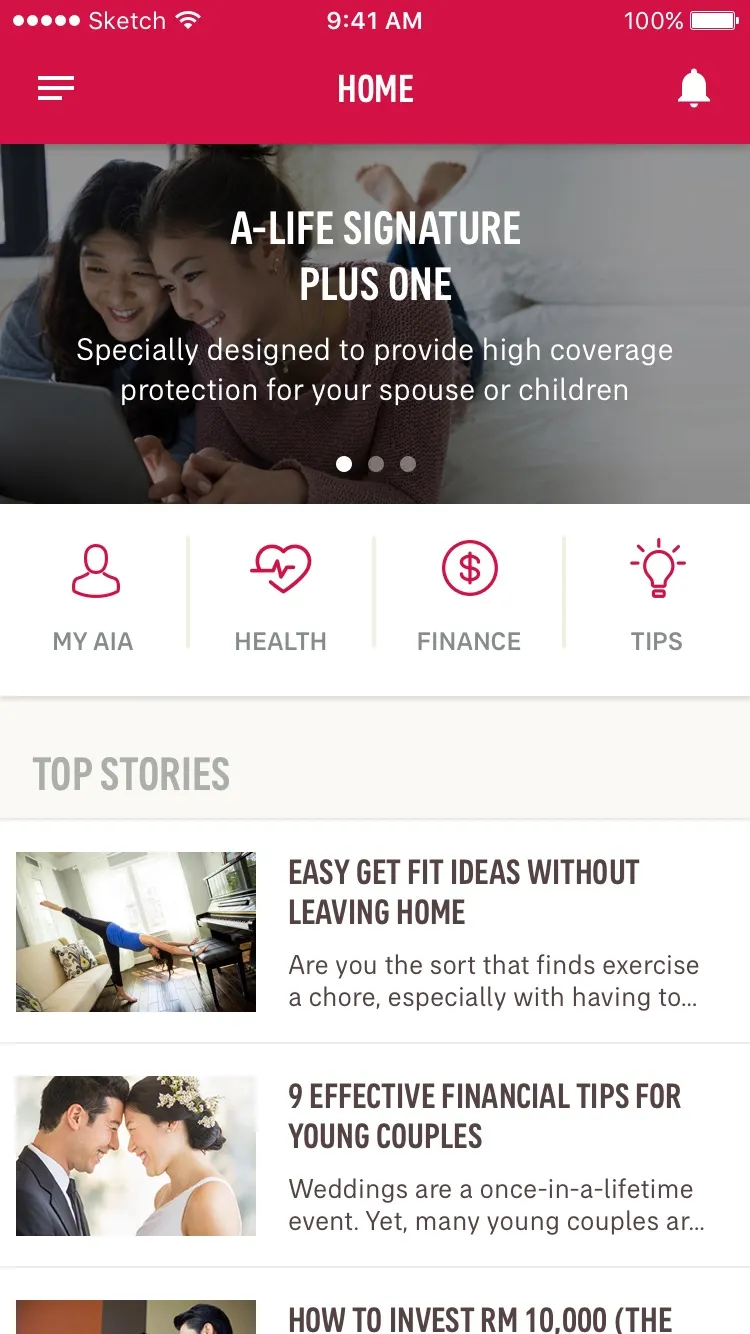
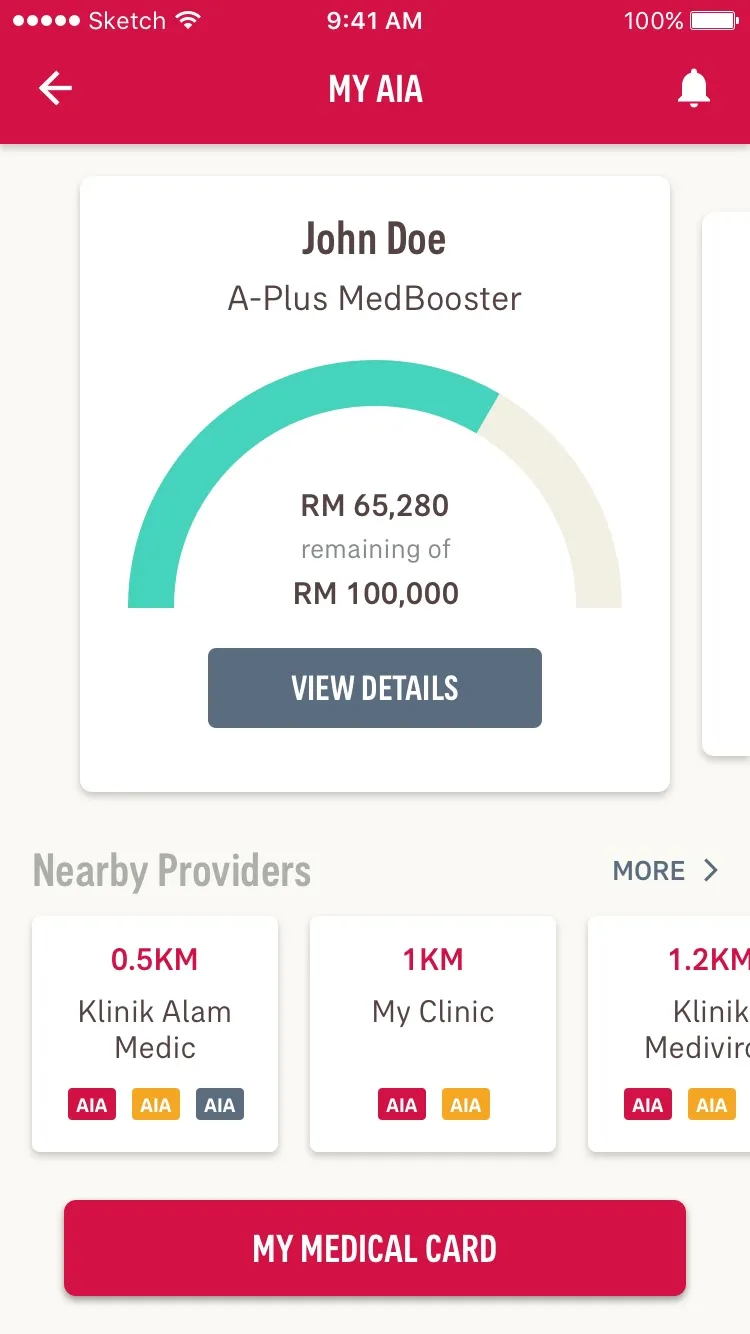
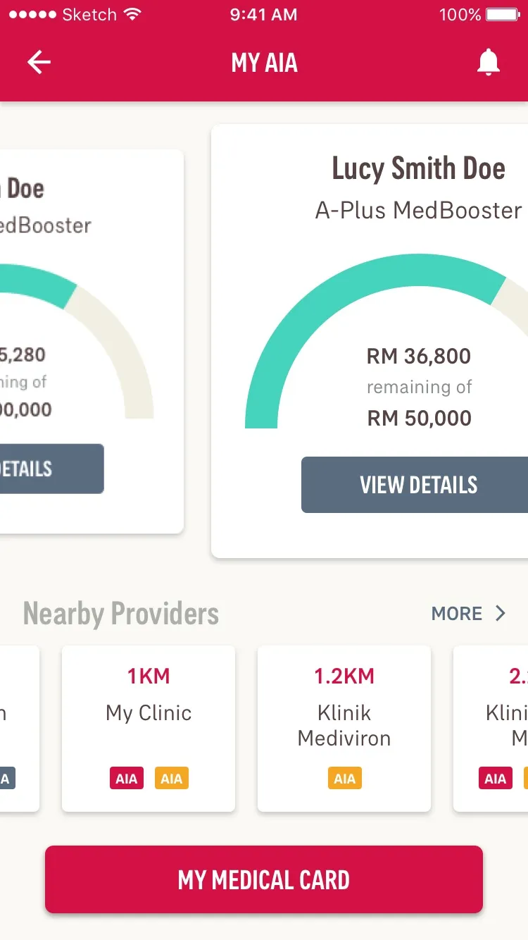
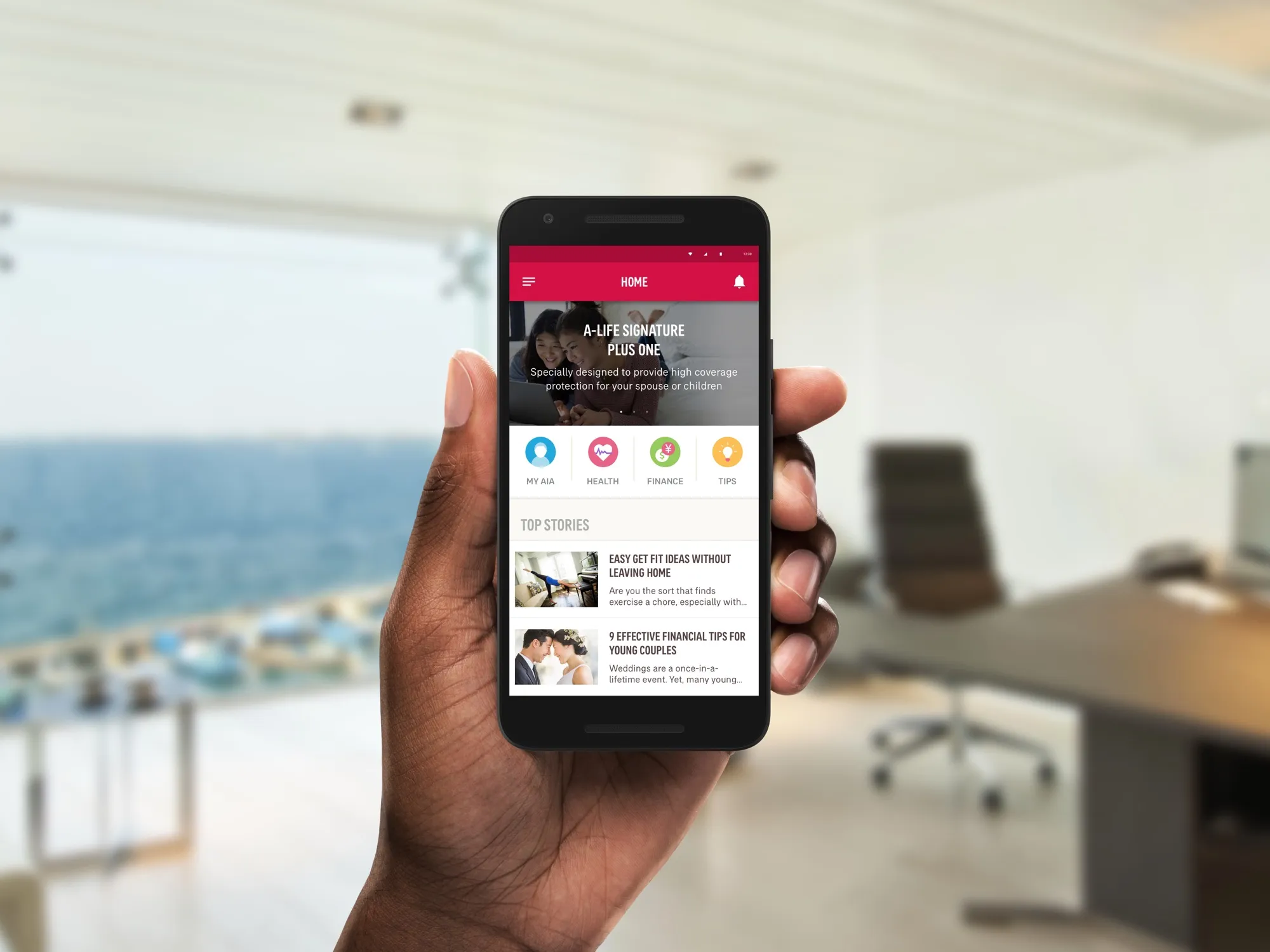
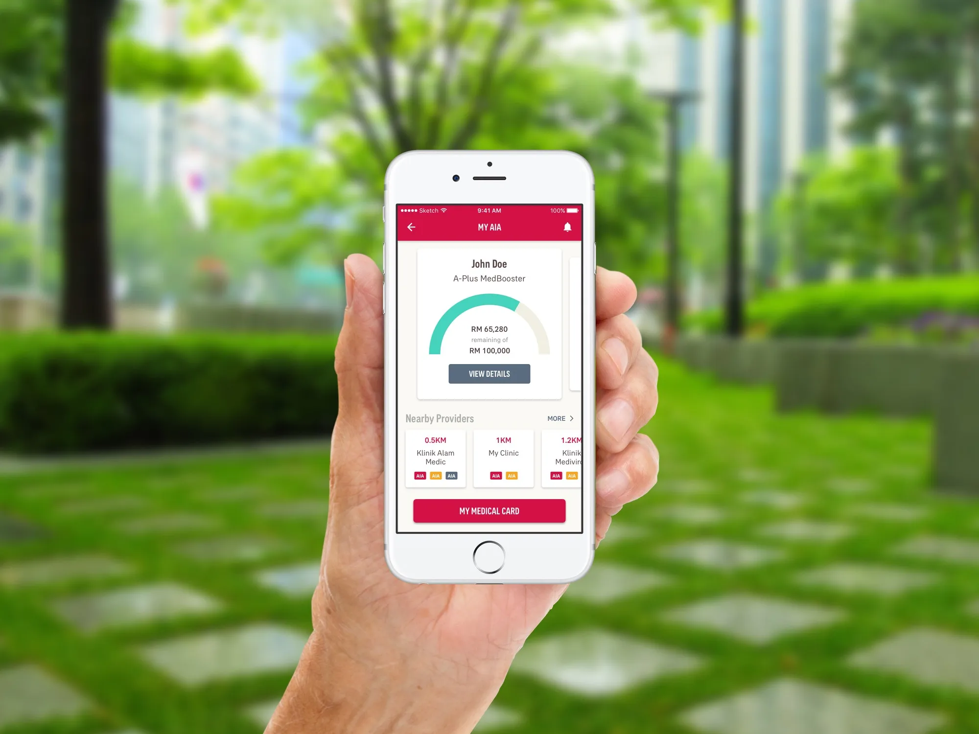
After the first round the app got smaller over two revisions. Home became banners, four shortcuts and a list of articles, and the four tiles moved into a new screen, My AIA. It showed your policy as a card with a gauge of how much cover is left, the clinics near you, and your medical card. The document wallet, the wizards, rewards and the reminder were dropped. By the second revision in early December, signing up and the help pages had moved out to AIA’s website, and there was a new way to use your medical card at a clinic: scan the clinic’s QR code, pick a card, check how much cover it has left, and confirm.
The look
In November we designed Home and My AIA in AIA’s red and their Everest font, for iOS and Android. We did two versions of Home, one with filled icons and one with outlines, and on My AIA you could swipe between your policies.