A one-page test for front-end candidates
The test I give front-end candidates fits on one page, a button in three states, an avatar and two boxes, and it is there to show me how someone thinks.
We’ve been interviewing front-end developers, and I’ve been using a one-page test for it. It’s a simple one I put together quickly, for a first round of filtering before we spend time on a face to face interview. The page is a Sketch artboard exported to a PDF, with four small things on it, and the candidate’s job is to build it in HTML and CSS however they like.
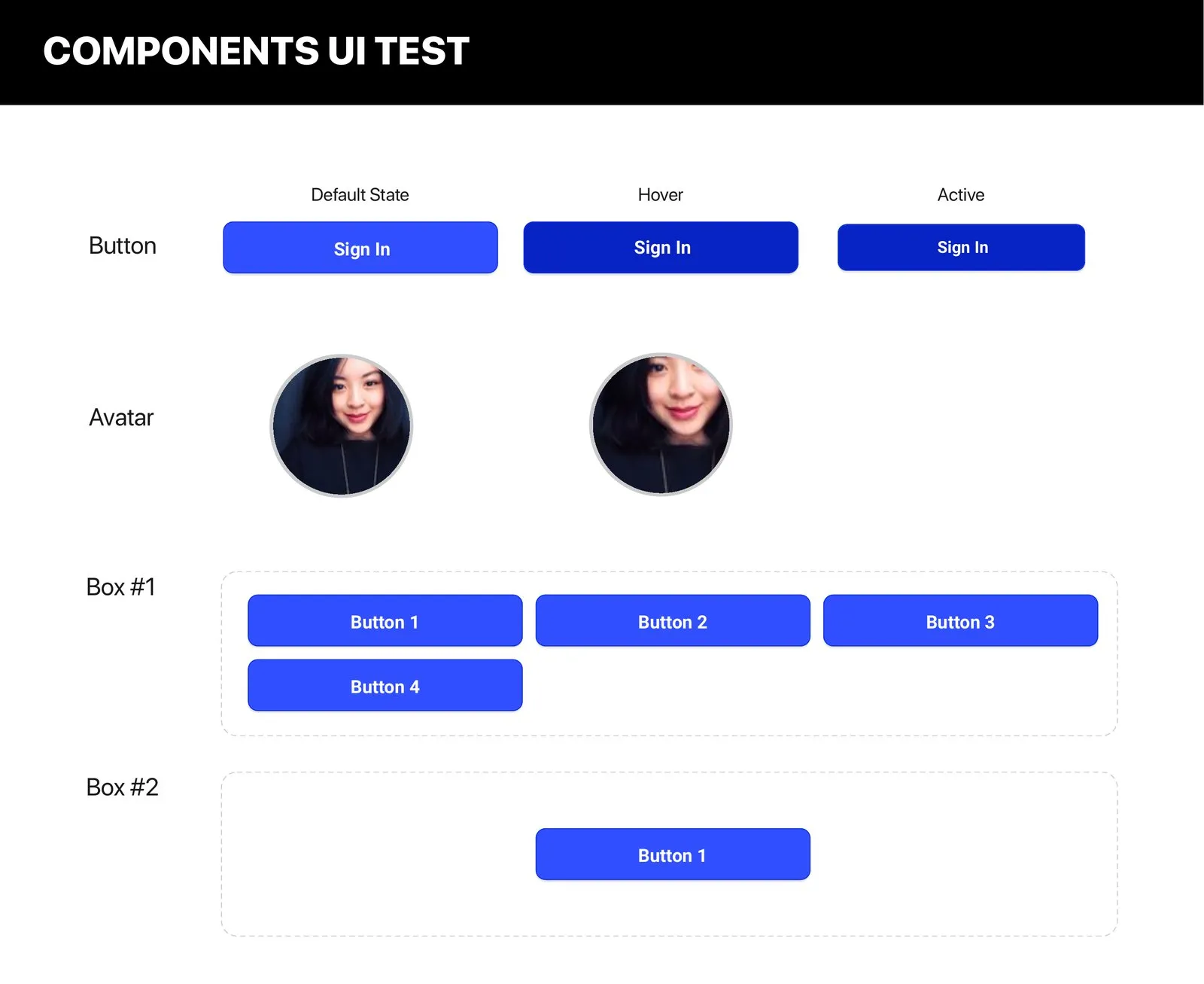
It looks almost too simple. There’s a Sign In button in three states, default, hover and active, an avatar with a second, blurred state next to it, a box with four buttons that don’t fit on one row, and a box with one button sitting in the middle.
The button states show whether someone thinks about what happens after the first render, or builds the default state and calls it done. The avatar is a circle with an image in it and a hover effect. Box #1 is a wrapping problem, four buttons in a container that can’t hold them in one row, with nothing in the brief about what should happen to the fourth. Box #2 is the classic one, centering one thing inside another.
What I’m after is how they think and solve the problem, more than whether they know the answer. Flexbox, grid, floats, absolute positioning, any of them is fine. I want to see which approach they reach for, and why. One page is enough for that, and enough to decide who to bring in for the face to face.