Hargapedia, version one
Hargapedia went into the stores just before Christmas, and this is everything that went into version one, the icons, the colours, the screens in three languages and the launch video.
Hargapedia has been in the stores since just before Christmas, so this is a good time to write down what went into it. It’s Ontrack’s first thing for consumers… the company has been doing B2B for years, and this is the other side of it, an app that tells you where a product is cheapest. I’m on the founding team, and my part is everything you can see, the logo, the icons, the branding and the front end. The rest of the team did the backend and the API, on AWS, and the app itself is React Native.
The icons came first
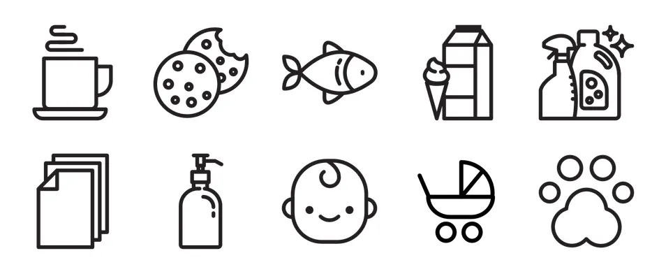
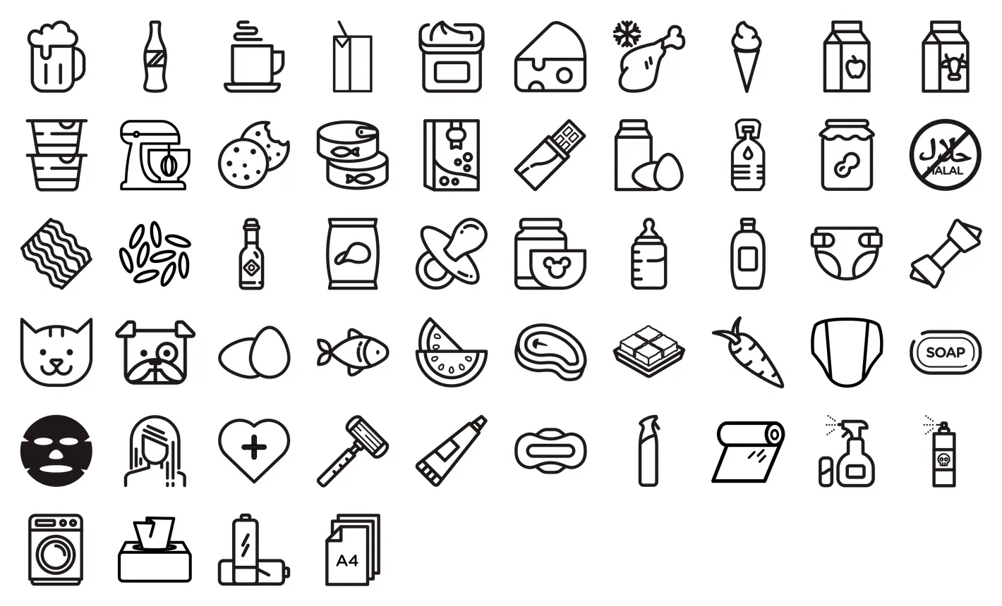
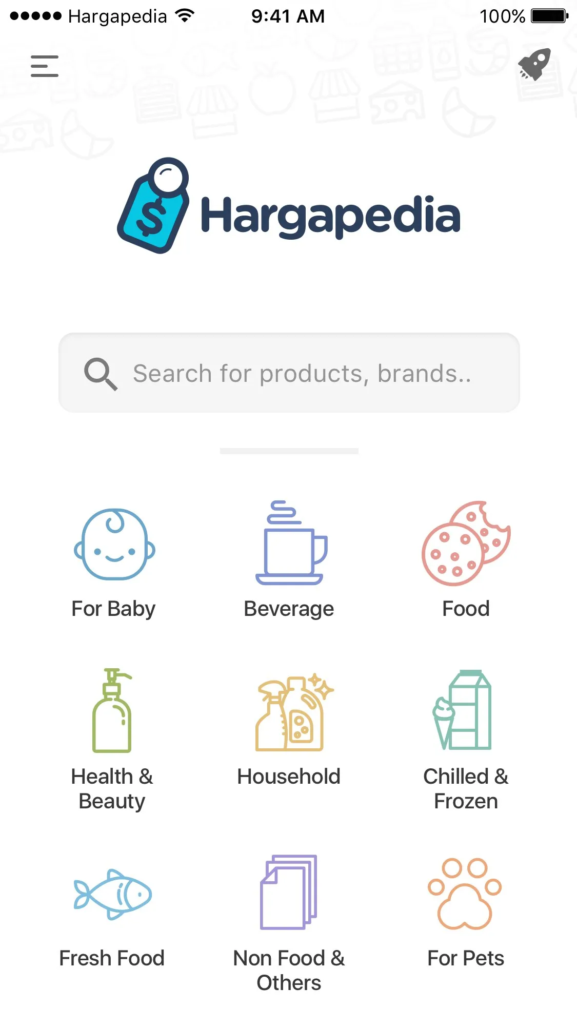
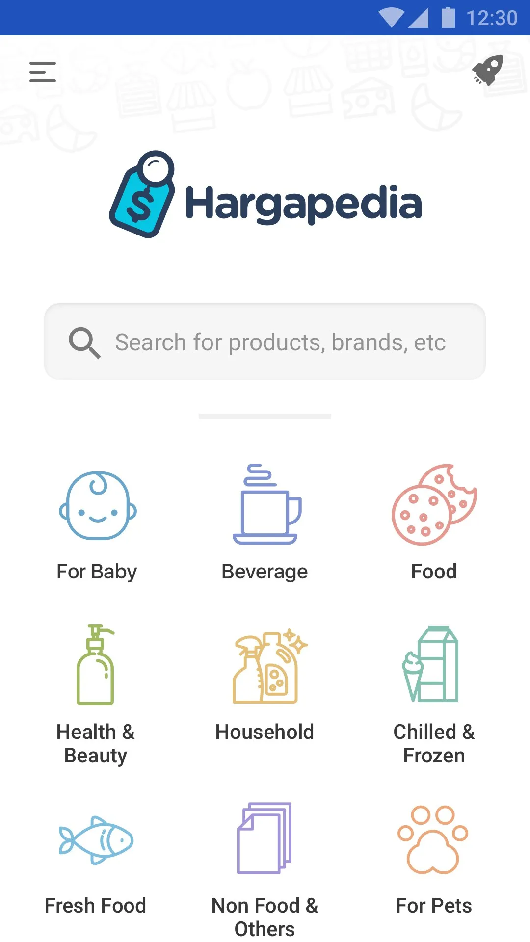
The first weeks of it had no app in them at all. A price app for groceries needs a category for everything on a supermarket shelf, so before I drew a single screen I drew icons, through most of October. Ten big ones for the top level, beverage, food, fresh food, chilled and frozen, household, non-food, health and beauty, baby, childcare and pets, and then the level under that, which is where it got long… beer, cookies, nappies, cat food, toilet rolls, batteries, all custom drawn in the one line weight.
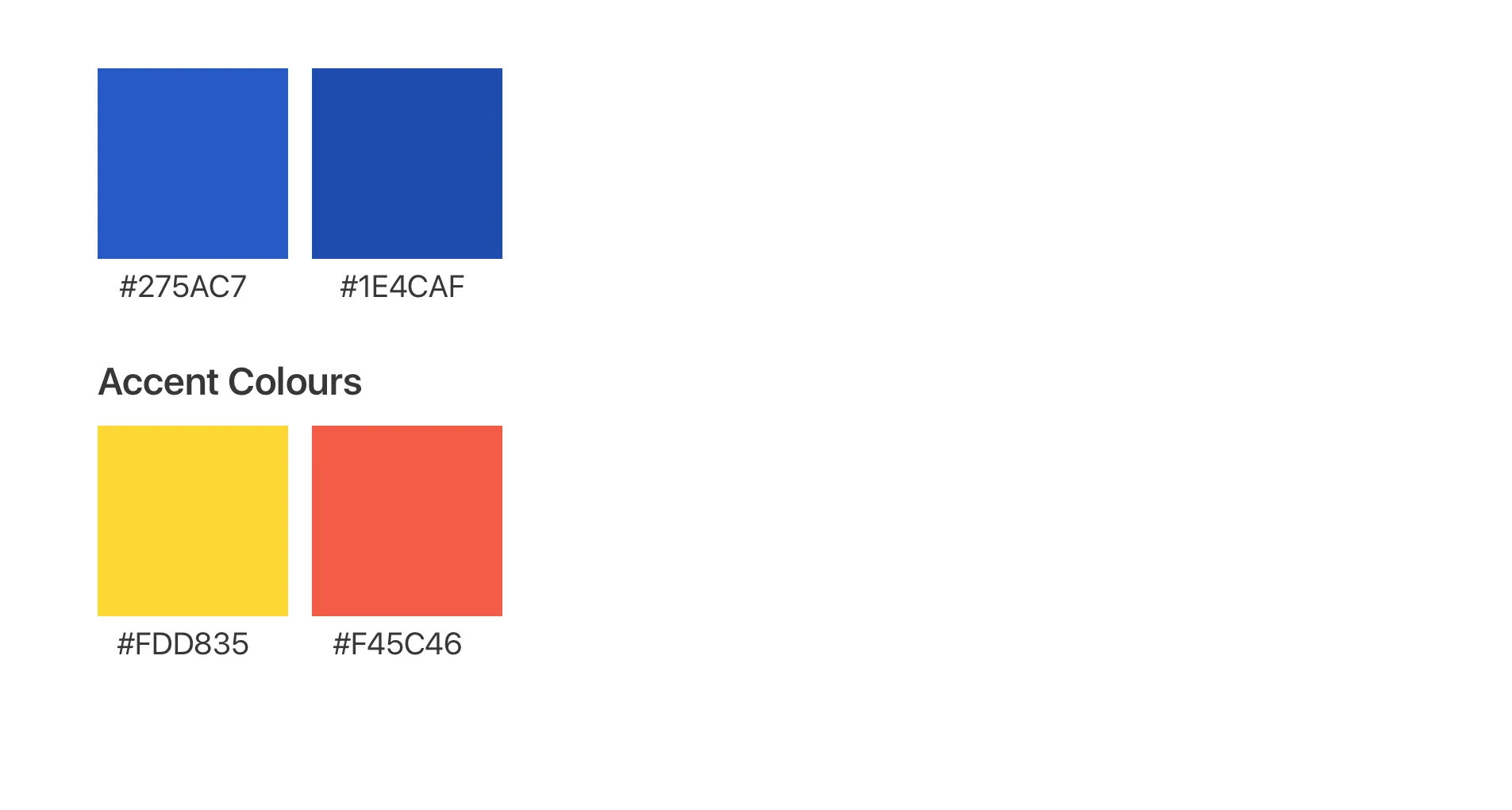
The logo was there before the icons, a price tag with a magnifying glass on it, and the colour came after. The apps already out there had taken the other colours, so we went dark blue… #275AC7 for the app, a deeper blue next to it, and a yellow and a red for accents. The app icon is the same tag, cyan on light blue.
Four screens, twice
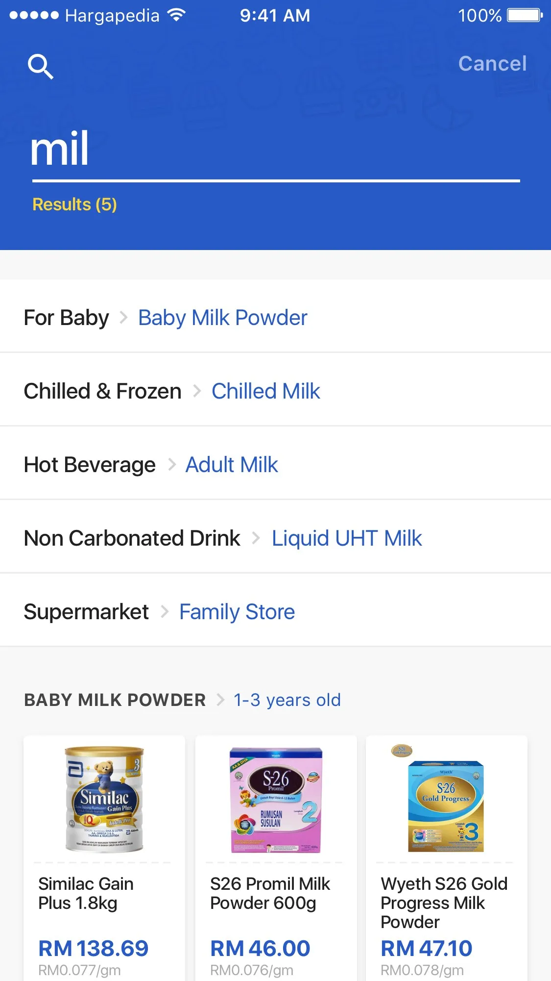
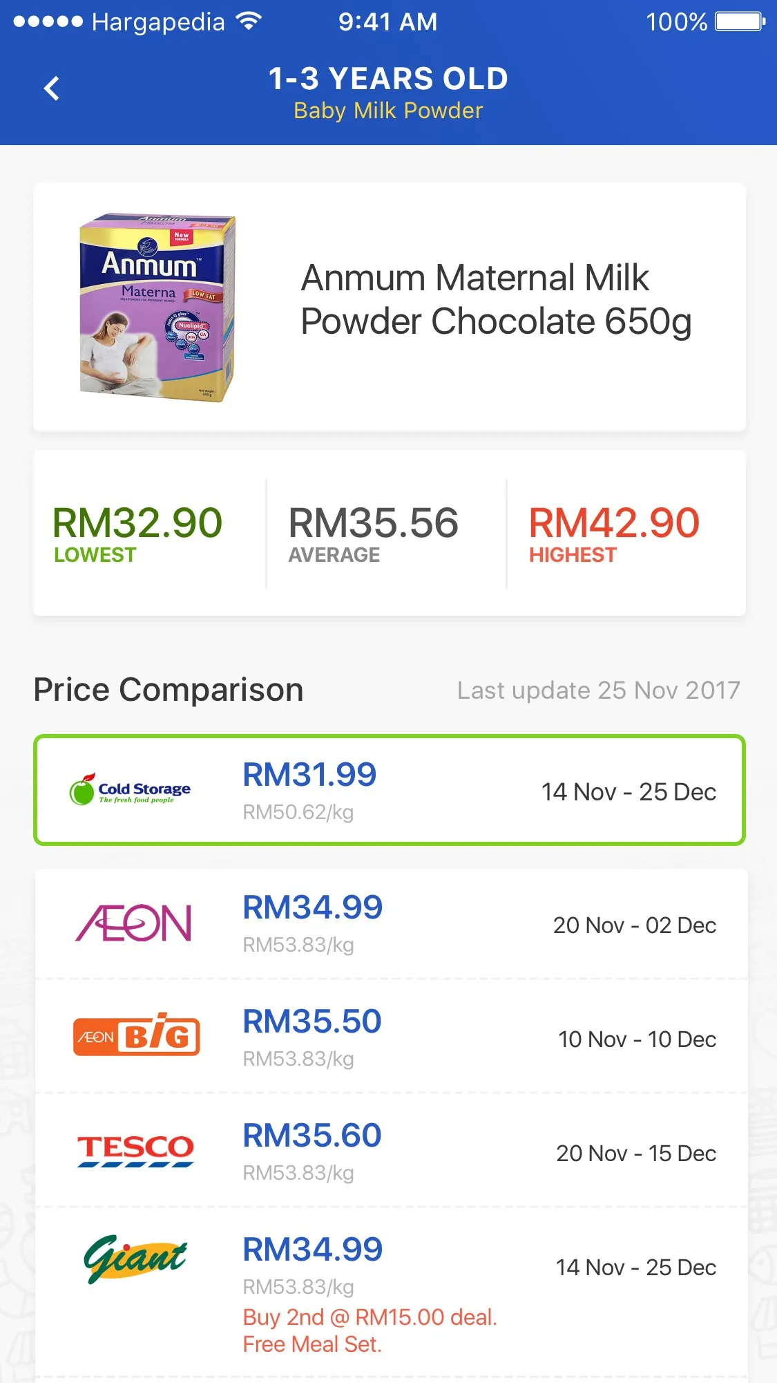
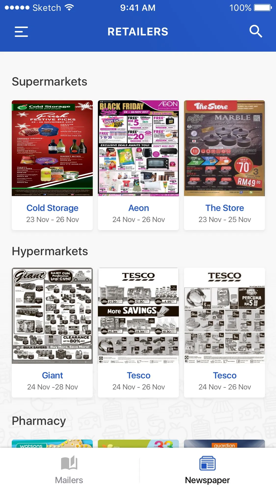
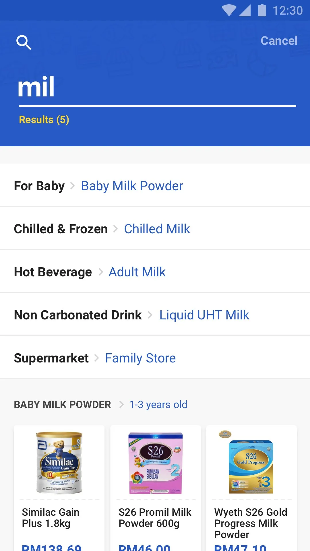
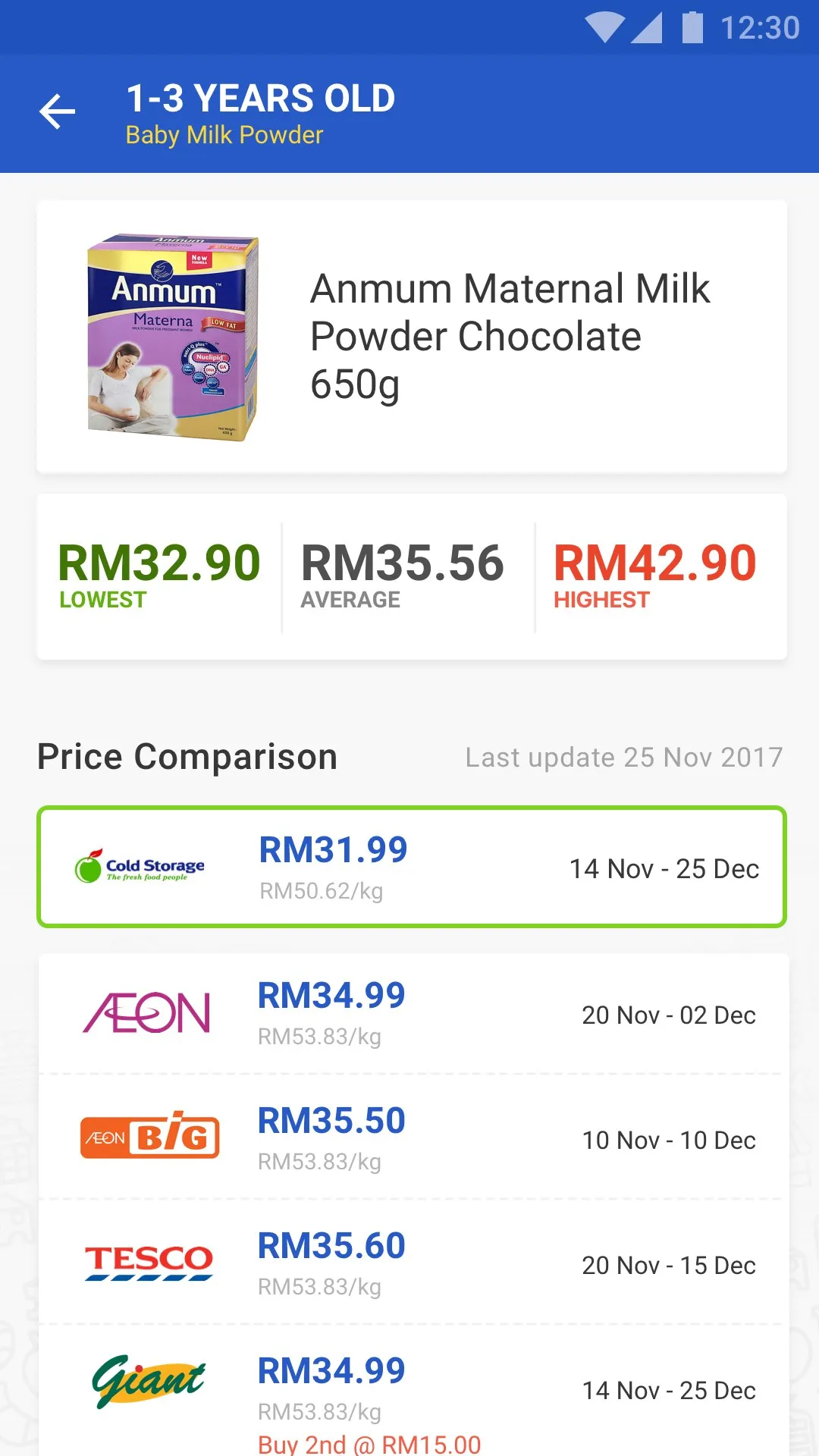
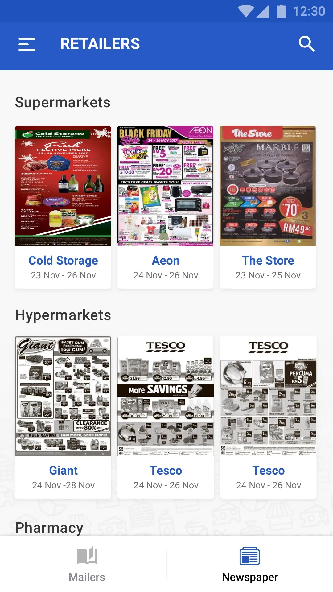
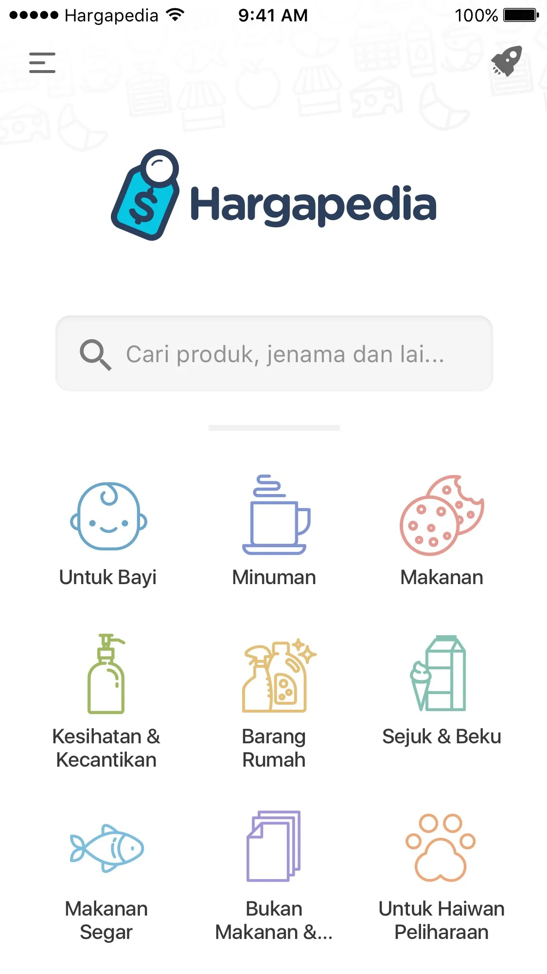
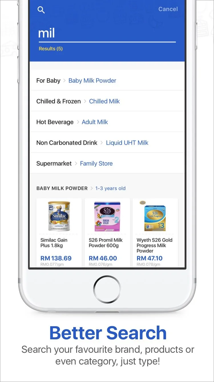
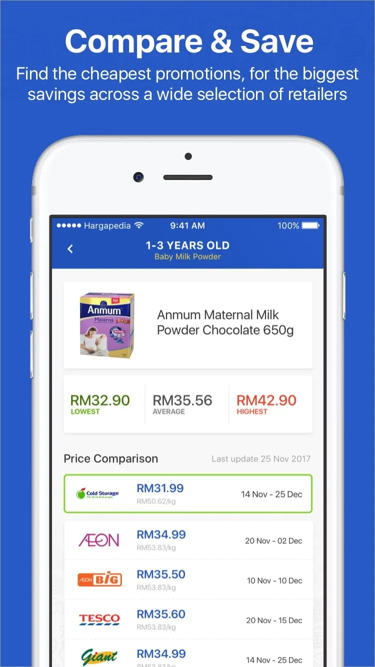
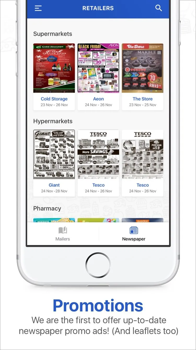
Version one is four screens. The home screen is a search box and the categories, each icon in a colour of its own. Search takes you in by name or by category, a product page shows the lowest, the average and the highest price before the list of retailers, each with its price and the dates it runs to, and the last screen is the retailers’ mailers and newspaper ads, by supermarket, hypermarket and pharmacy.
Three languages, on day one
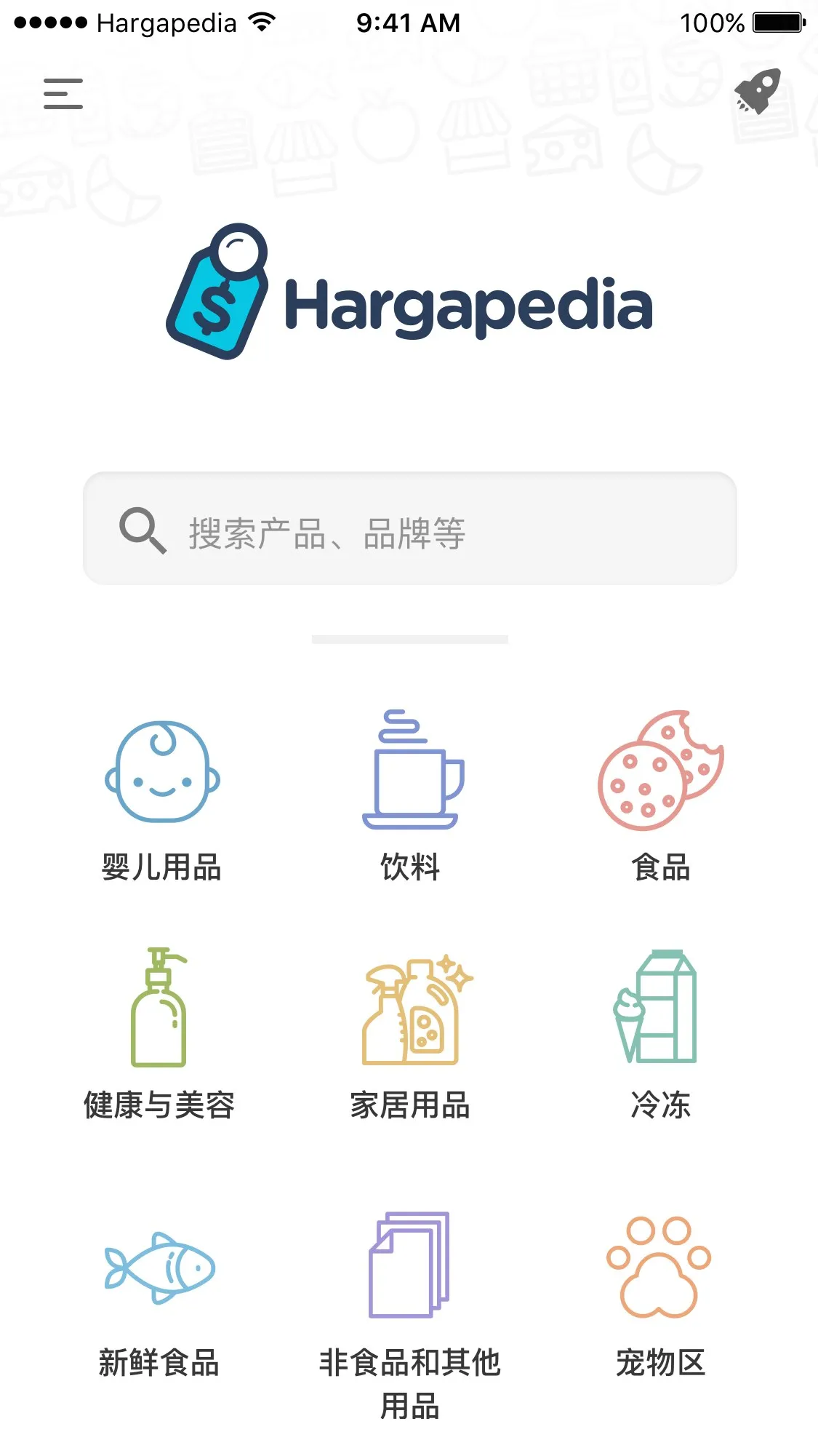
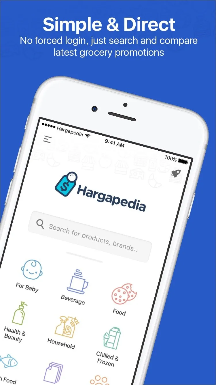
Then every screen again in Malay and in Chinese, because the app went into the stores in all three. That meant three sets of store screenshots too, framed with a headline each, Simple & Direct, Better Search, Compare & Save and Promotions, in the iPhone SE, 6 and 6 Plus sizes, and the Play Store graphics to match. The first two weeks of December went on that.
The launch video for Facebook went up this month, built in Hype, fifty-odd seconds of the app doing its thing.